Jo Hoffberg has a long standing presence in the global Swing Dance circuit as an empowering figure of feminism. As such, her brand already exists. My task was simply to create a visual identity that is in harmony with that brand. I began by doing some research on Jo Hoffberg and her online presence.
Jo's personality is strong and modern as well as feminine and sassy. Her hair is blonde and bright red and her fashion sense is edgy and vintage/modern. I decided to create a personal logo for her and an identity under which the 'What'cha Know Jo' business could exist.
I take to the sketch pad first and foremost before moving forward with several concepts digitally.
Below are the two concepts we had narrowed down to. We felt the concept on the right was the stronger of the two so I carried on with more iterations. I decided simple is better and eliminated any 'decorative' elements working on scale instead. My aim was to draw attention to the 'Jo' mark and convey her brand mostly within it.


The final logo came in three distinct colors that I felt captured a vintage aesthetic since Jo specializes in vintage Swing Dancing. I customized the mark 'Jo' on paper before taking it into Illustrator. The goal was to convey femininity and boldness. The red color captures her bold personality as well as her distinct hair style. The mark also has movement to it which I felt was necessary as her business is geared towards training dancers.
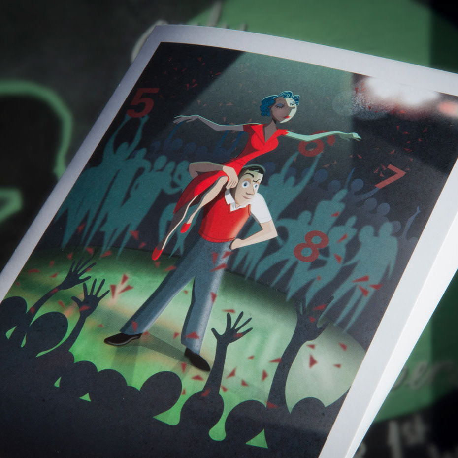
Next came the deliverables: Jo needed graphics for social media which included profile pictures, banners and cover photos. I expanded the brand identity from the logo taking inspiration from mid century graphics. Jo was partial to this style of design and It's vintage, edgy and modern aesthetic fits her well.
I created this Facebook banner for Jo and based the rest of the deliverables off of it.
Finally, to get an idea of the overall brand identity I threw together this style sheet for Jo.
Jo Hoffberg's Brand sheet


