Pre Production
Uninterrupted has a slick, clean and simple design with a minimal colors and basic shapes. The typography, colors and overall aesthetic is consistent through each touchpoint. The elements I observed and took note of was their use of sans serif white type on black background with an occasional single red horizontal line leading to bits of information. The content display itself is very attractive: because Uninterrupted has a simple brand it allows the beautifully and artistically photographed/edited content posters to shine. This draws the users attention to the content and its appeal. I decided to use this as the focal point of my design.
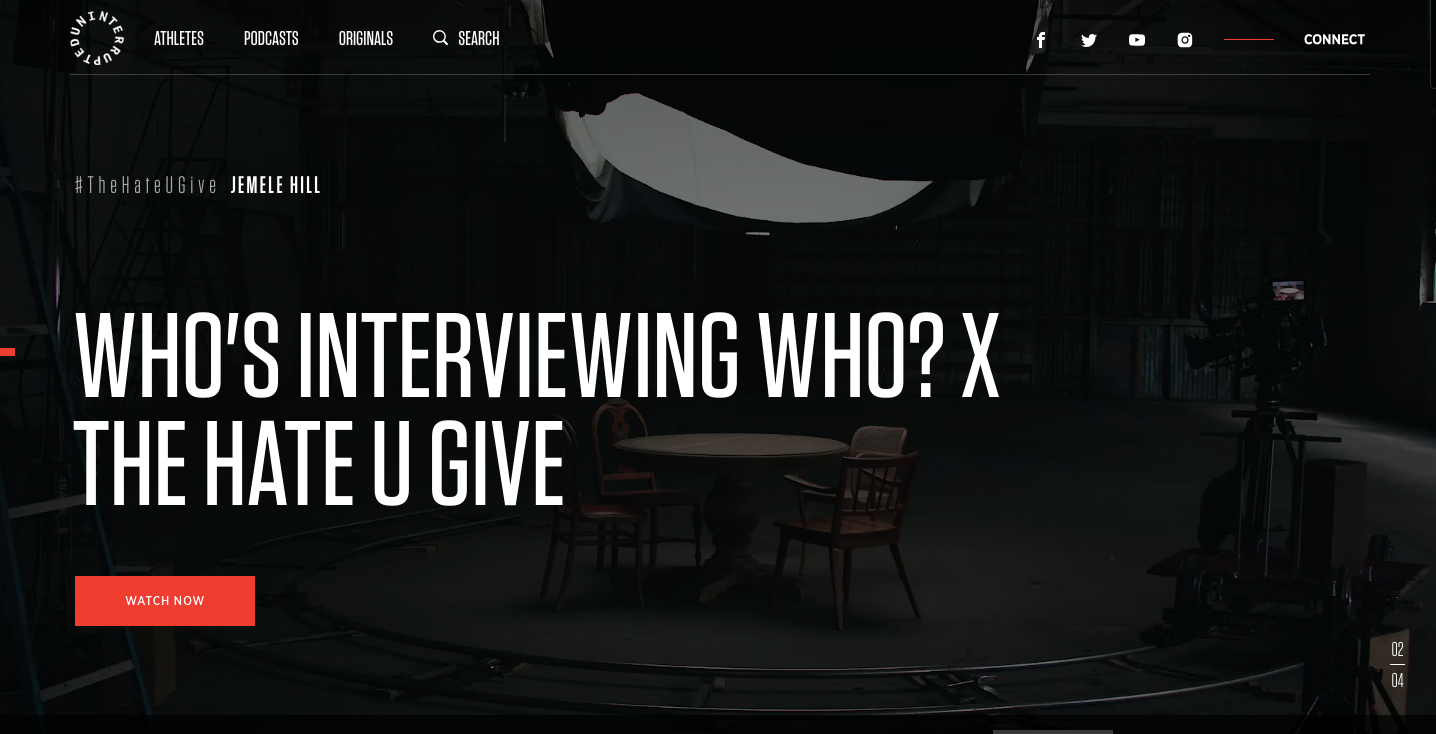
Uninterrupted Website
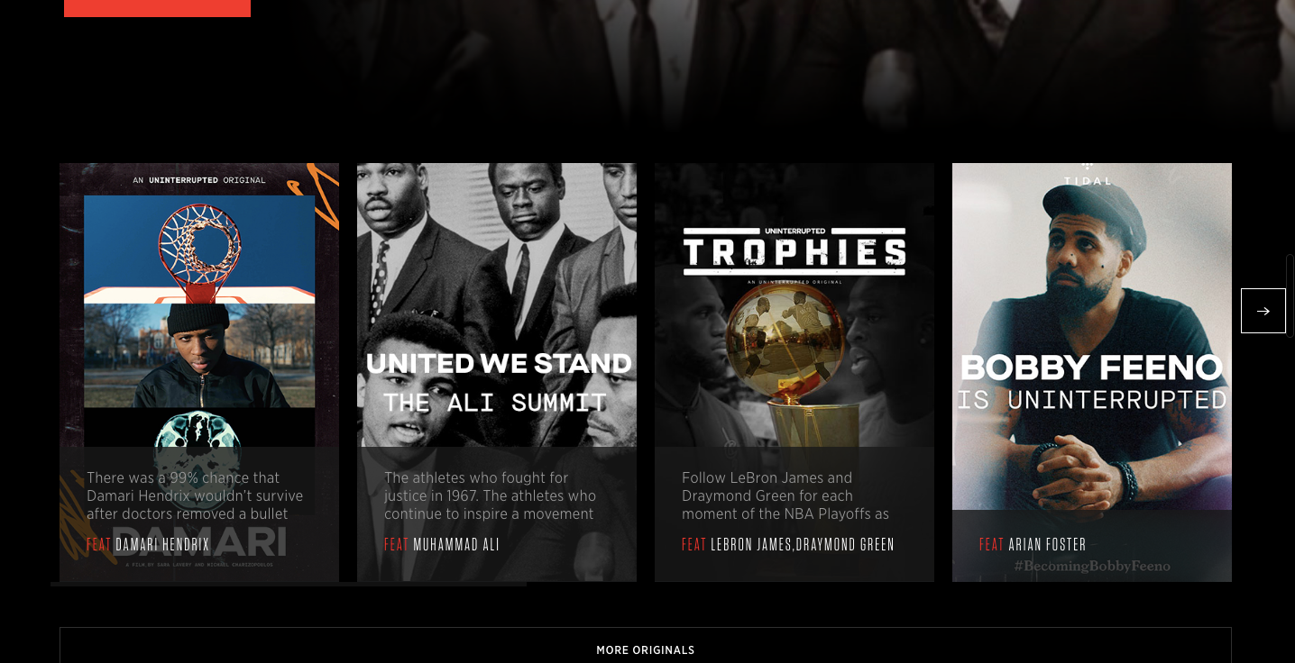
Uninterrupted Website
Production Work
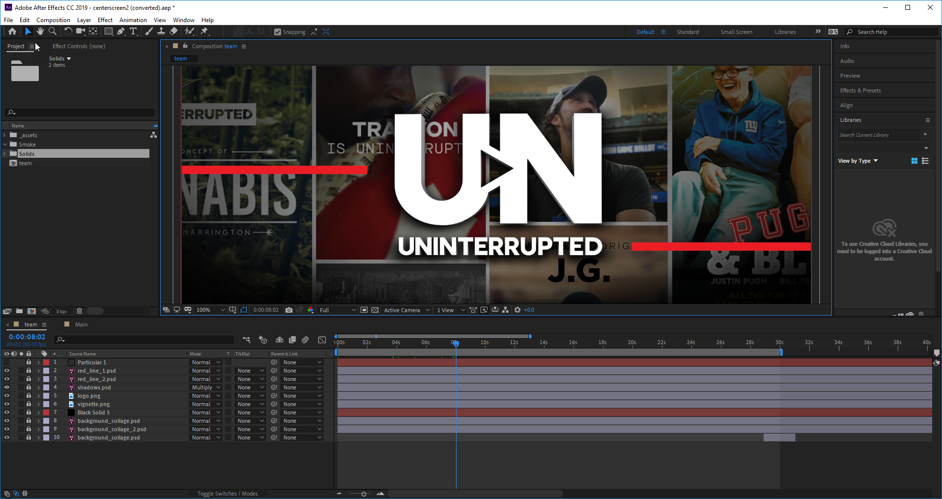
For the landing page video, I created a 3D version of Uninterrupted's logo to match our own (Direct Sports Network) and keep consistency with our other Sports Network apps. The next step was to create a collage of some of the content posters found on Uninterrupted's website. I created two versions of this poster so that I may fade between them in After effects and reveal different posters during the animation.

Background Assets (photoshop)
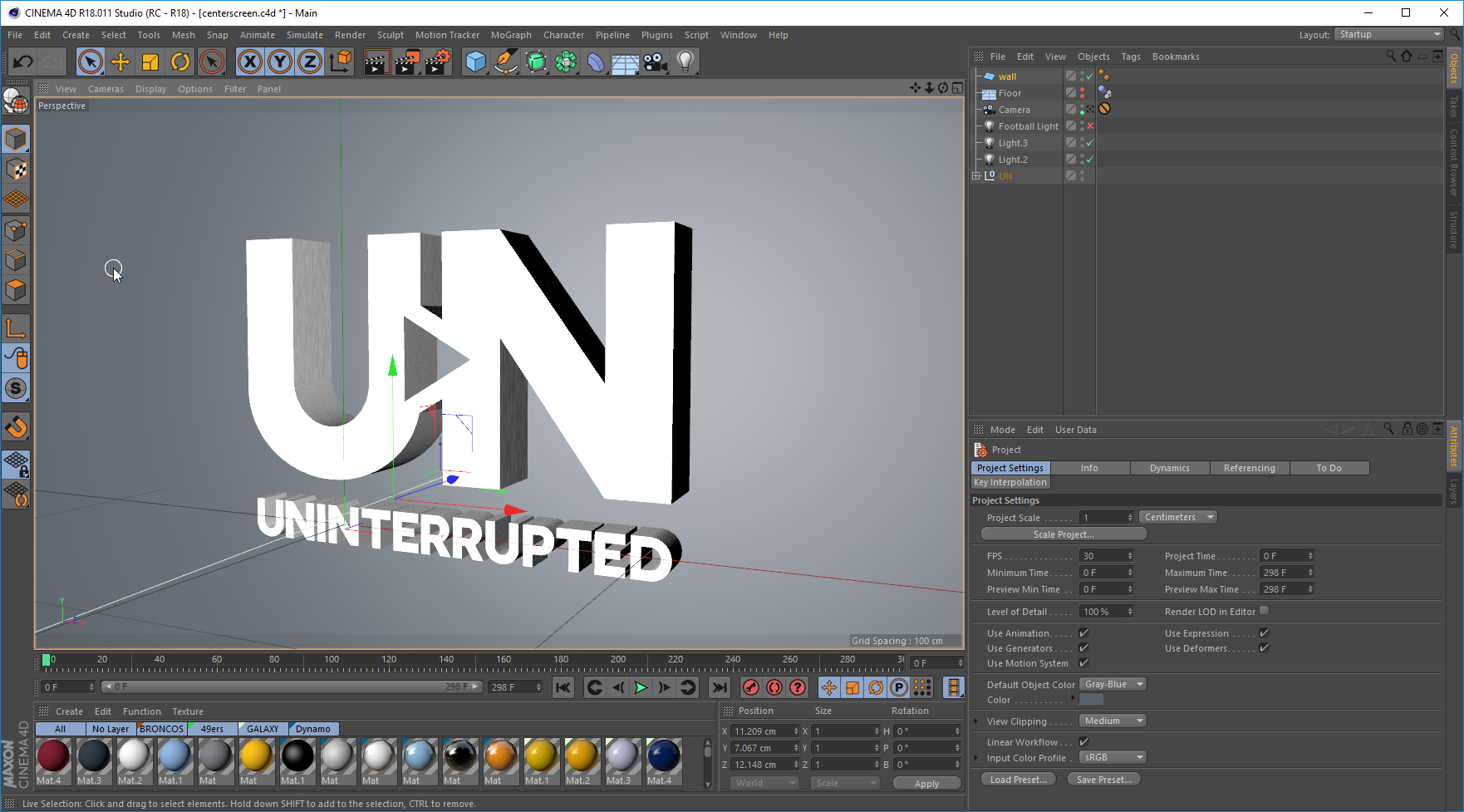
Rendering 3D Logo in Cinema 4D
Post Production in Adobe After Effects
Once the assets were complete, I imported them into After Effects and began animating. The Logo was fixed in the center and I added two horizontal red lines; one leading to the Icon and the other to the wordmark underneath it in order to echo the red lines present on the website.
The final product
Once the Landing Page was complete, I echoed the same aesthetic for our Feature Graphic. This appears behind the description in the app store. Using the same posters from Uninterrupted, I created a slanted collage. Below is a screenshot of the Feature Graphic in the context of the app store.

Graphic I created for the app store

App Store
The individual channels within the app were more simple: Clean banner images featuring players and content subjects. The names were placed on the right in a sans serif white font with a red horizontal line coming in from the right to indicate it.