Understanding the Brand
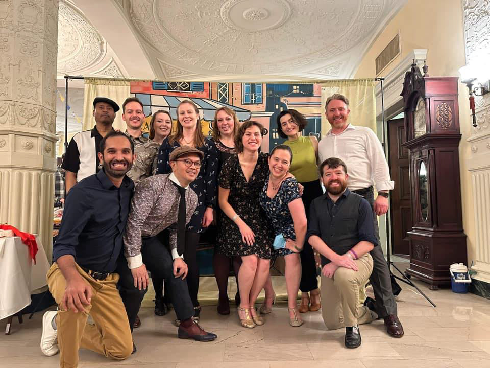
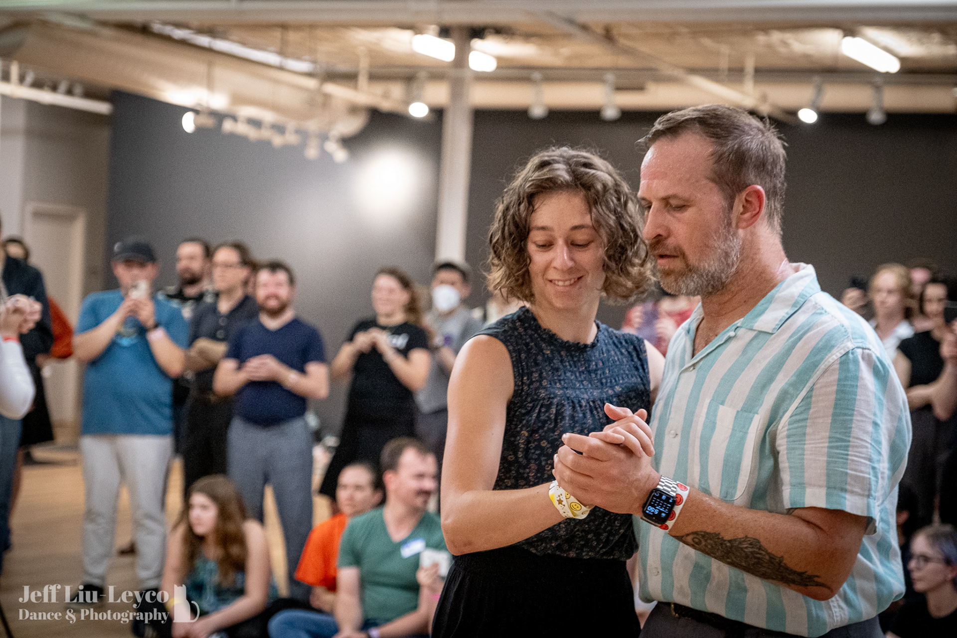
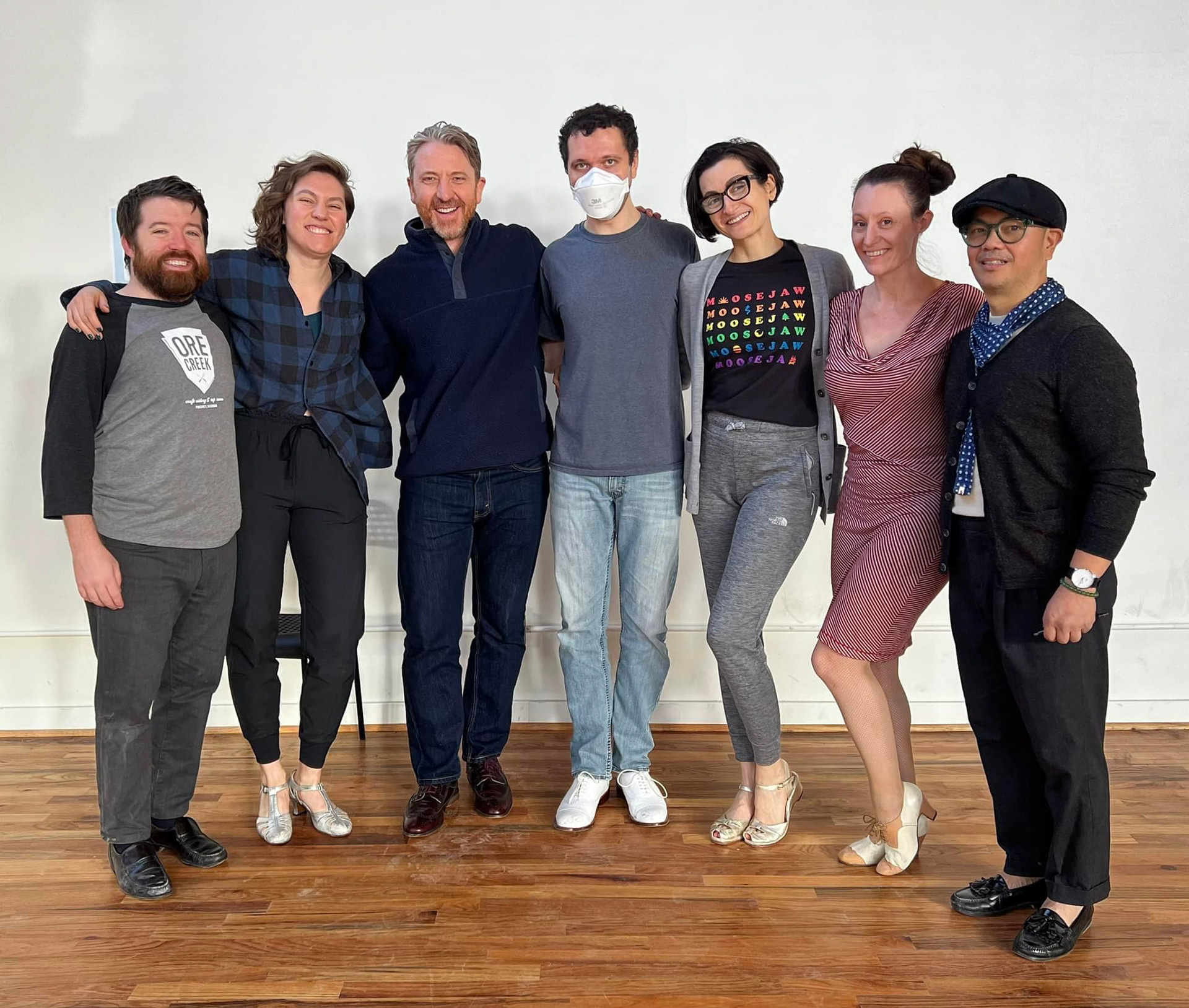
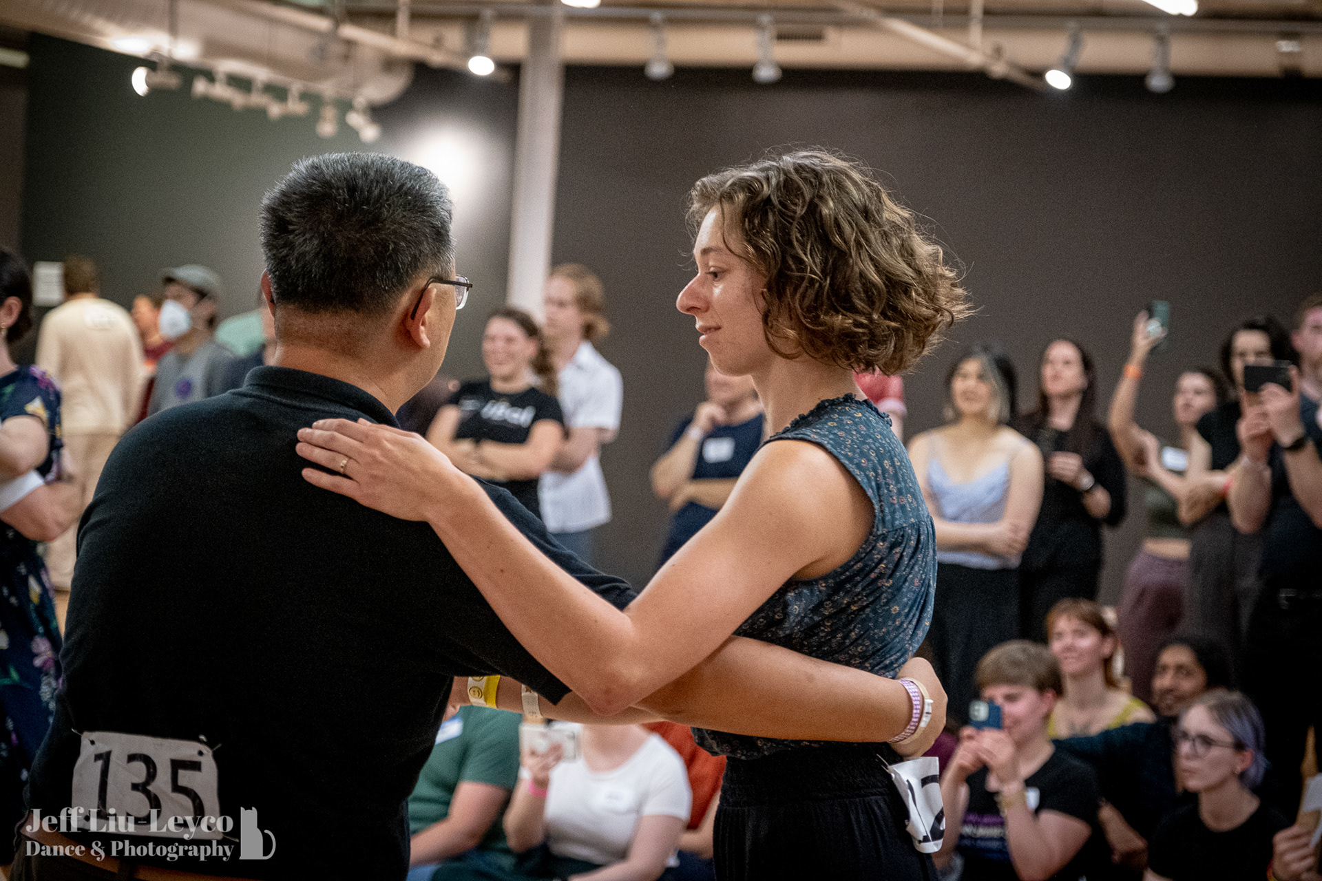
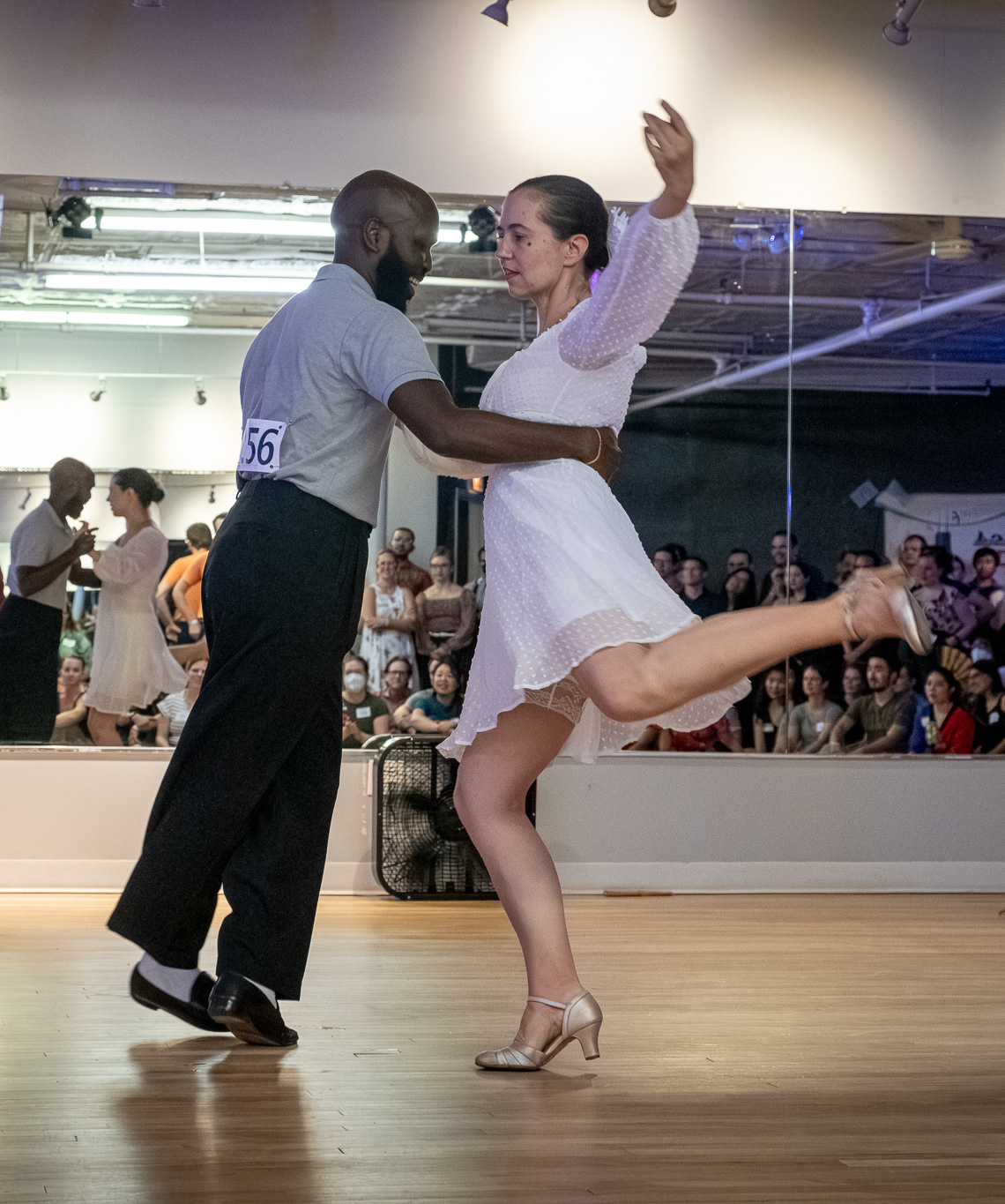
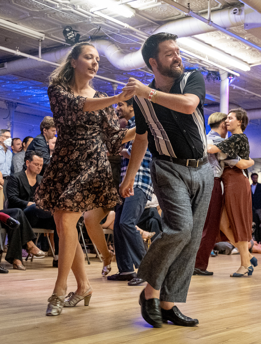
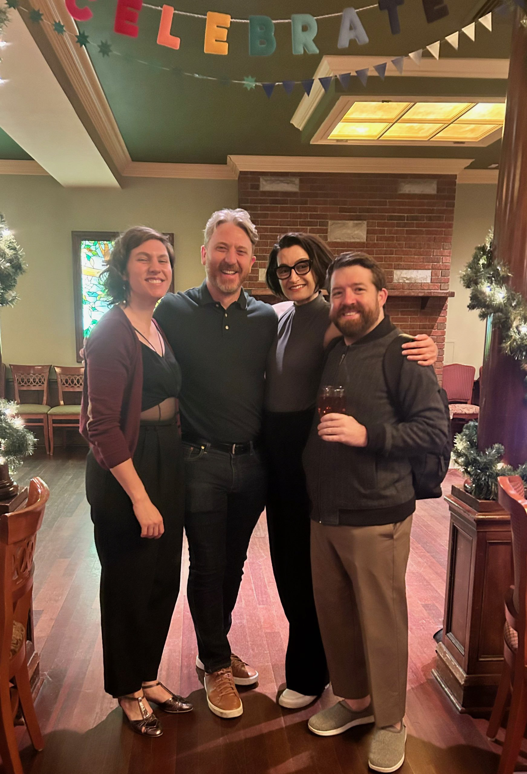
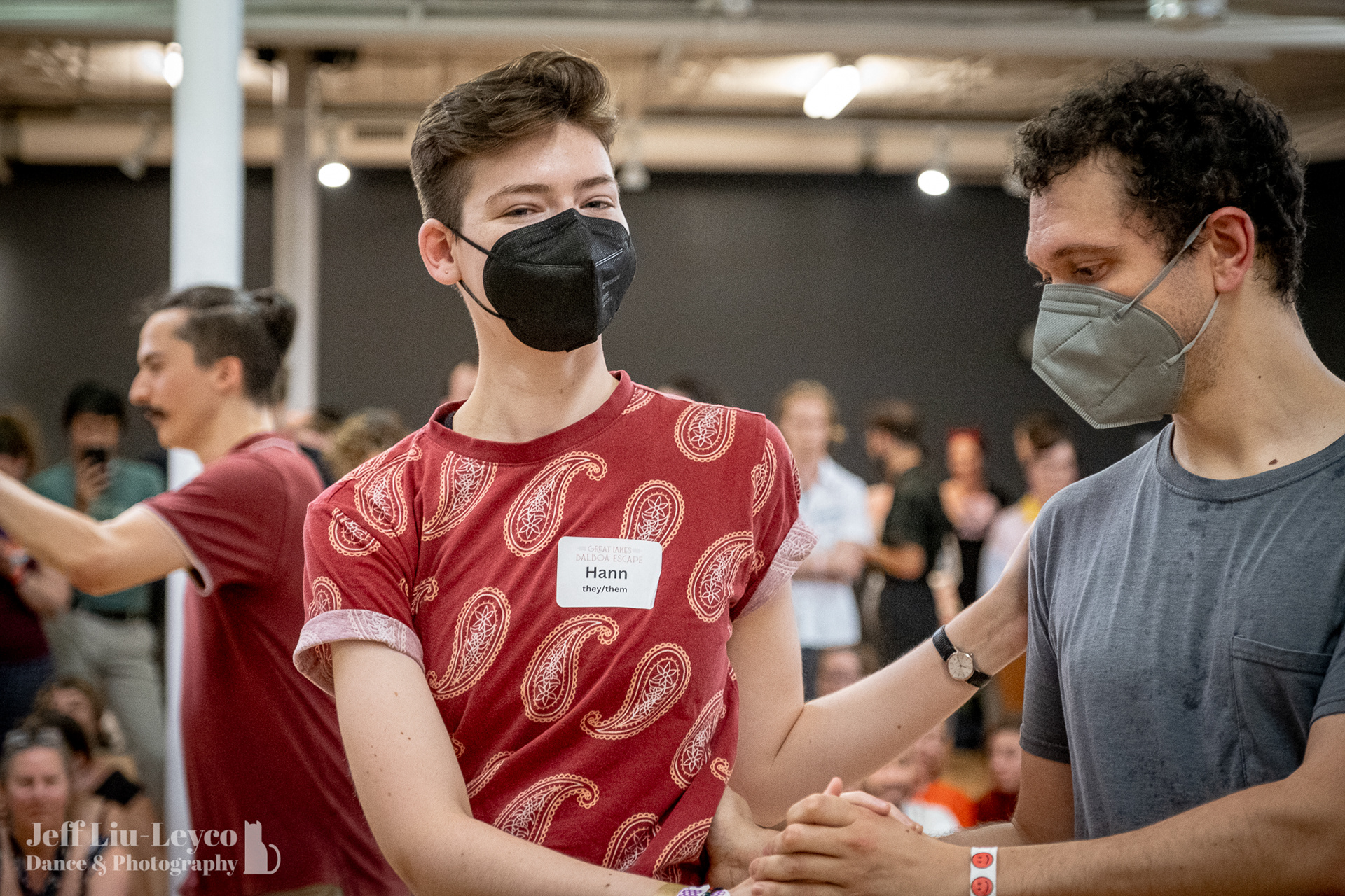
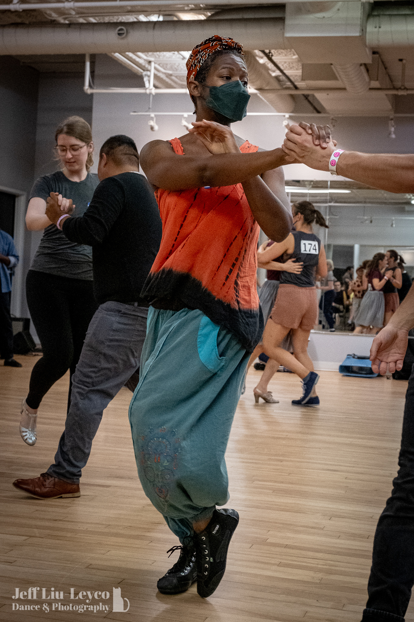
Chicago Balboa Underground, also known as Chi Bal, is a swing dance organization based in Chicago. They specialize in Balboa, a vintage era partnered swing dance from Southern California. But more importantly, Chi Bal is a radically inclusive space: queer-friendly, body-positive, community-focused, and welcoming to dancers of all backgrounds and experience levels.
They approached me for a full rebrand that could help visually represent their values and attract new dancers. The challenge was to strike a balance between the vintage roots of the dance and the modern, inclusive character of the organization. The brand needed to feel personal, vibrant, and distinctly tied to the city of Chicago — while being inviting to both seasoned swing dancers and complete beginners.
Logo Design
Before diving into design, I worked to understand Chi Bal’s personality and mission. They aren't just a dance school — they’re a community hub. Their events are infused with warmth, safety, and connection. They prioritize marginalized identities and reject rigid, gendered dance roles. The visual identity needed to honor inclusivity while still celebrating the vintage aesthetics of the dance form.
I anchored the brand around three core emotional qualities: personal, vintage, and vibrant. Visually, the direction needed to reflect Chicago’s urban energy, the nostalgic roots of Balboa, and the softness and safety of a chosen family.
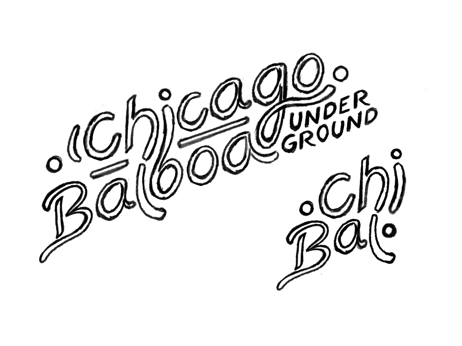
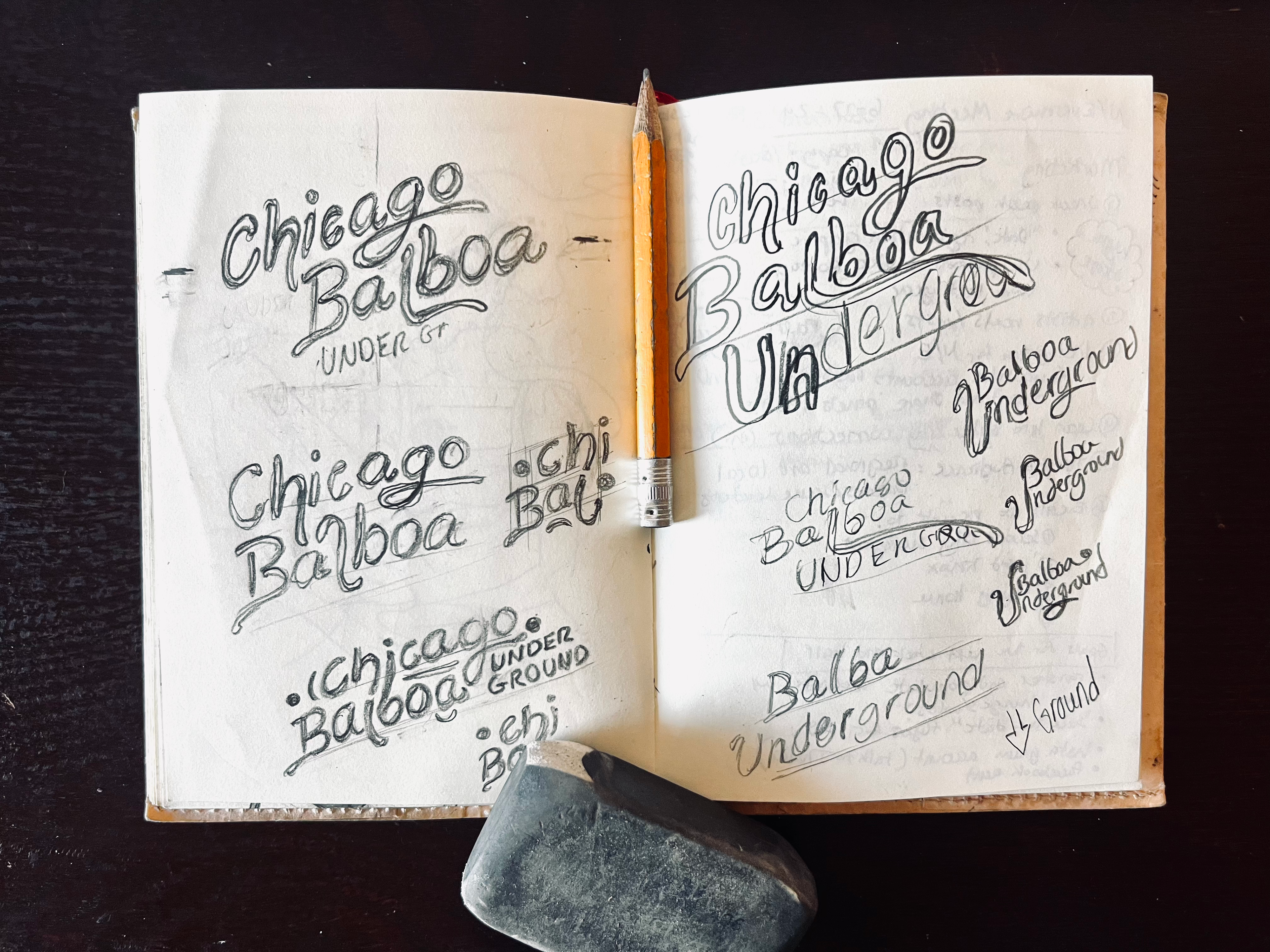
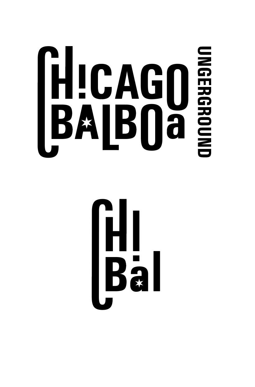
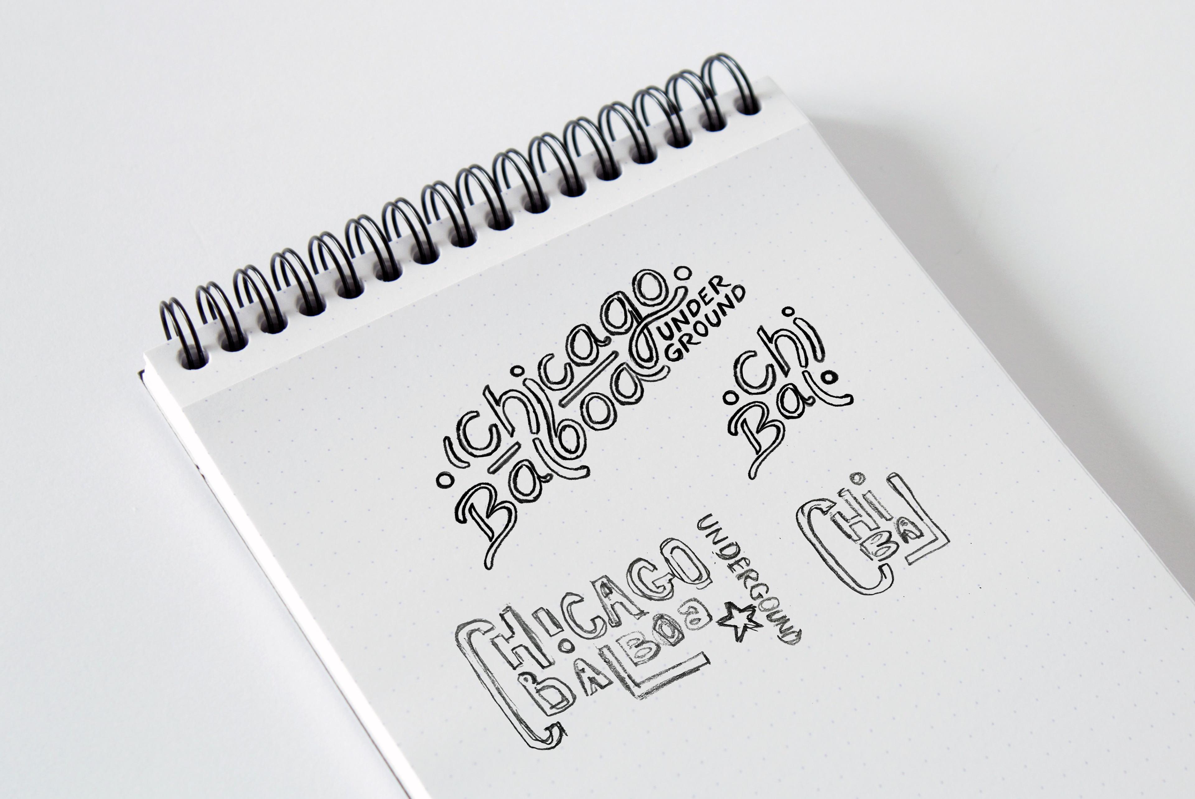
I presented two distinct directions for the logo. One leaned into vintage, hand-drawn lettering reminiscent of old neon diner signs — gritty, human, and warm. The other was a more contemporary typographic approach and more refined and structural.
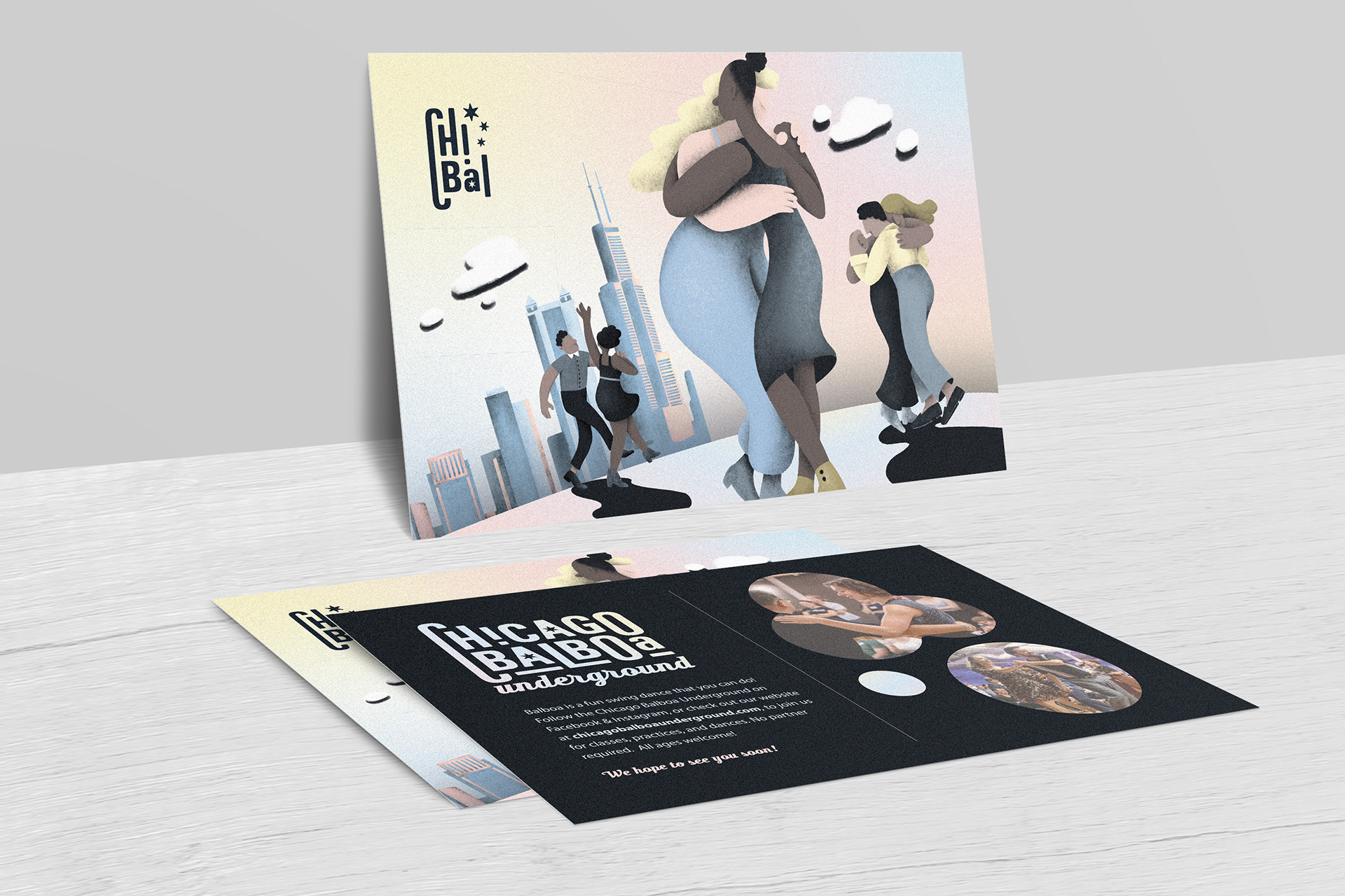
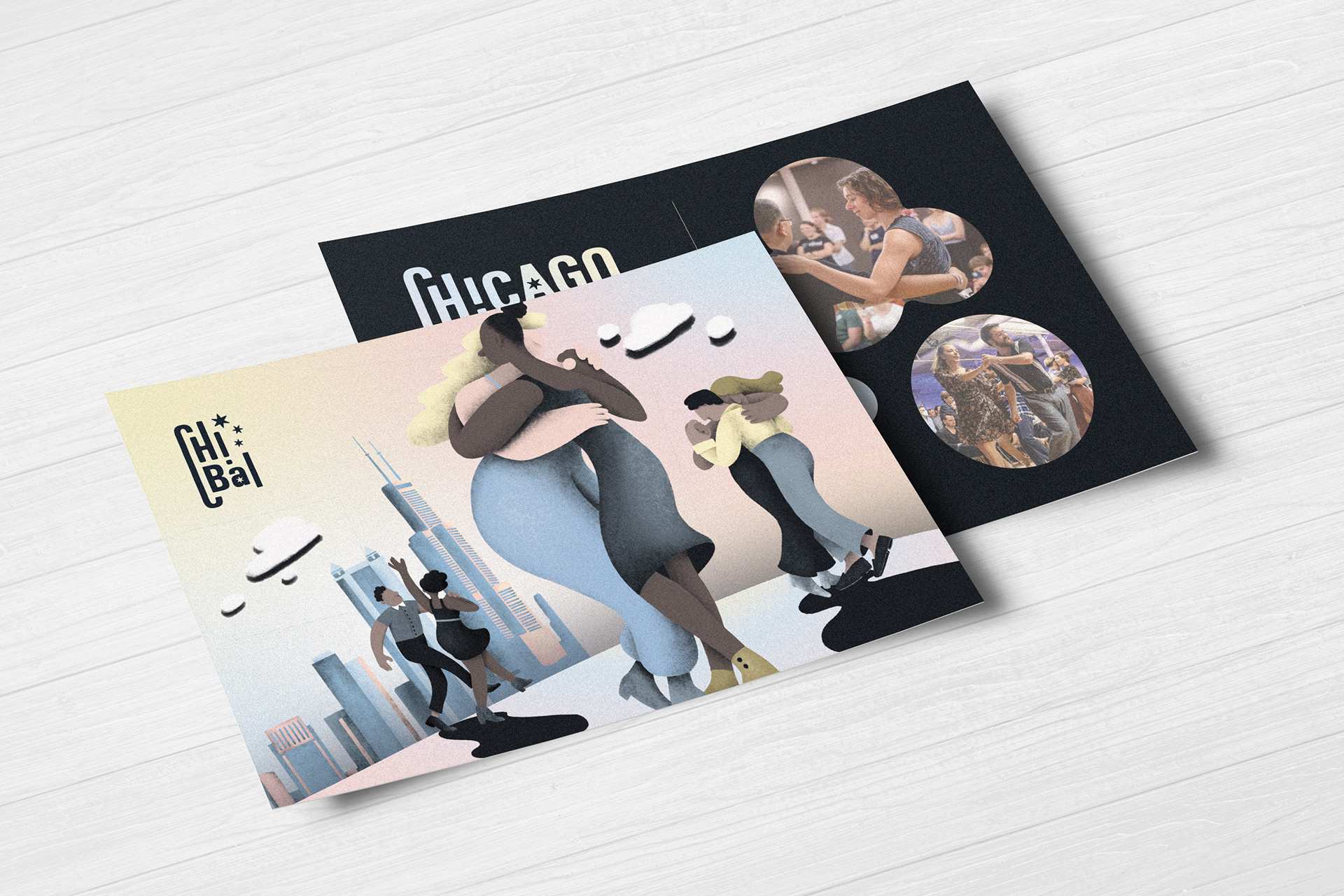
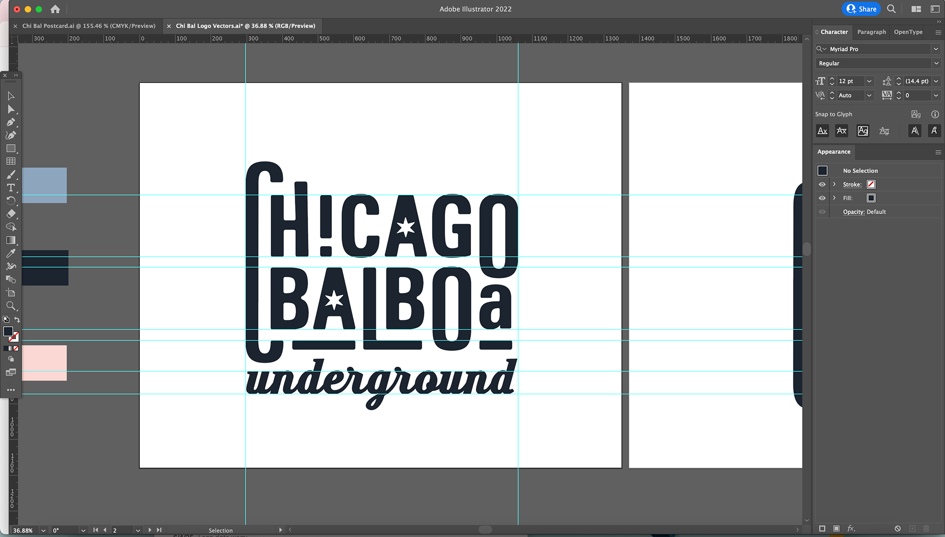
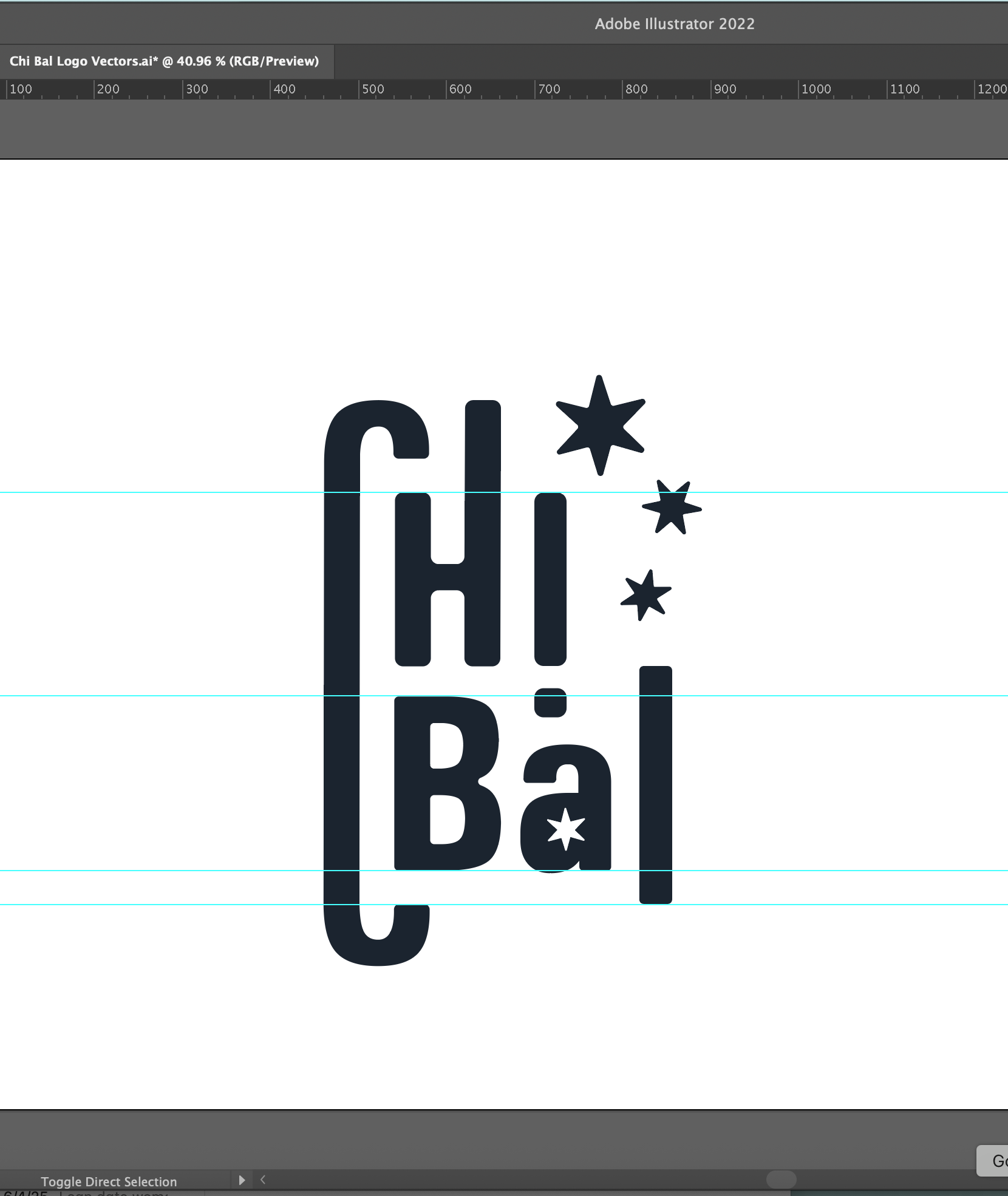
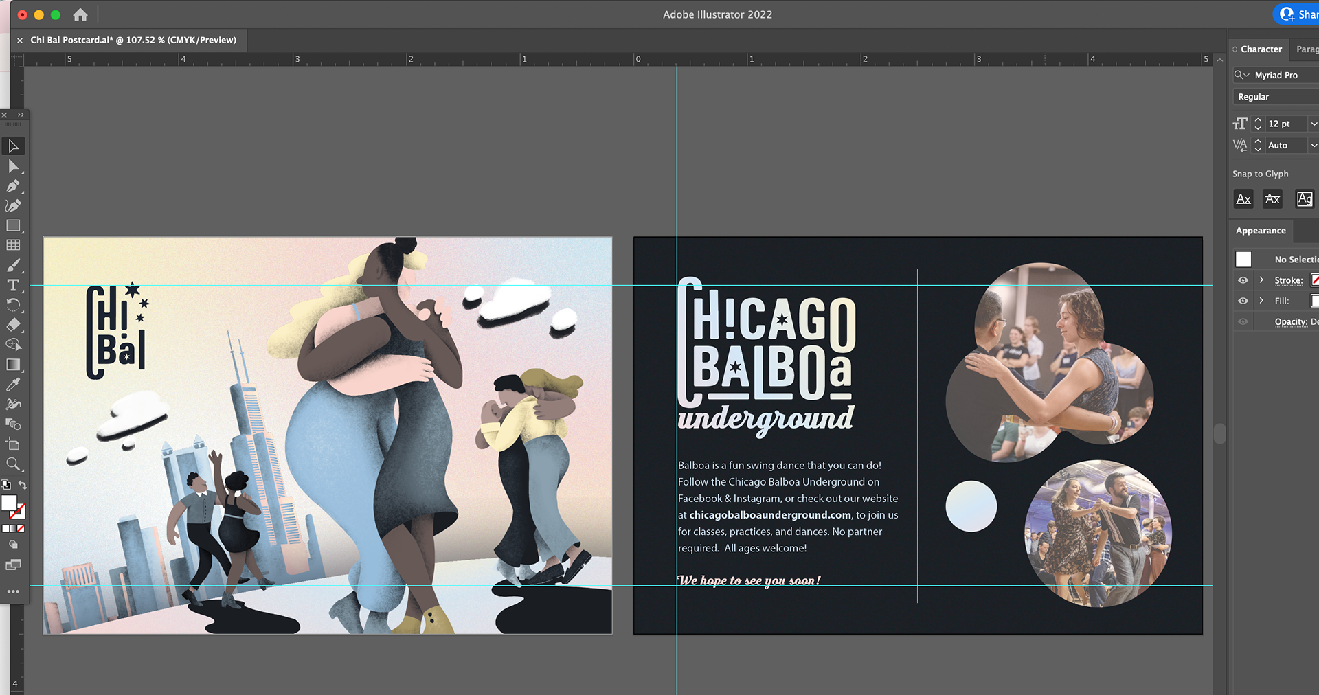
The client ultimately chose the modern direction. Inspired by the vertical rhythm of the Chicago skyline, the final logo subtly echoes the city’s architecture. I manipulated the letterforms so that their tops and bottoms rise and fall like buildings and added some visual elements from the flag of Chicago. This added a sense of motion and scale, connecting the identity to both the energy of dance and the groundedness of place.
The end result is a clean, bold logo that’s legible and scalable, yet full of character and motion.
Color Palette
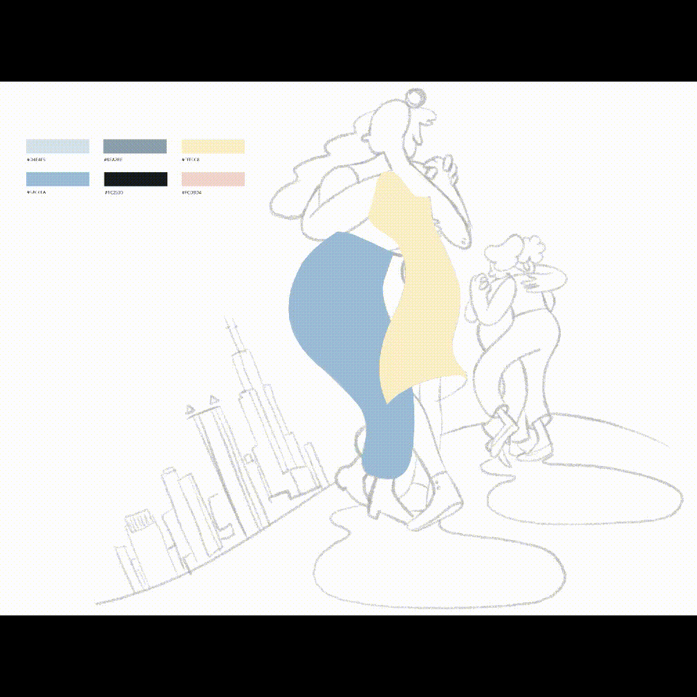
The color palette was developed with emotional resonance in mind. I drew inspiration from the moody weather of Chicago — soft greys, misty blues, and subtle purples — but infused the palette with warmth and glow to avoid feeling cold or distant. There's a gentle, welcoming quality to these tones, evoking community and care.
To ensure the brand could be used consistently and confidently moving forward, I delivered a short brand guide outlining logo usage, color codes, typography guidelines, and visual direction. This document serves as a reference for any future designers or volunteers creating Chi Bal materials, helping them stay aligned with the brand’s identity.
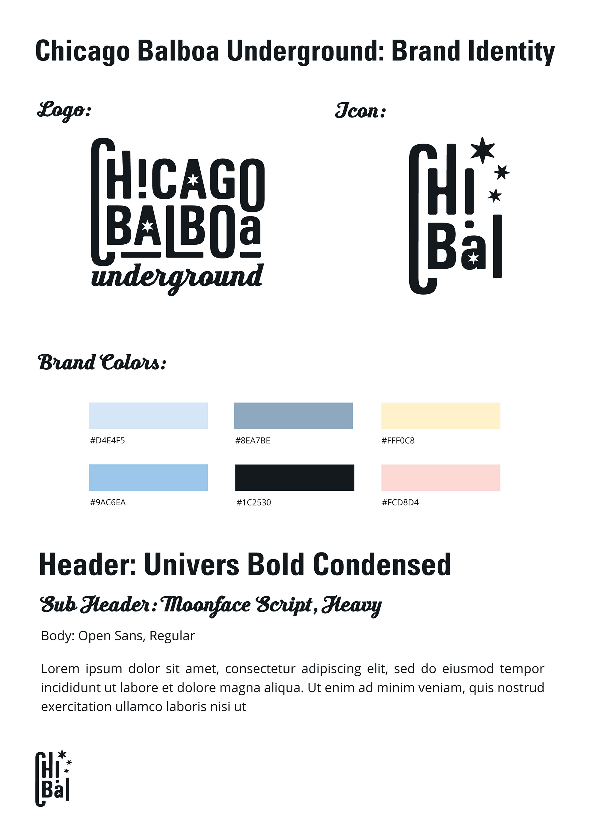
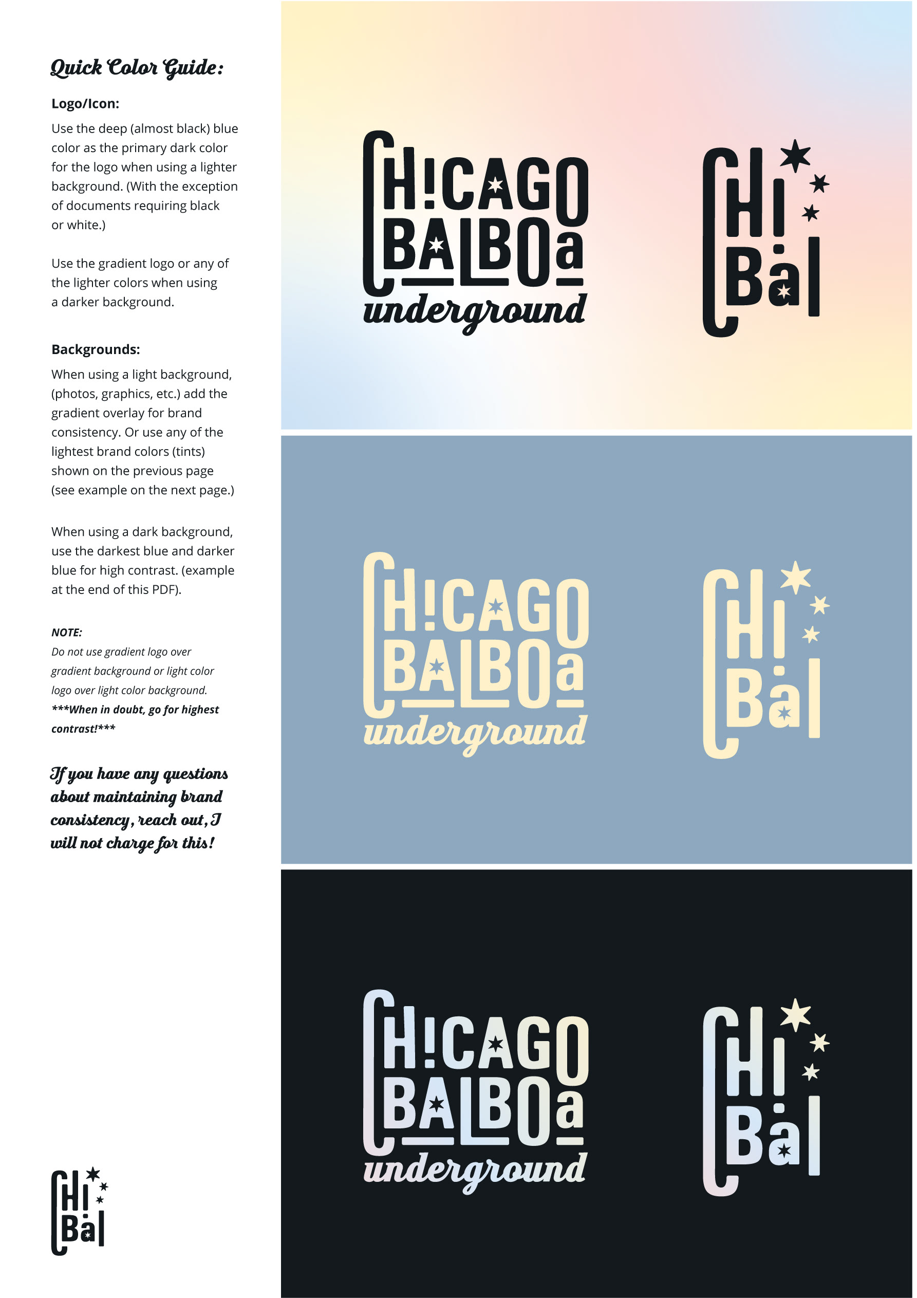
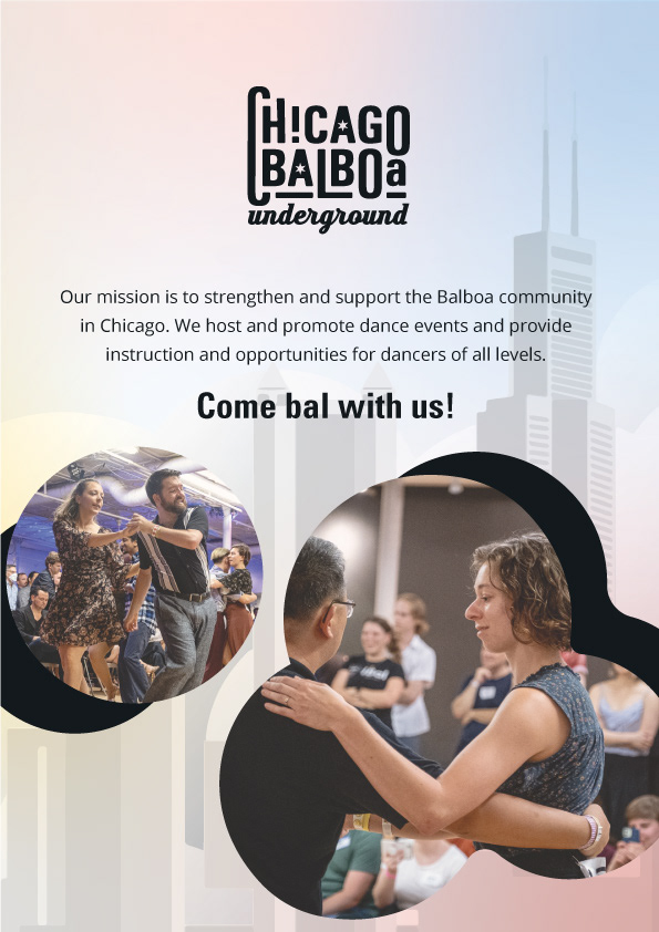
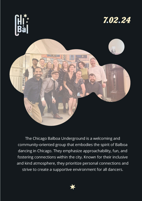
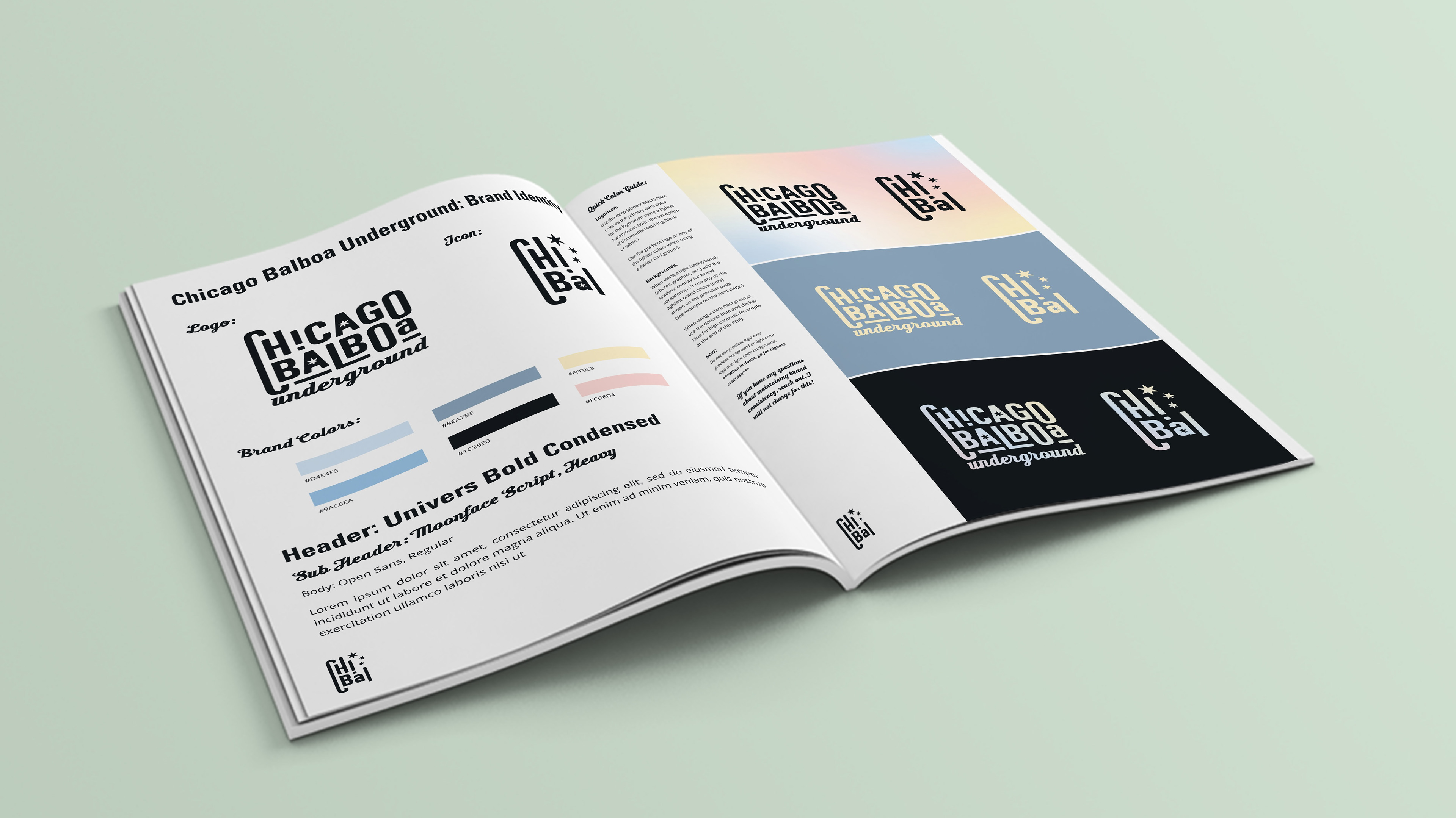
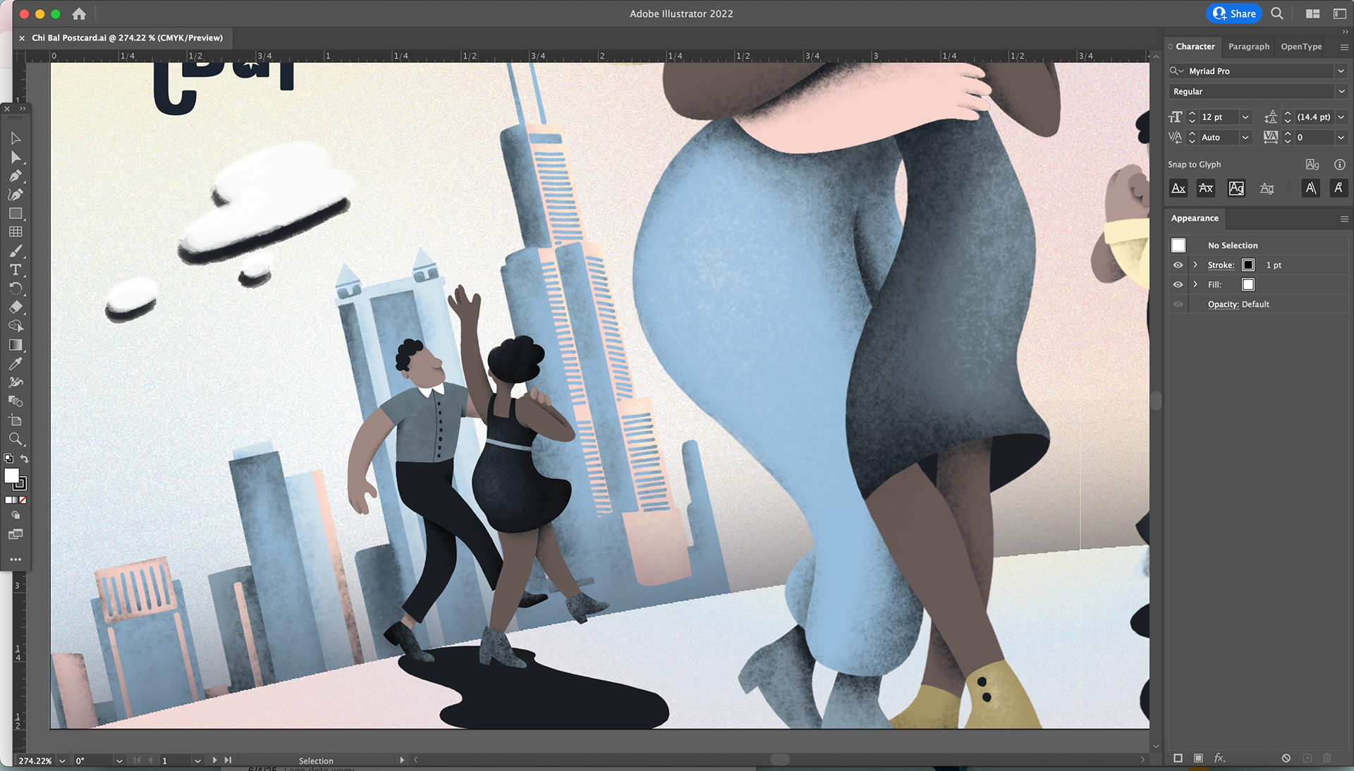
Illustration and Postcard Design
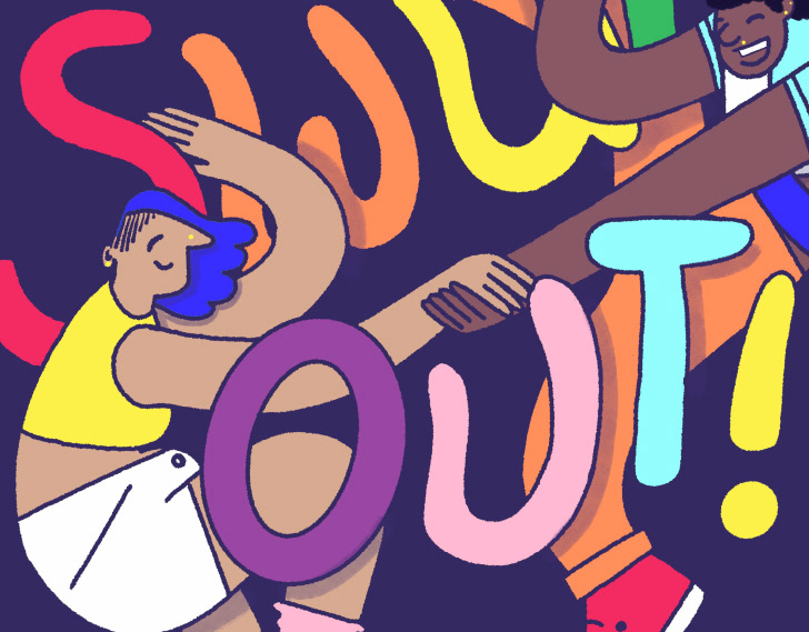
Chi Bal isn’t just about dance steps — it’s about people connecting. I created a custom illustration that visually celebrates this. The dancers represented in the artwork span a range of gender expressions, ethnicities, and body types. Partnering is intentionally non-gendered, reflecting the organization’s practice of letting people choose their dance roles freely and safely.
The composition is stylized and dramatic, with a playful, tilted perspective and a simplified version of the Chicago skyline in the background. The illustration uses my signature warm, textured style, adding vibrancy and motion while anchoring the design in emotion.
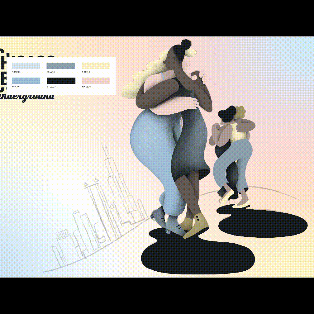
To promote Chi Bal’s events and community, I designed a printed postcard featuring the custom illustration on the front — a vibrant, joyful snapshot of the organization's essence. On the back, I used a traditional postcard layout, allowing space for contact details, event info, messaging and photography.
Working with Chi Bal was a deeply rewarding experience. It challenged me to merge structure with soul, and to use design as a tool for inclusion and community-building. The final identity feels unmistakably Chicago, but also distinctly Chi Bal — warm, inviting, expressive, and full of rhythm.