Photography by Hannah Lane and KK Hooray
Branding
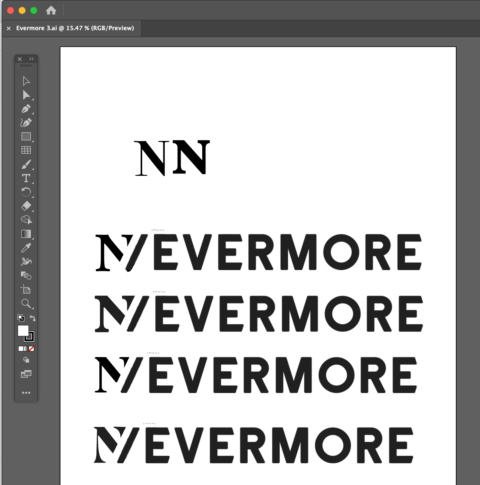
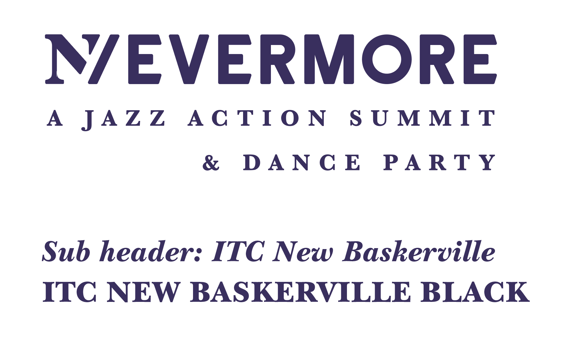
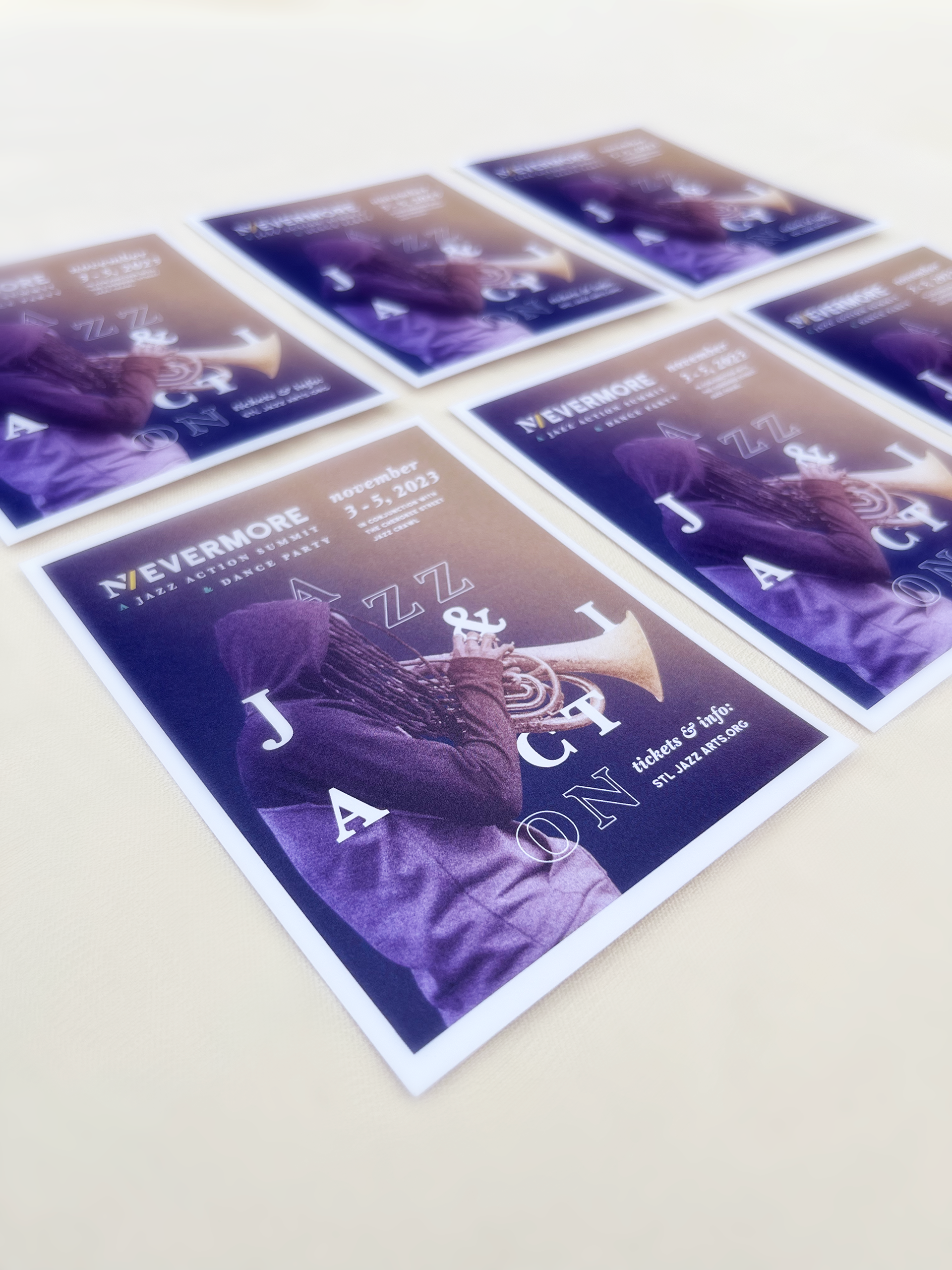
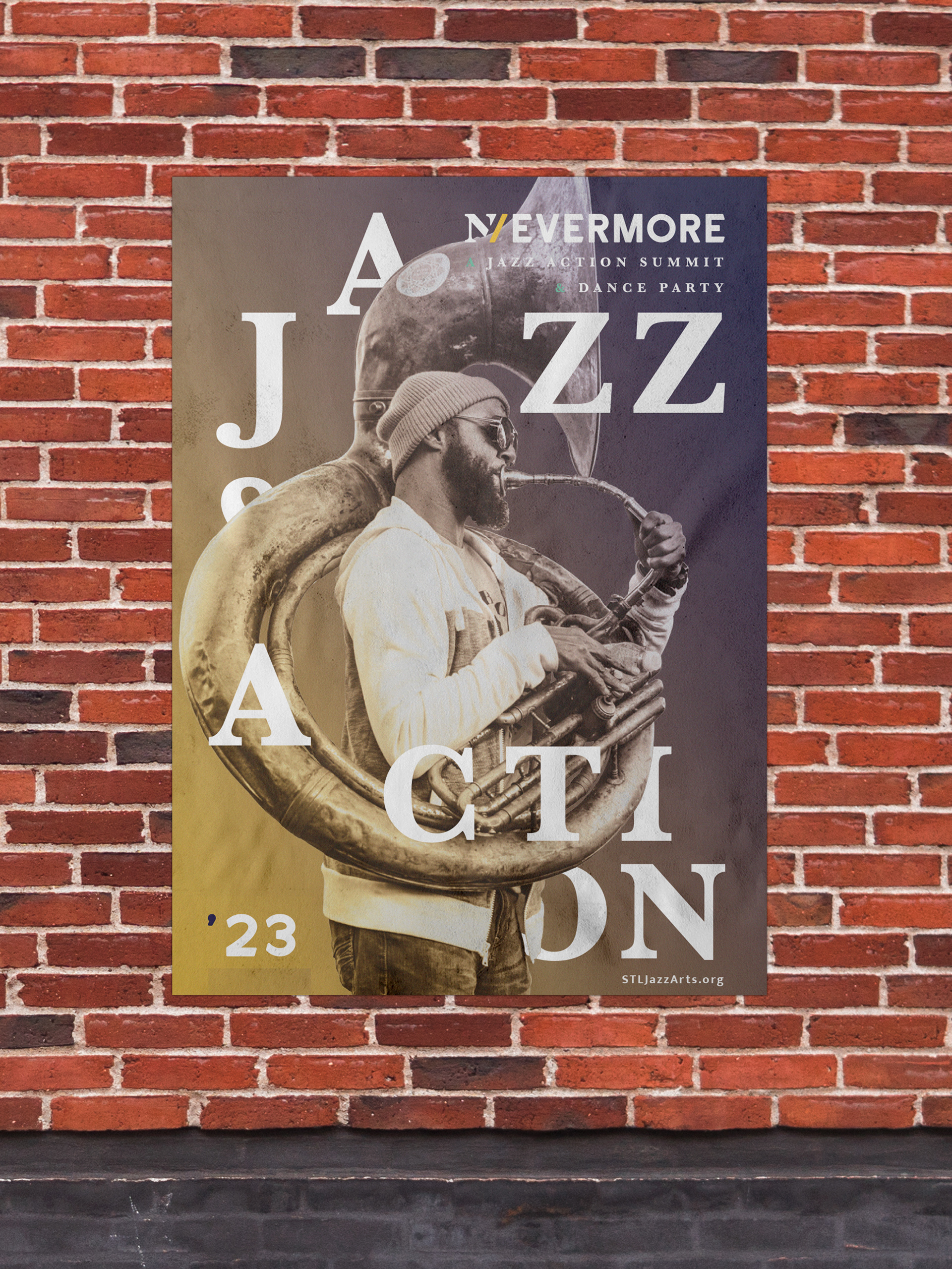
With the events core values in mind, I conducted some visual research. My goal for this branding assignment was to create an identity system that is fresh and modern but maintains a warm and inviting tone. I looked to more simple typographic designs for inspiration.
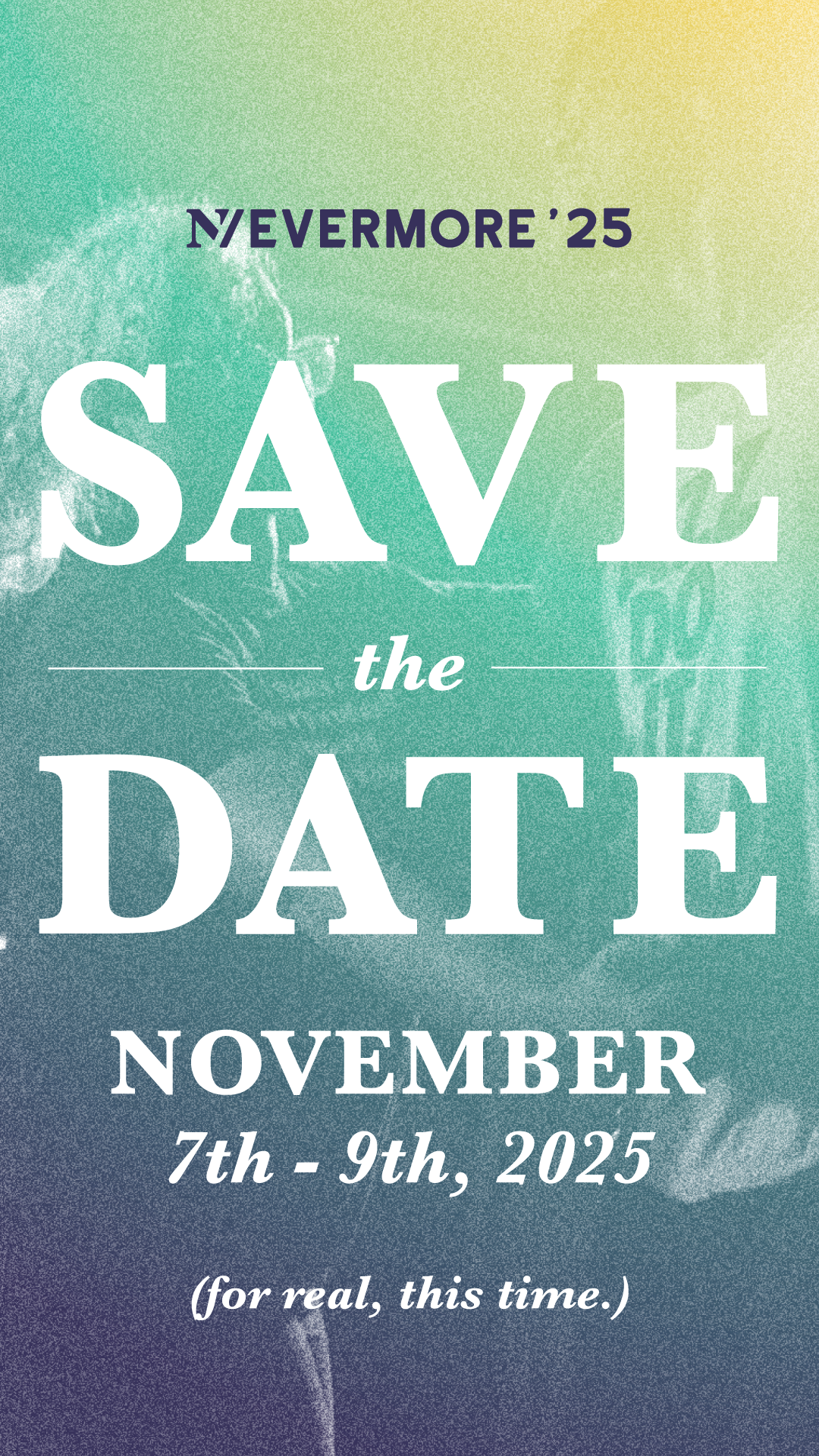
For color; after a lot of experimentation I settled on a warm gradient look with yellow, teal and deep purple colors. For fonts, I was drawn to ITC New Baskerville for it's versatility. I used this font family for smaller, italic sub-headers as an elegant contrast to the sans serif for the logo. I also used ITC New Baskerville Black for big and bold typographic designs.

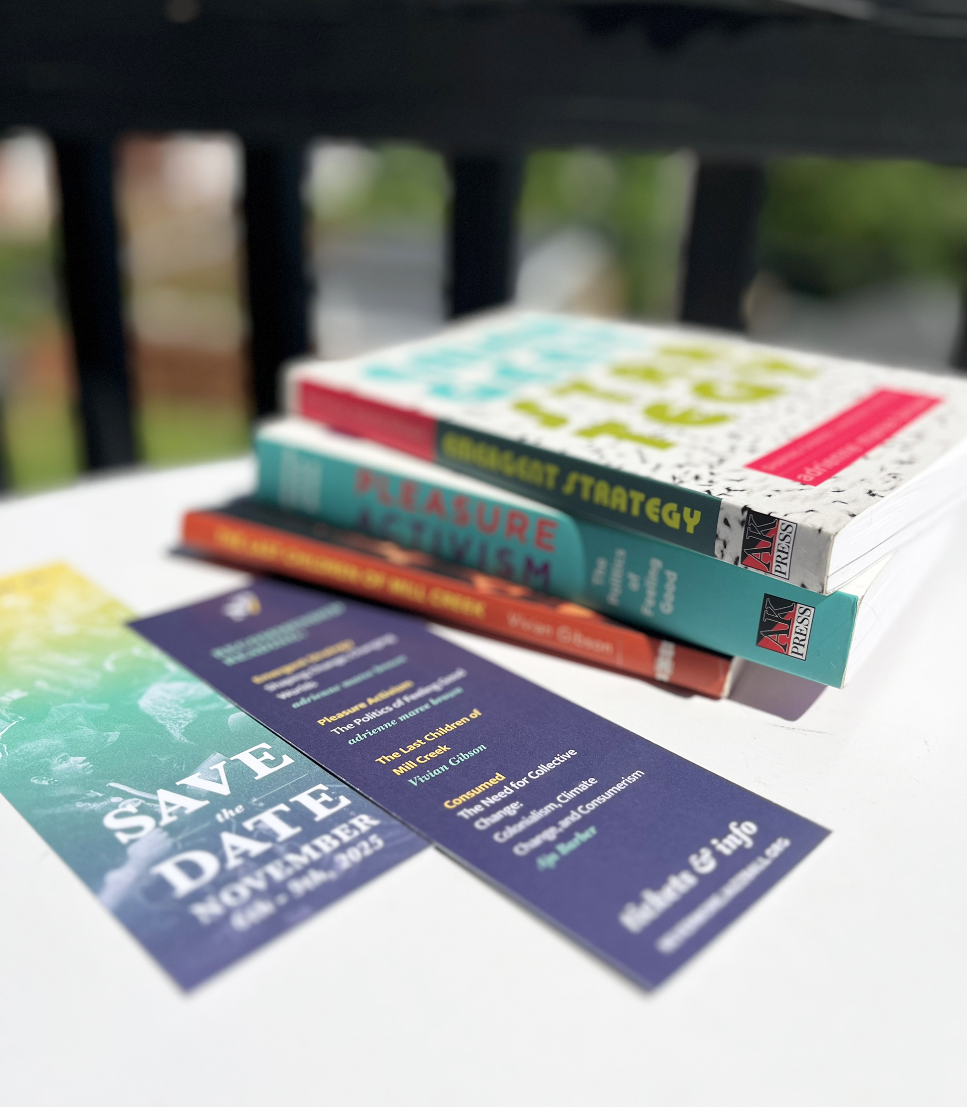
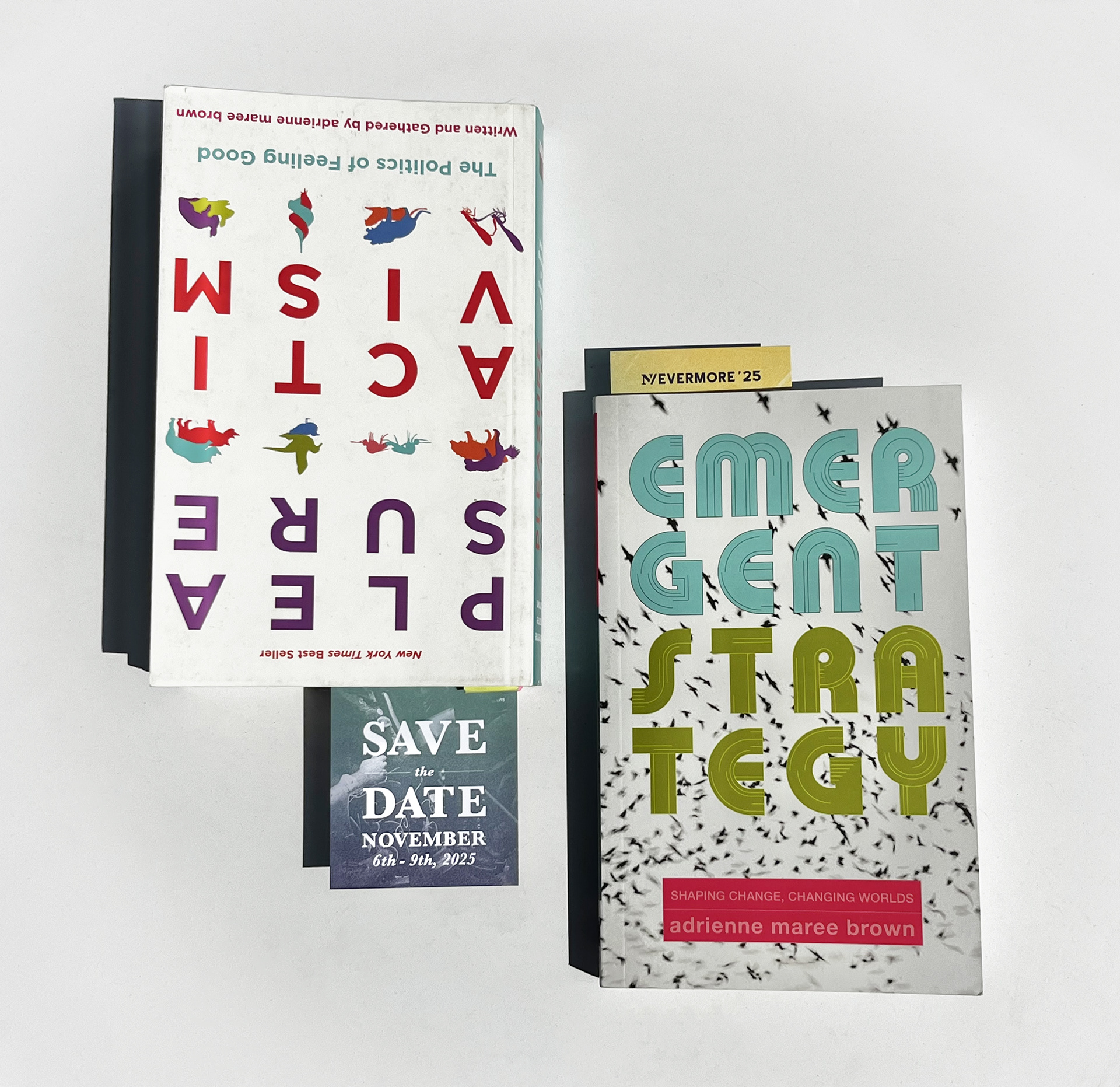
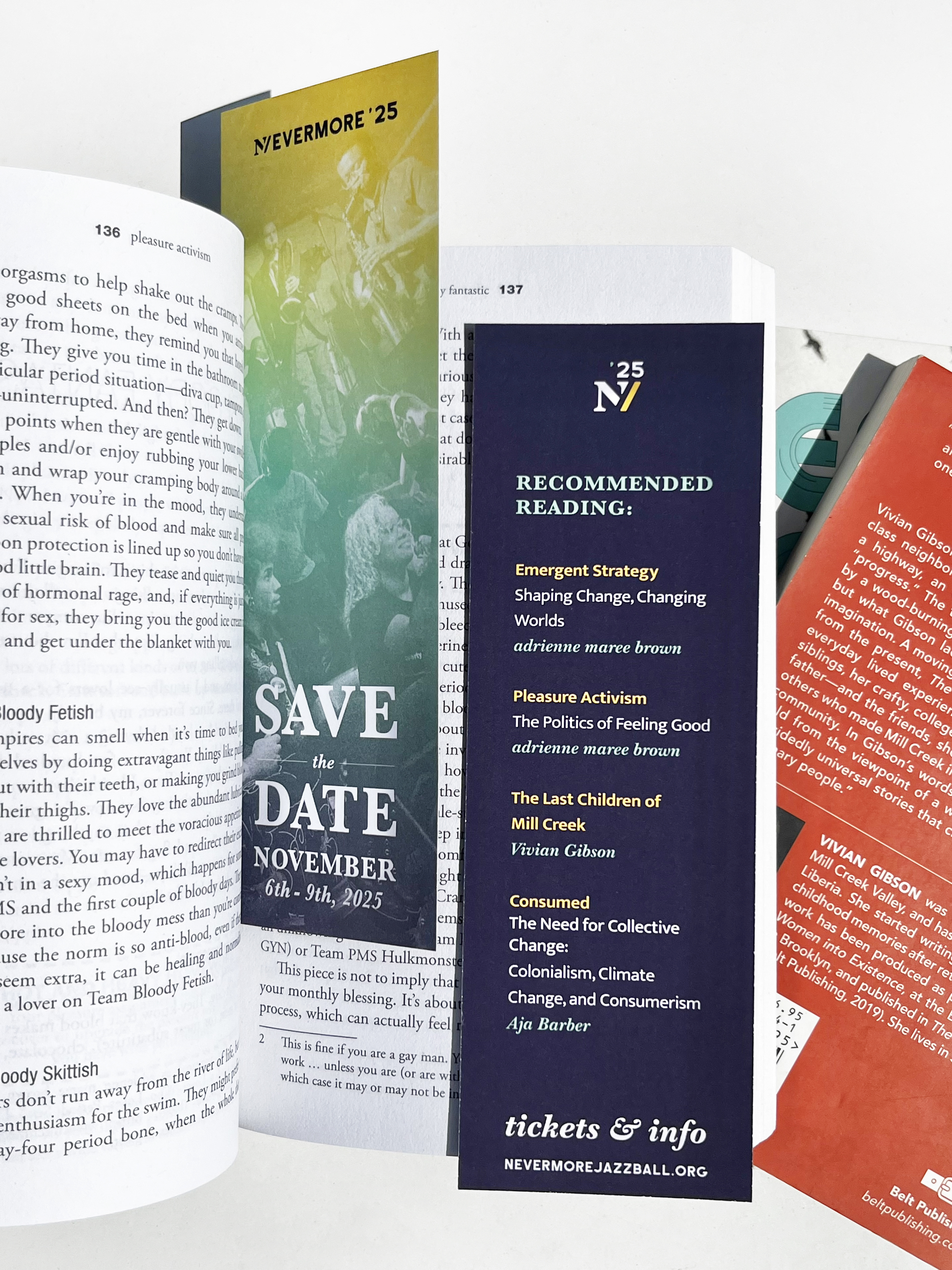
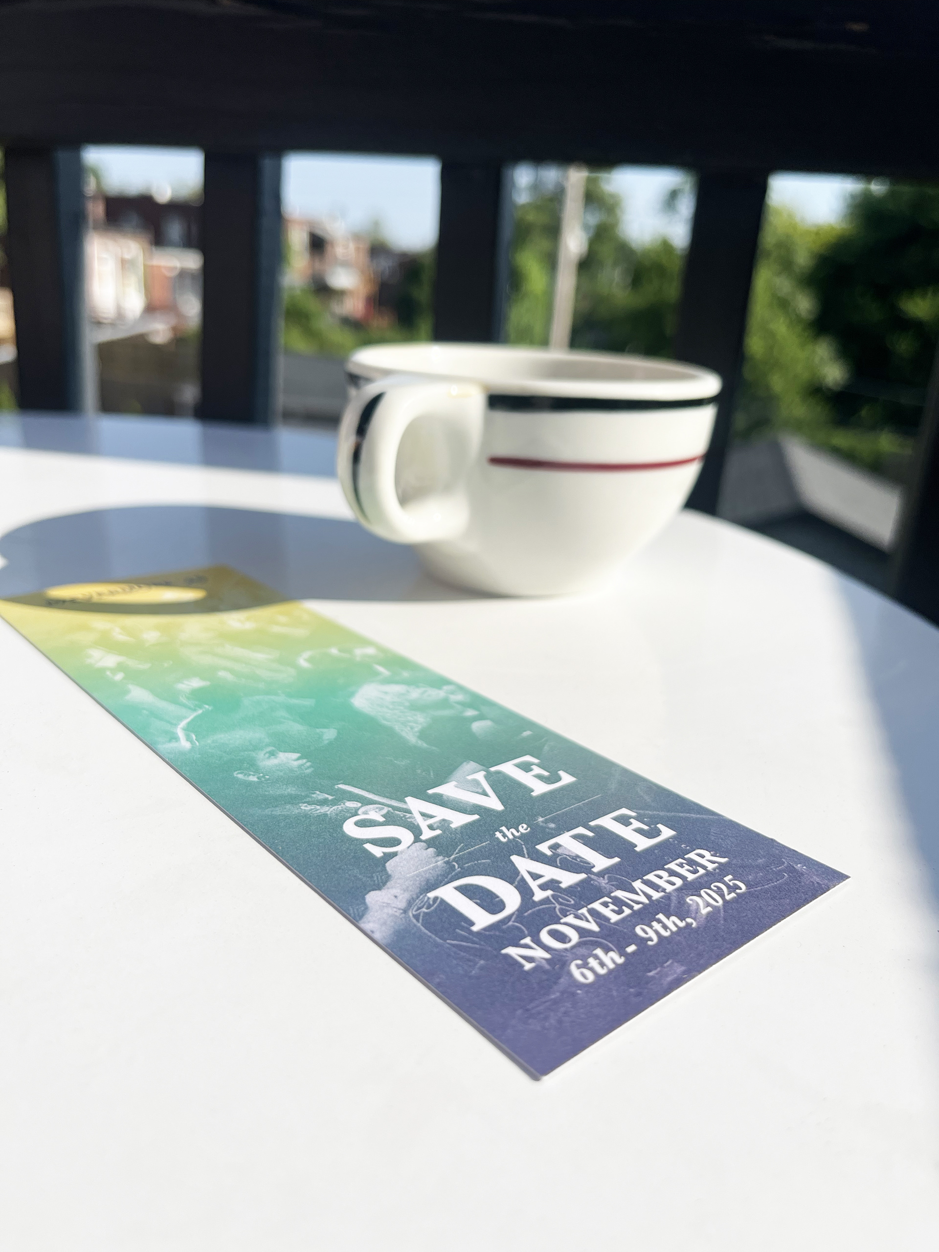
Save the Date Bookmark
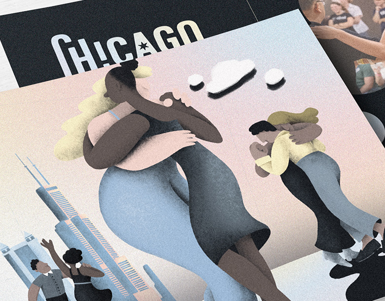
For the 2025 promotion of Nevermore, I designed an interactive "save the date" print piece in the form of a bookmark. Given the event’s focus on dialogue and learning, I saw an opportunity to go beyond a traditional announcement and create something both practical and engaging.
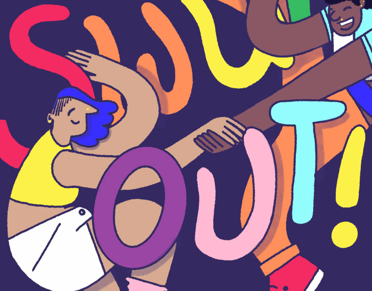
The front features a vibrant digital collage celebrating the musicians, dancers, and panelists who have shaped Nevermore over the years. On the back, the Nevermore team and I curated a recommended reading list—books selected to deepen attendees' understanding of Black music and dance culture and enhance their experience leading up to the event, blending visual storytelling with functionality and encouraging early engagement and deeper connection with the event’s themes.
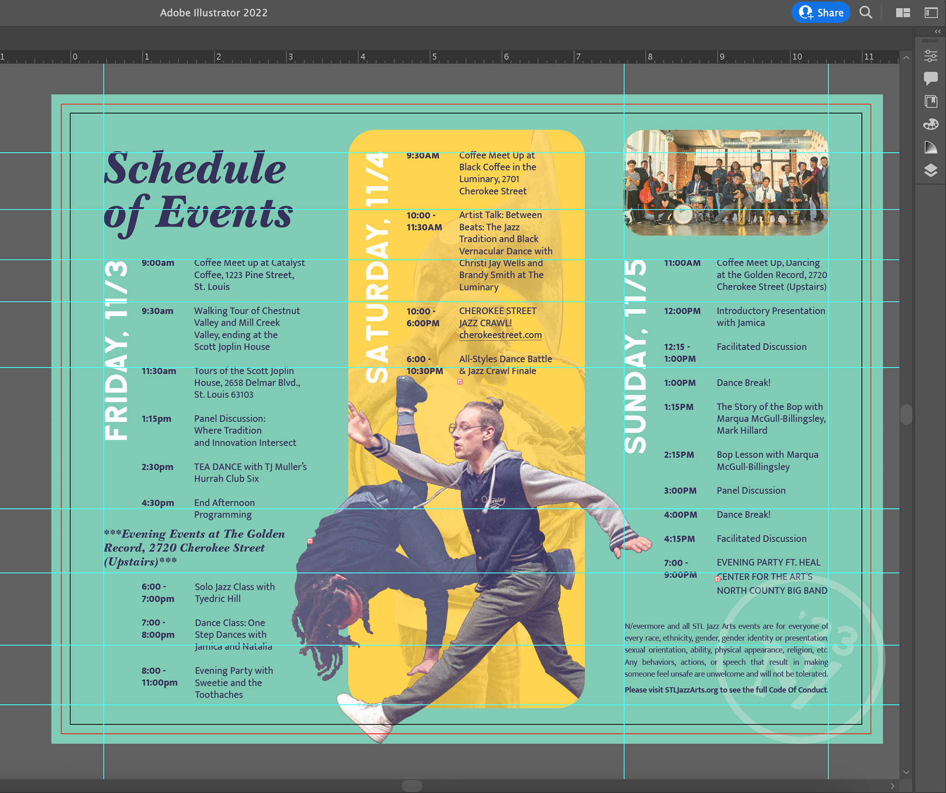
Schedule of Events
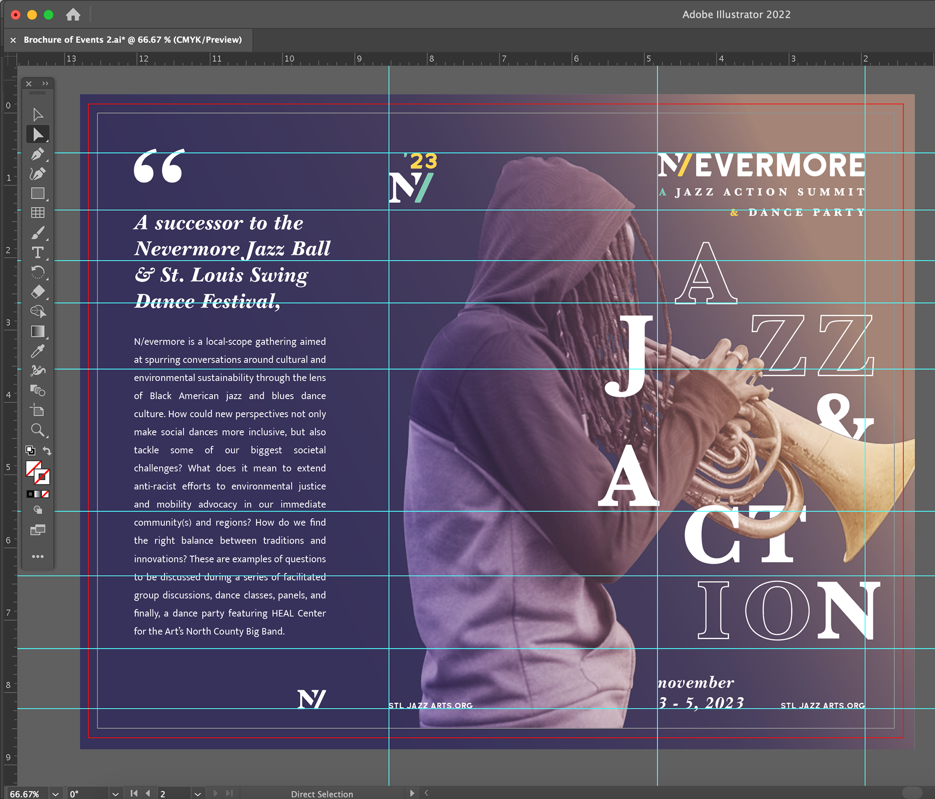
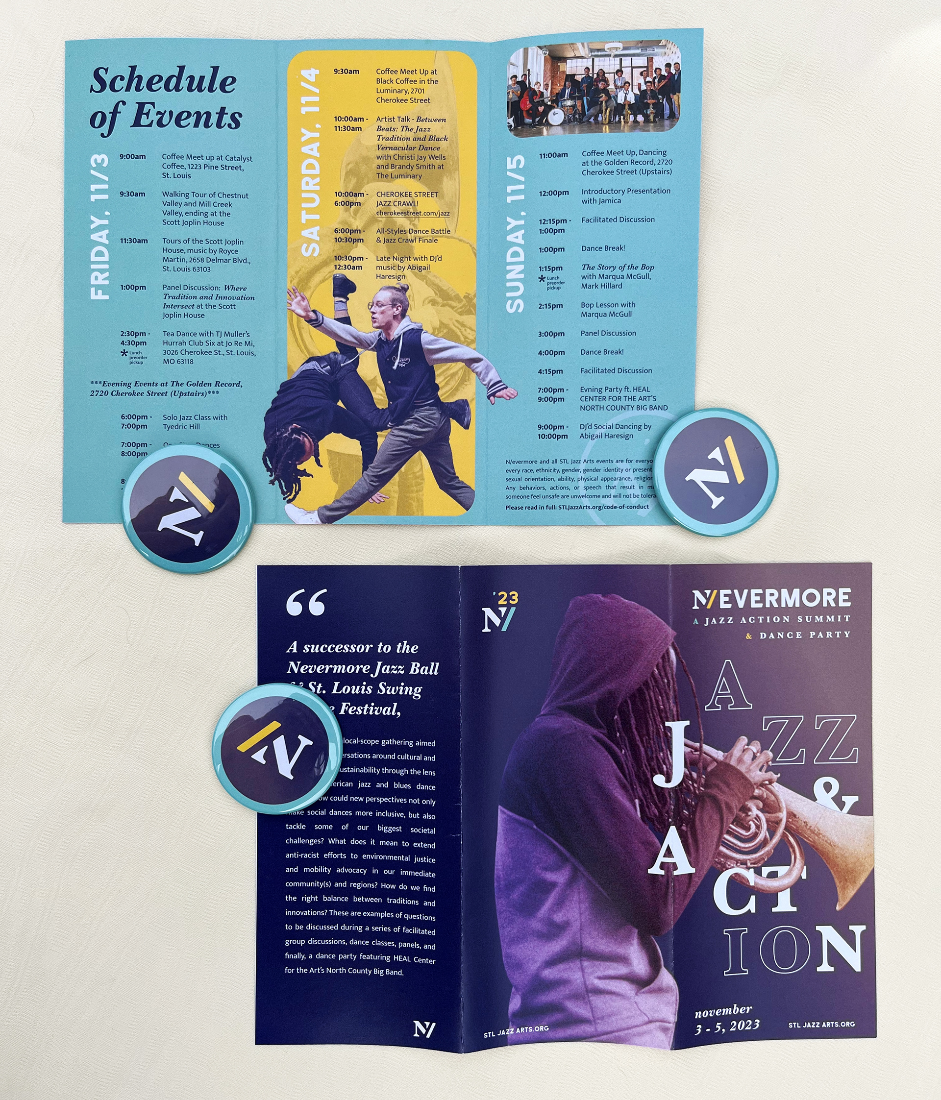
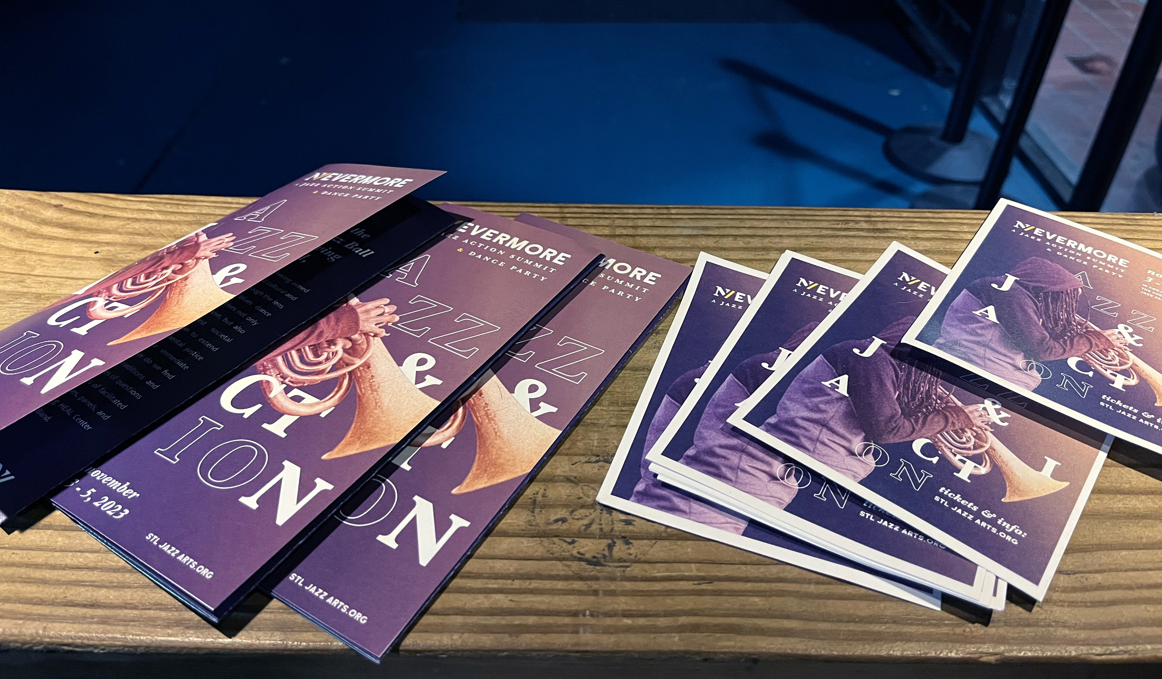
I approached the brochure design with meticulous attention to detail, crafting pieces that were both visually elegant and compelling.
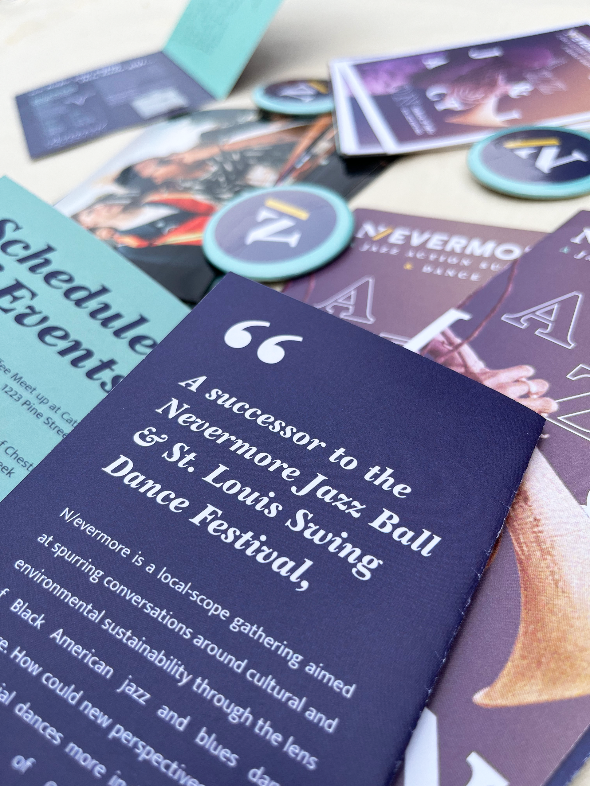
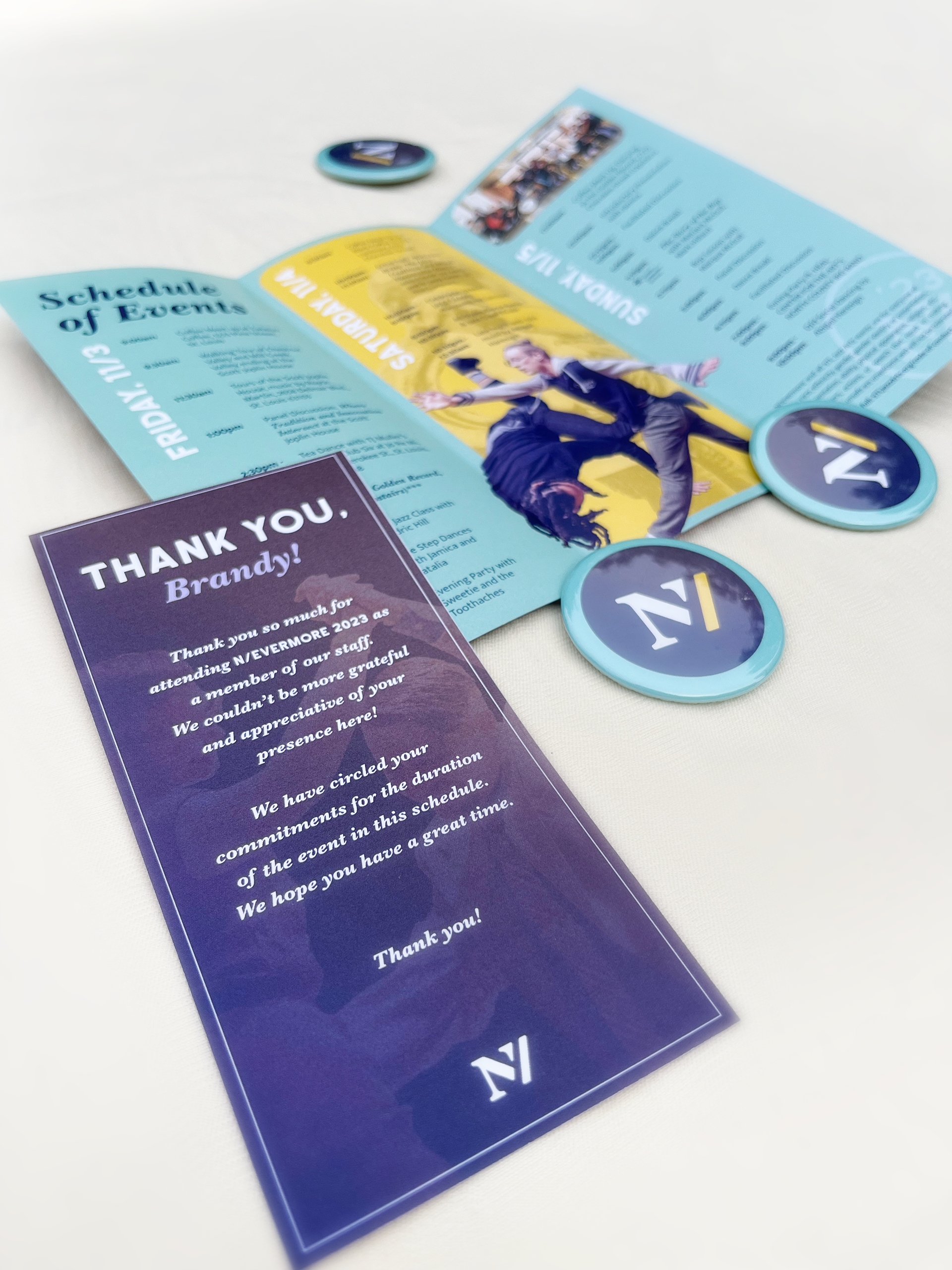
When designing informational graphics, I give heavy consideration to hierarchy and the balance of content with negative space.
N/evermore Program and Zine
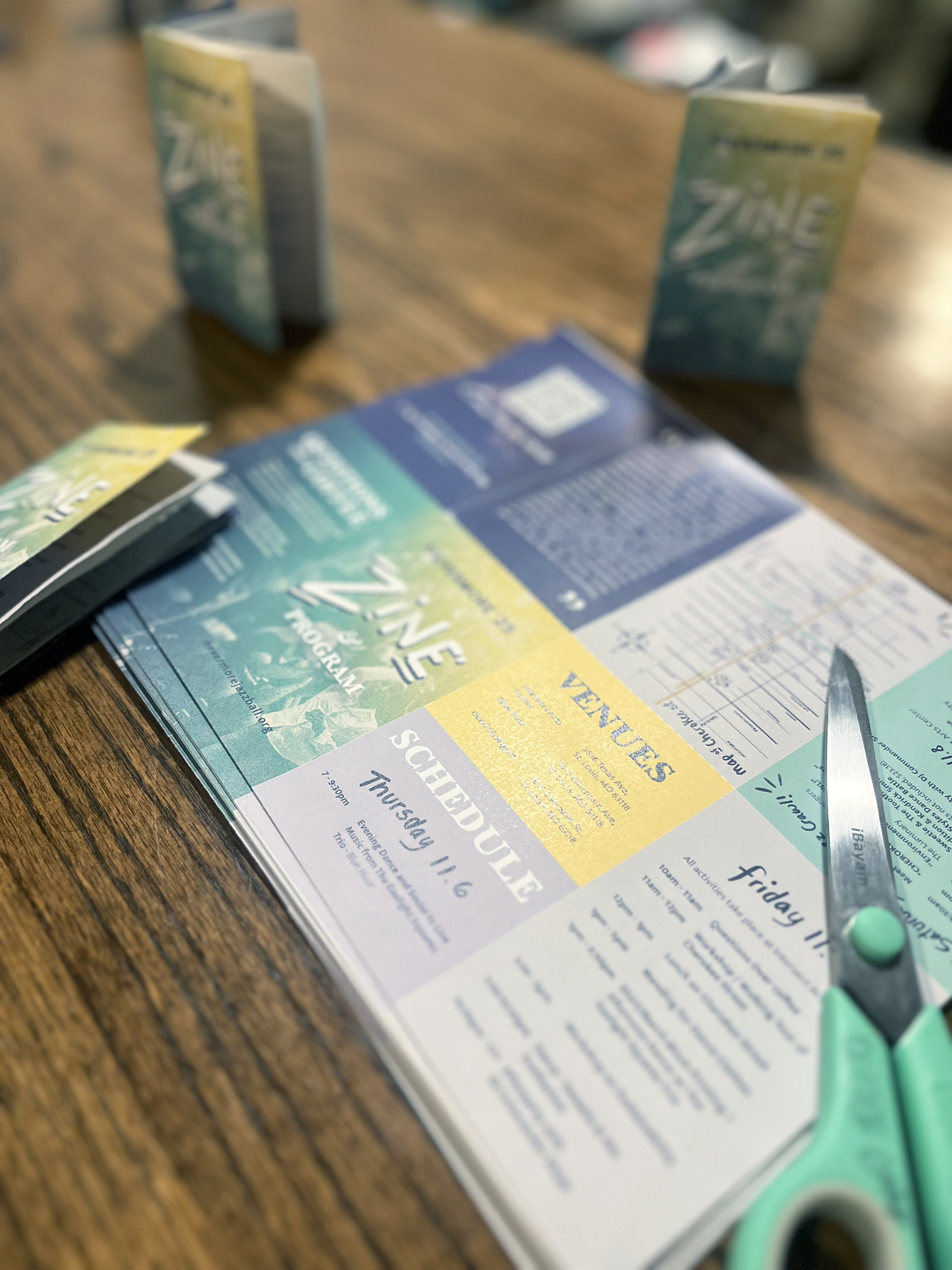
For the 2025 edition of N/evermore, Cindi Lyons (an organizer of N/evermore) suggested we create a zine with various important pieces of pertinent information, including the event schedule and programming. This was an elegant solution to keeping our printing costs low as well as setting an example of sustainable marketing practices. The zines were printed at the library for $12 and we provided a PDF version so the attendees can print and fold themselves. I added cut and fold marks that helped guide our attendees in assembling the zine together. I also created a detailed map of Cherokee street and included a quote and QR code to a written piece on the Jazz Crawl--the Saturday street music event--written by Christian Frommelt.




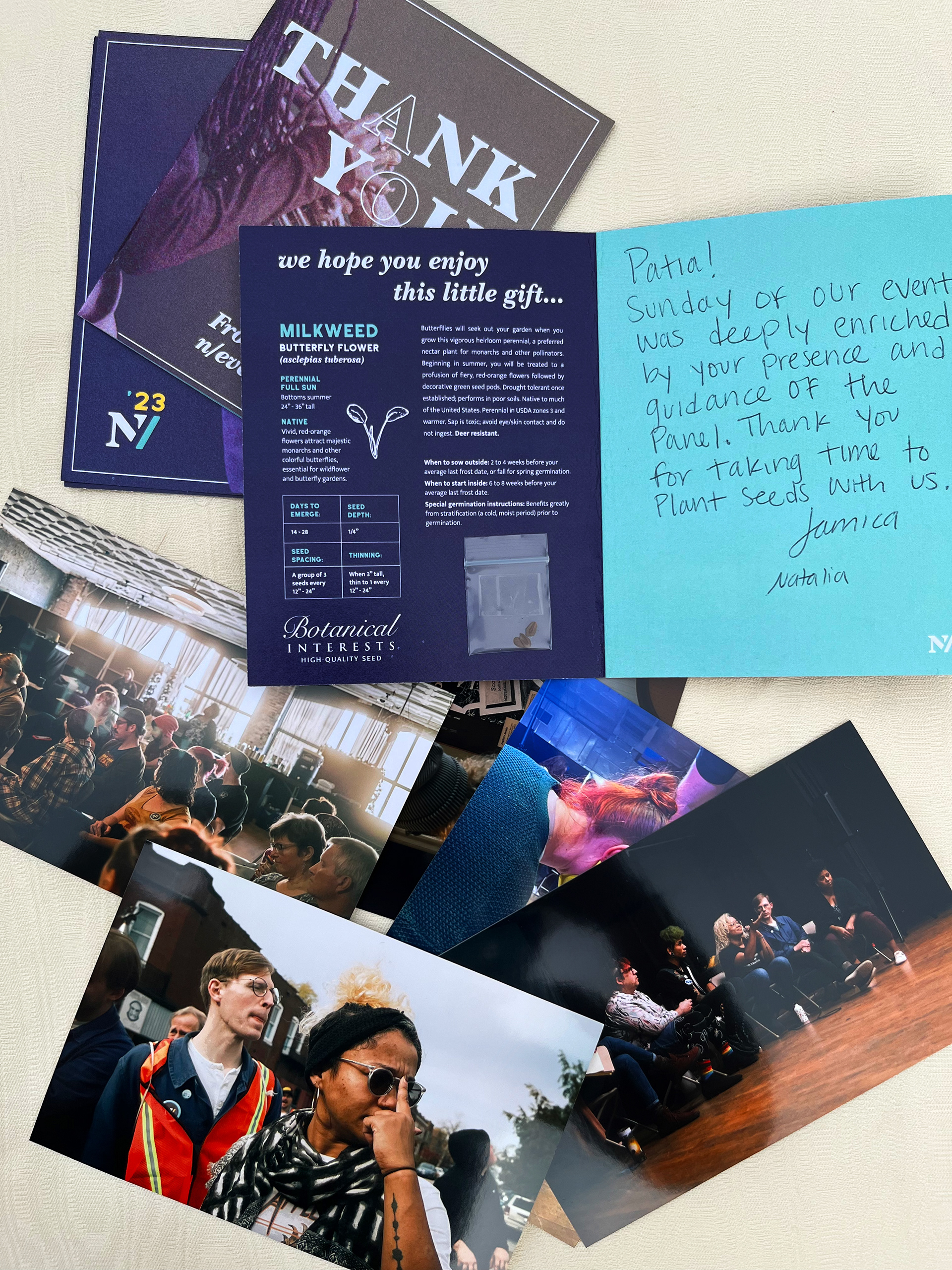
At both the beginning and end of the event, each staff member received a personalized thank you card. The post-event cards featured a handwritten message, signatures from the organizers, and included photographs of the staff in attendance. Additionally, each card was accompanied by a small bag of seeds for planting St. Louis Native Milkweed Butterfly flowers, as a token of our appreciation.
Social Media
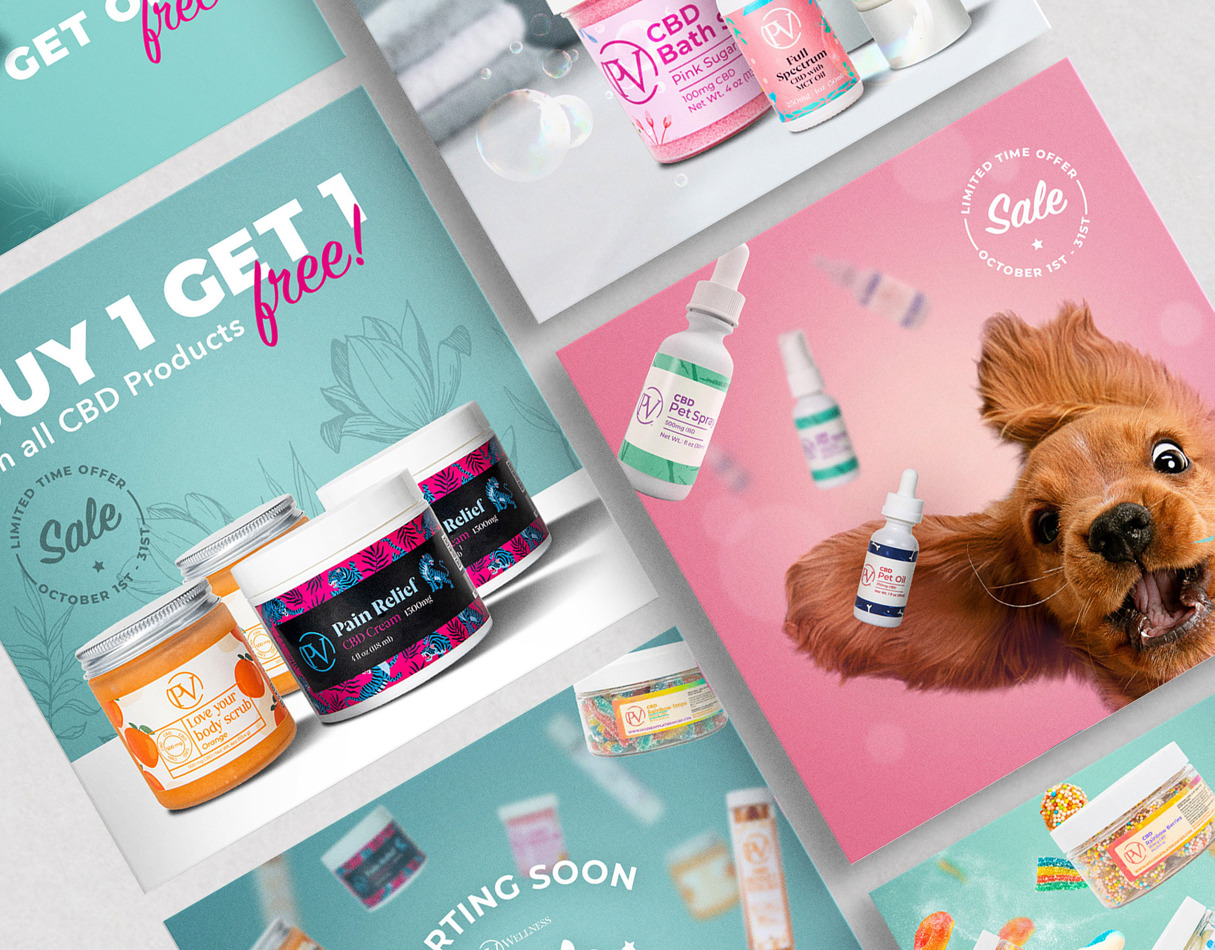
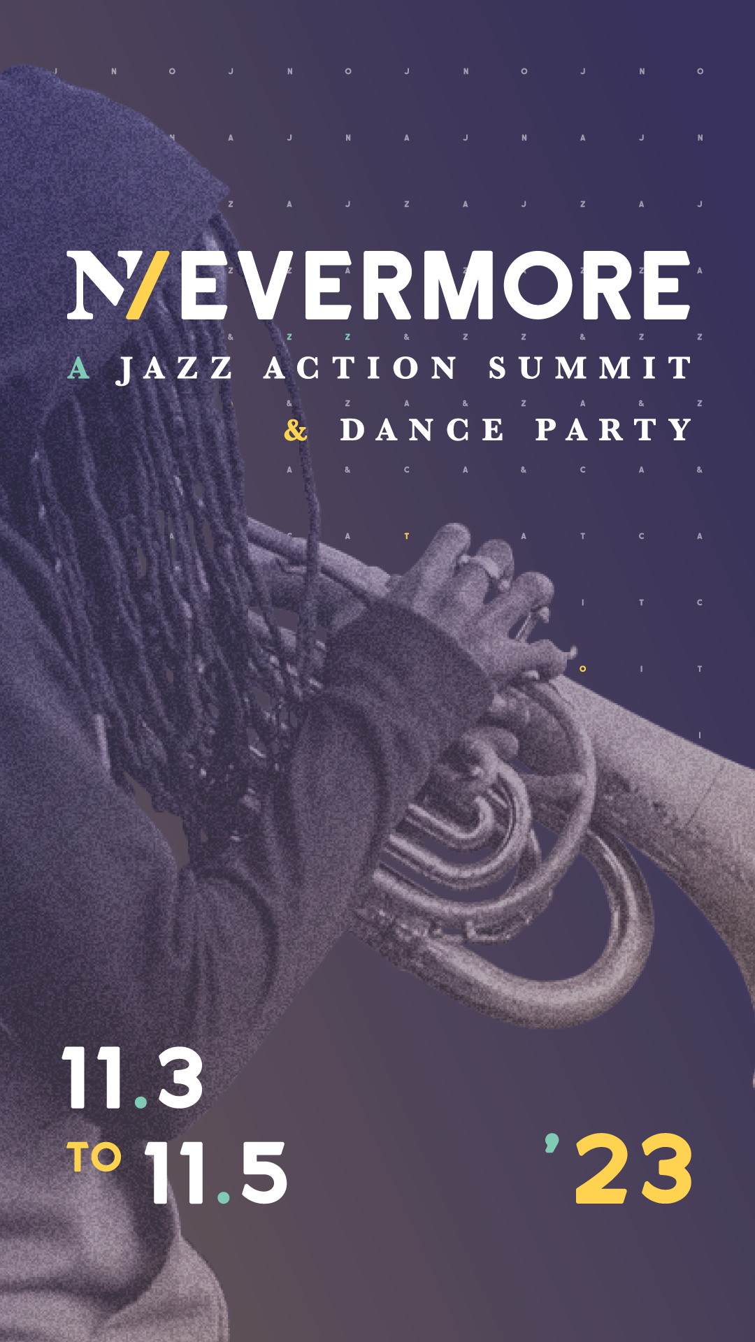
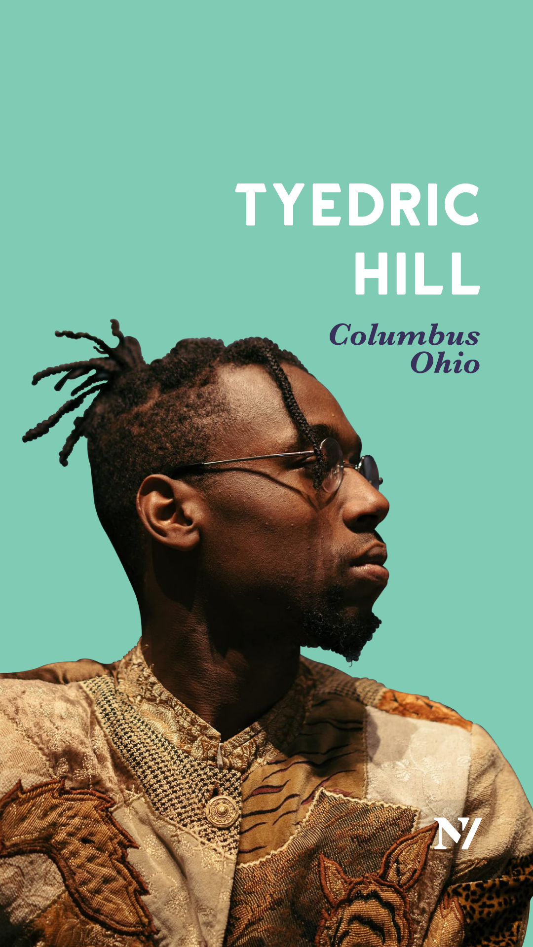
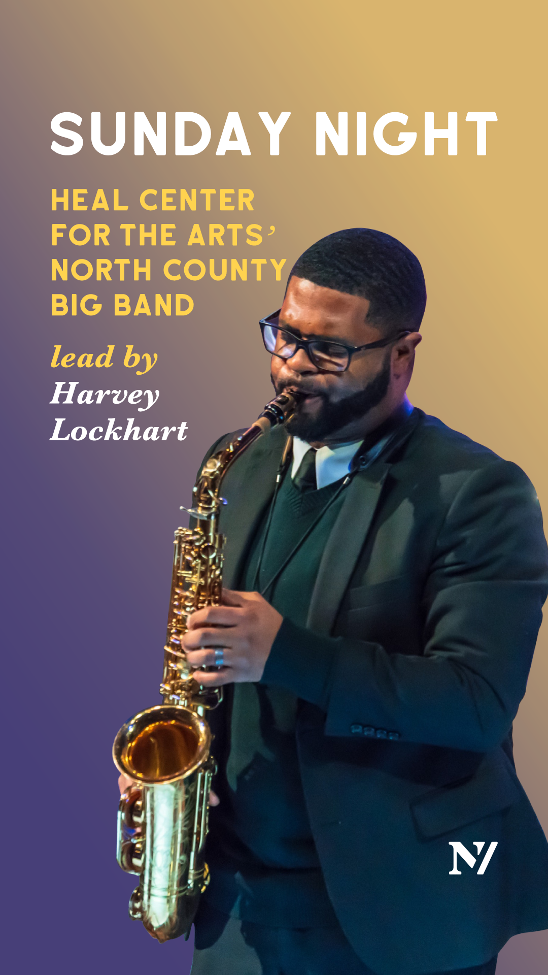
I oversaw our social media presence, crafting digital assets and scheduling posts to draw in our audience while maintaining a cohesive visual style. I also orchestrated marketing campaigns and effectively collaborated with a copywriter and a junior designer, ensuring seamless execution and creative synergy across all tasks.
This is a project I am truly passionate about, as I deeply resonate with its mission. I am honored to continue designing for the Nevermore Jazz Ball and to contribute my skills and enthusiasm to this meaningful event.
