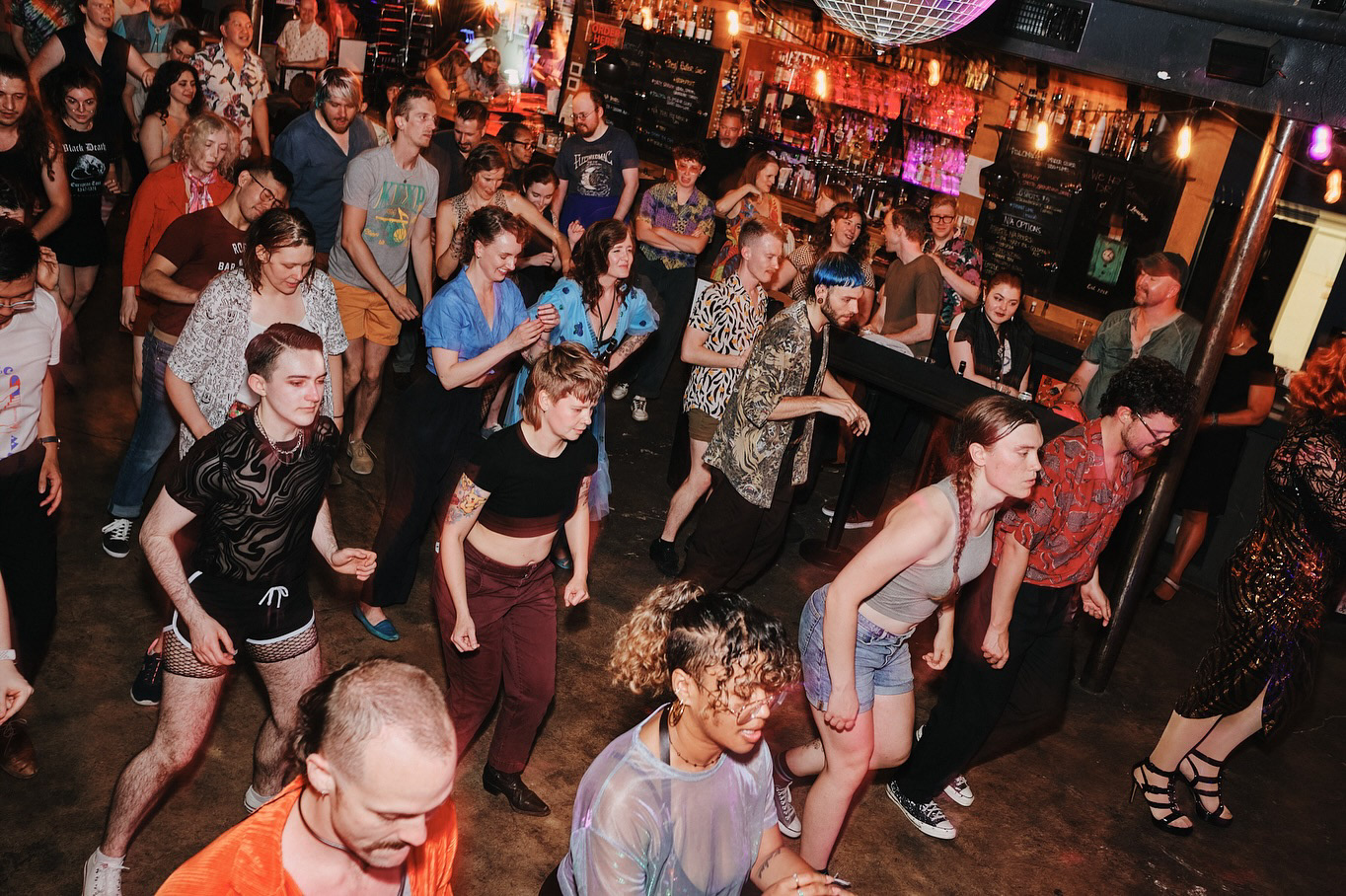
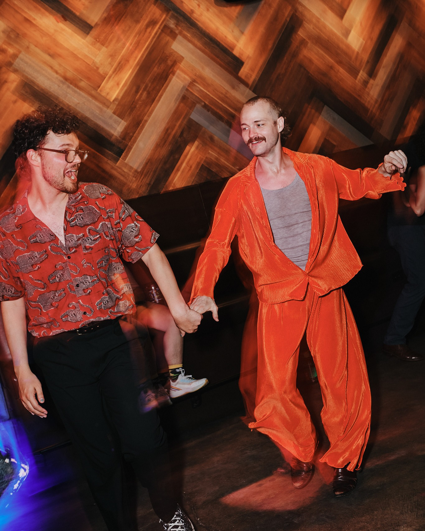
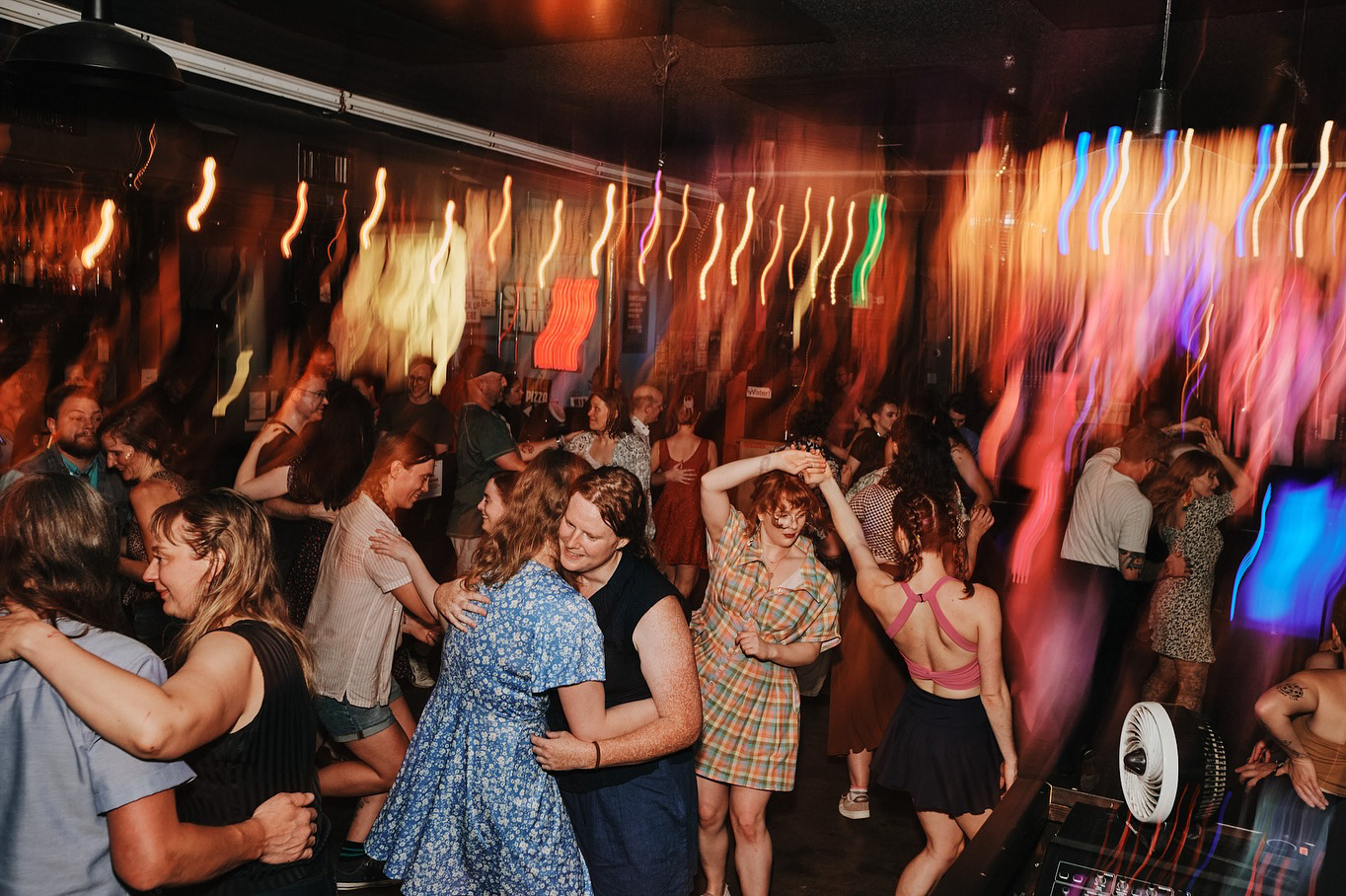
Empathizing with our Audience
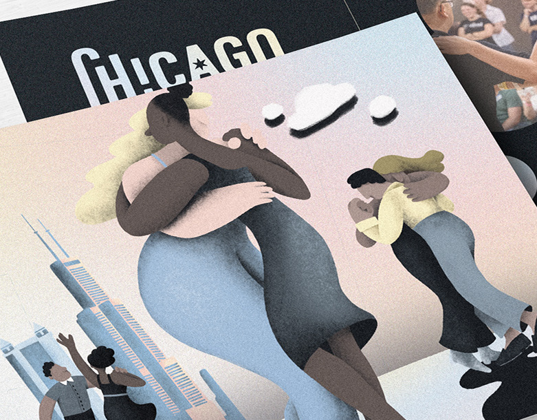
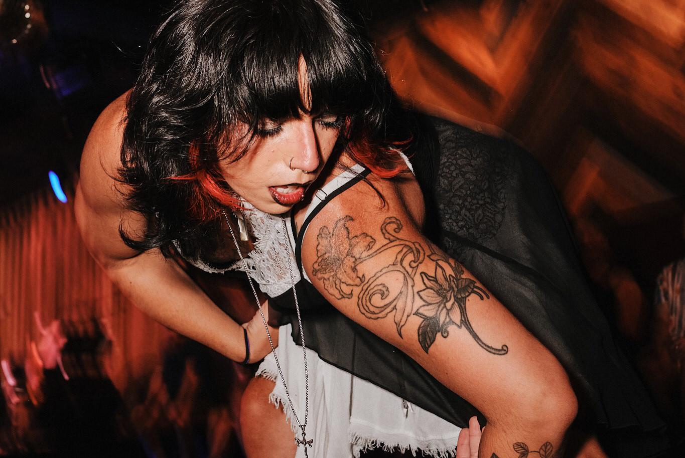
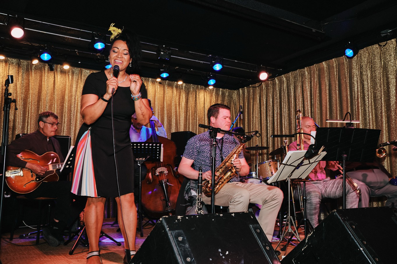
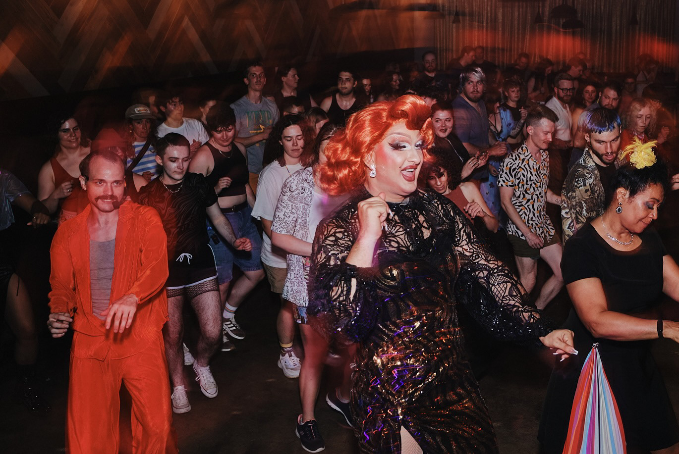
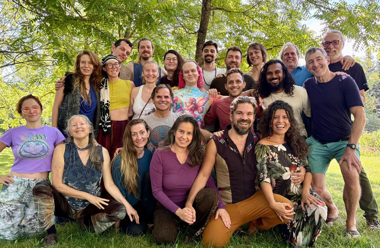
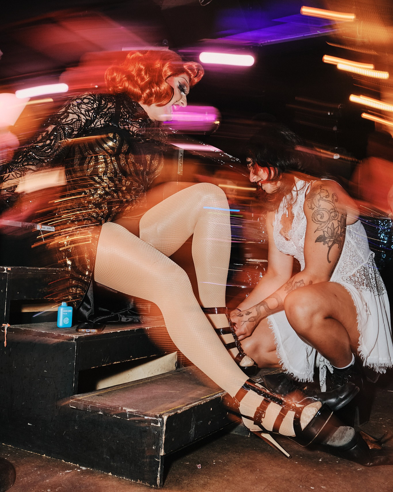
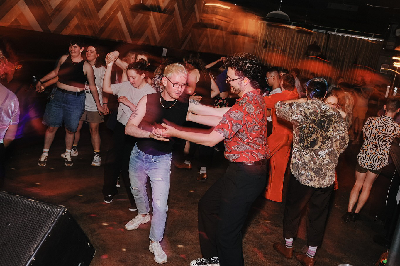
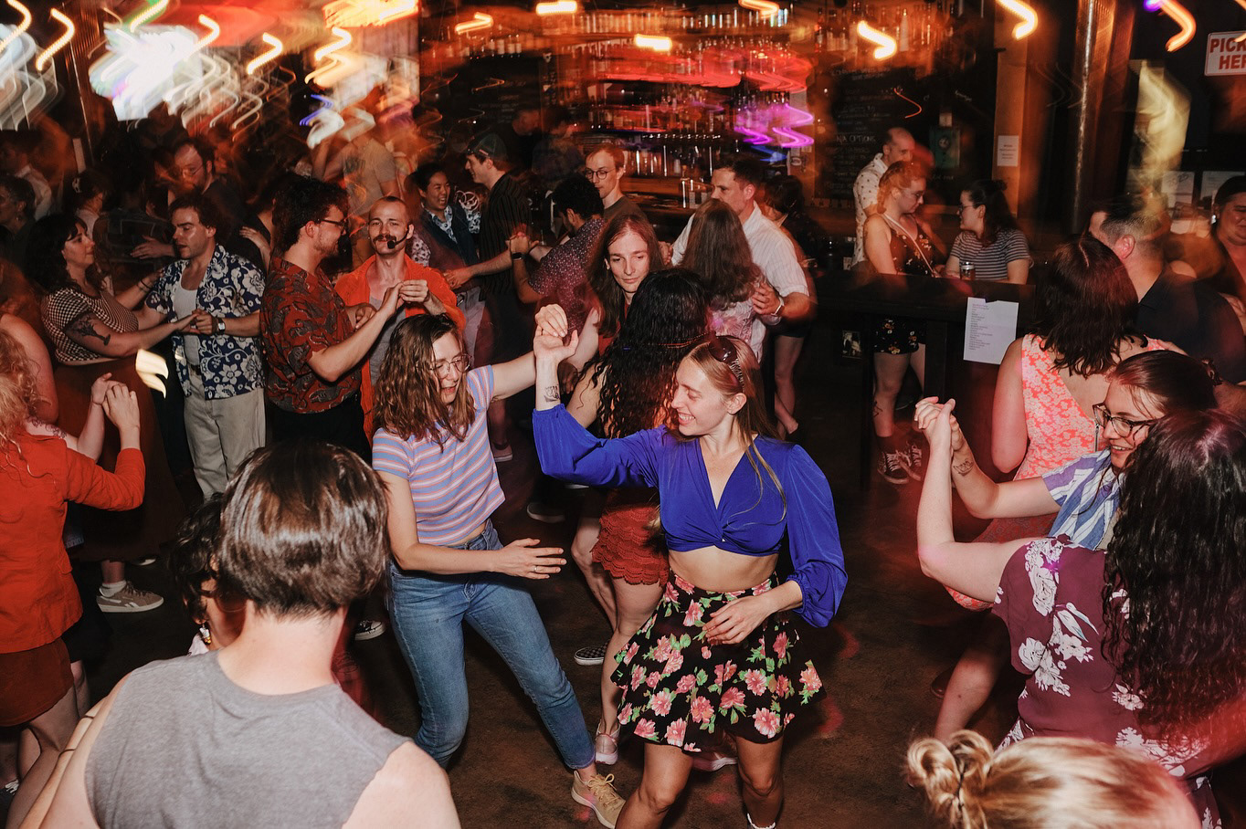
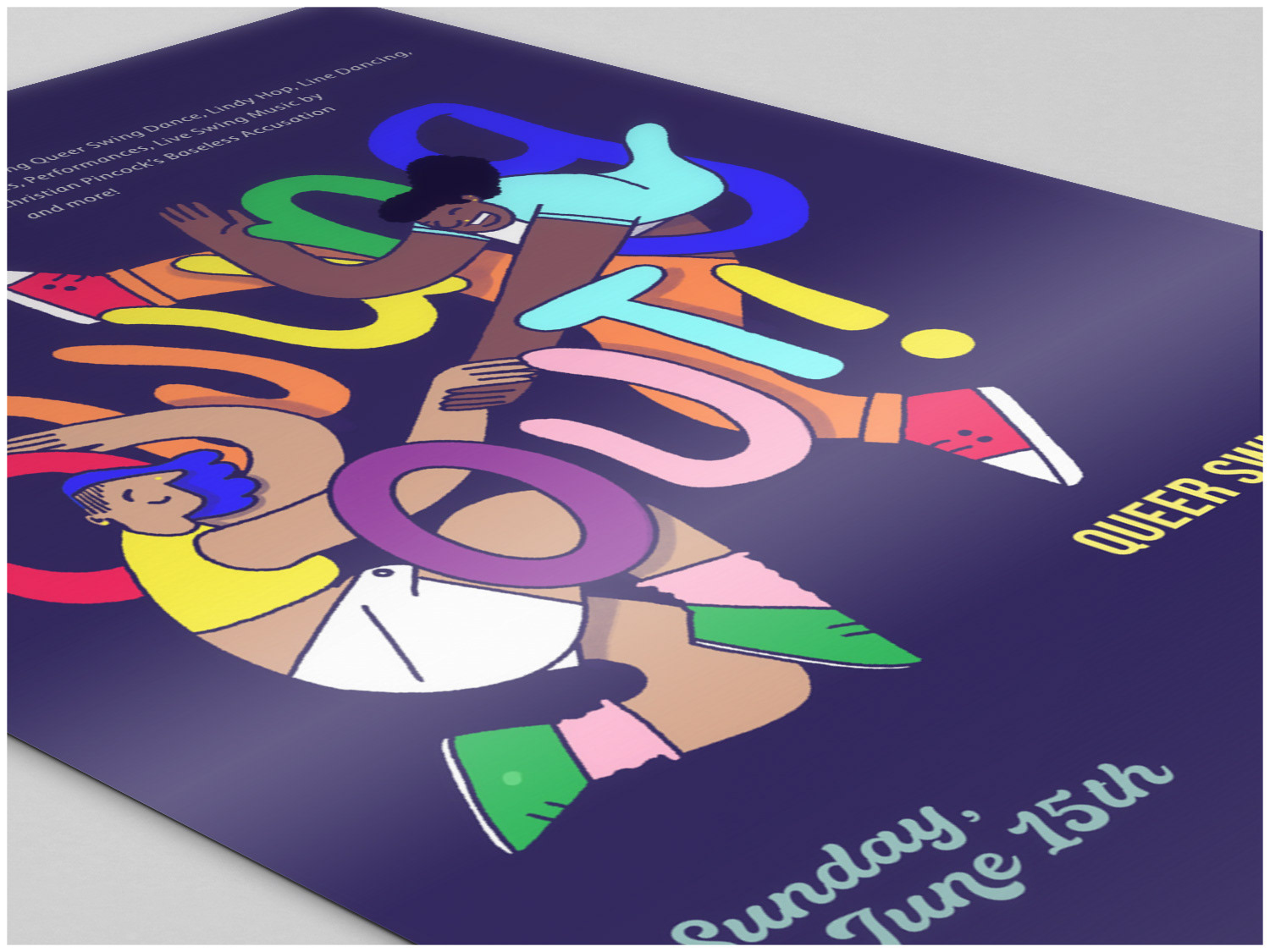
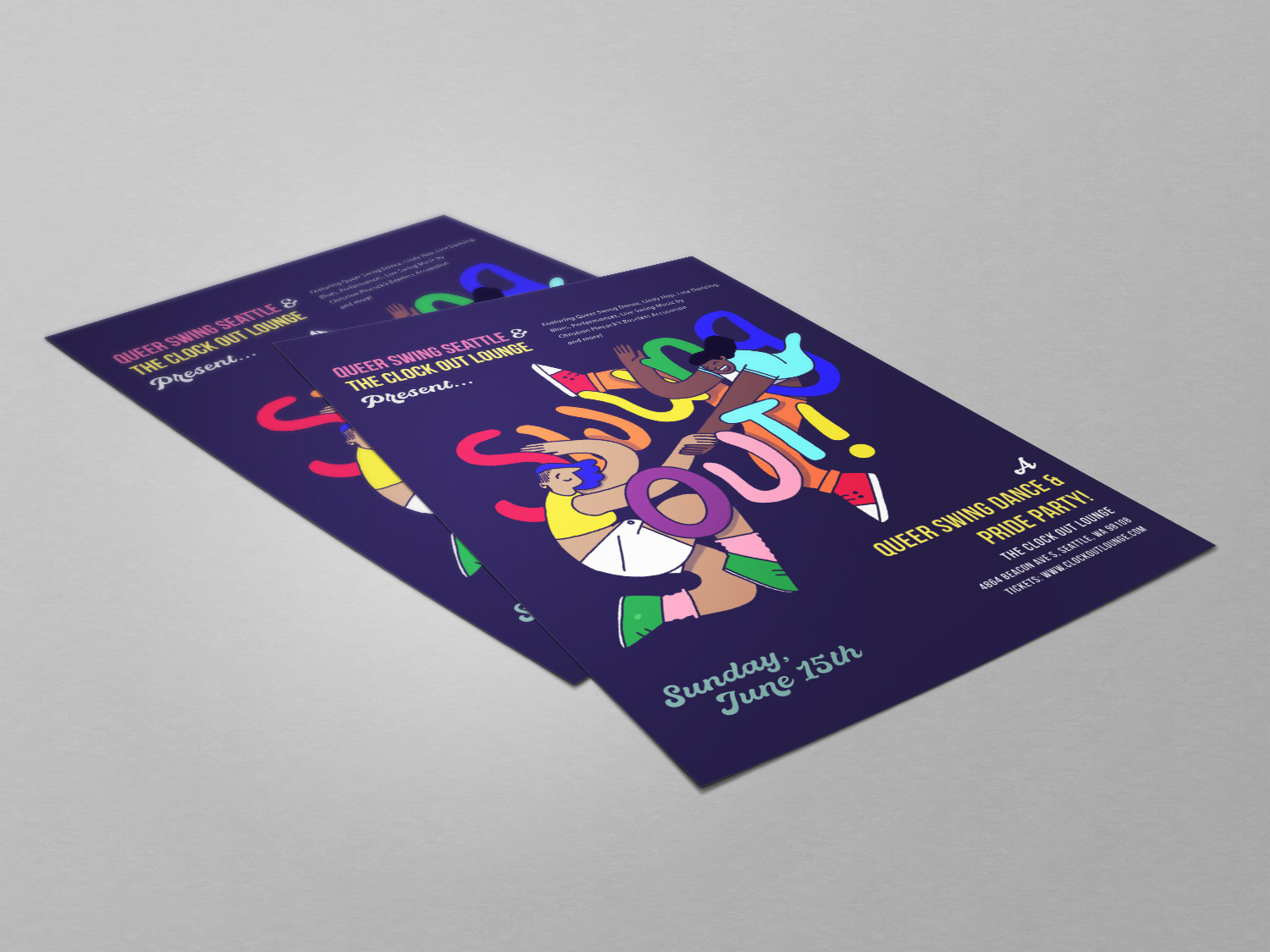
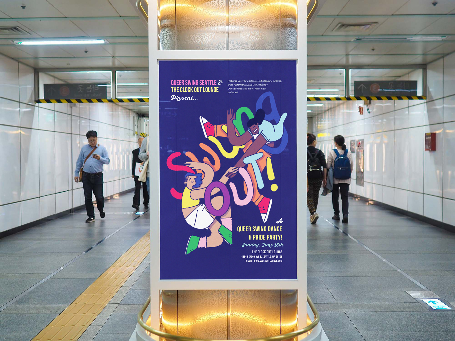
Queer Swing Seattle is a small local organization built with love, care and heart and with the expressed intention to create a safe and inclusive space for queer people to dance and be in community together. To express this visually, we chose a color palette inspired by the full Progress Pride flag, symbolizing the diversity and vibrancy of queer identity.
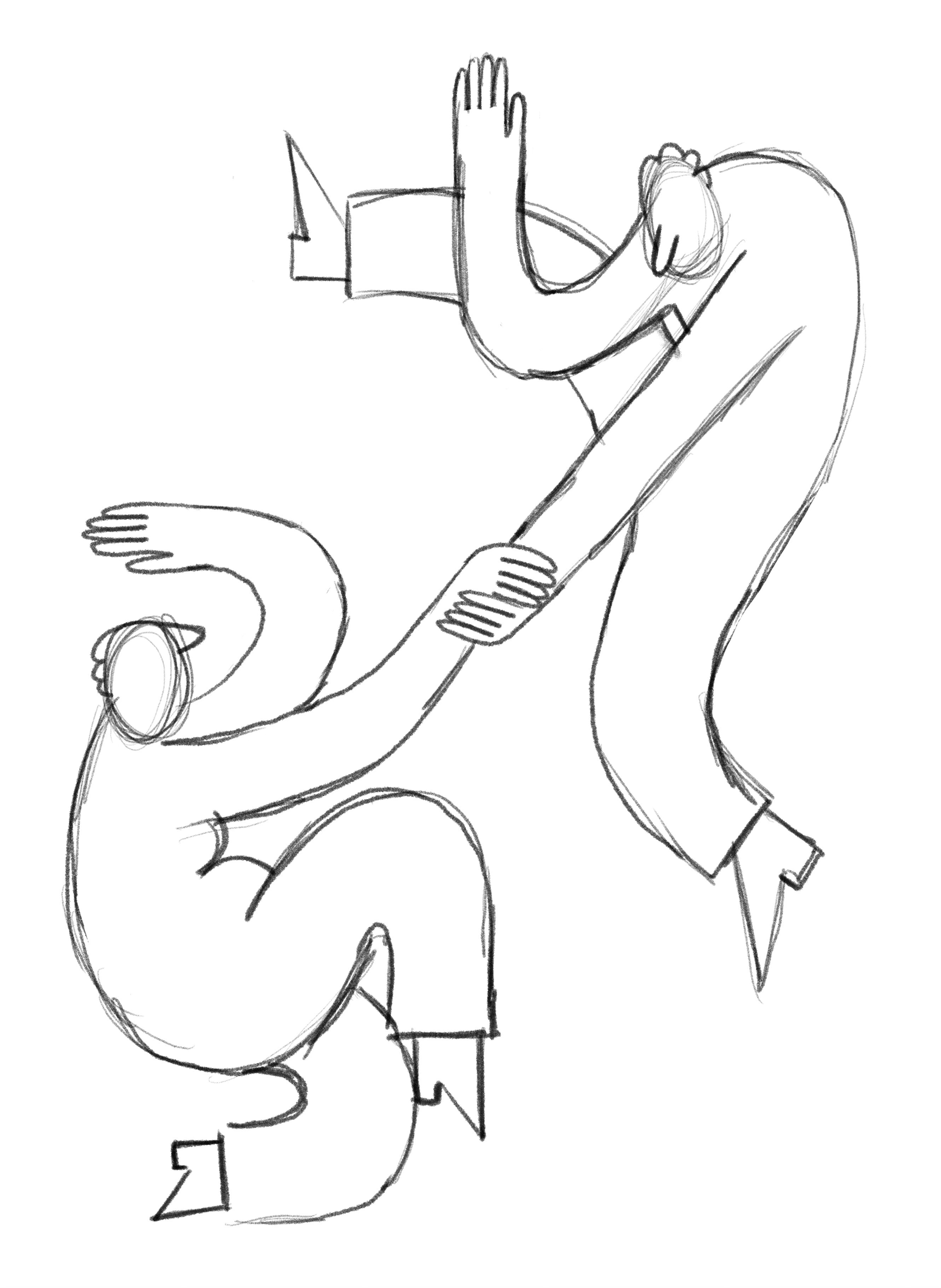
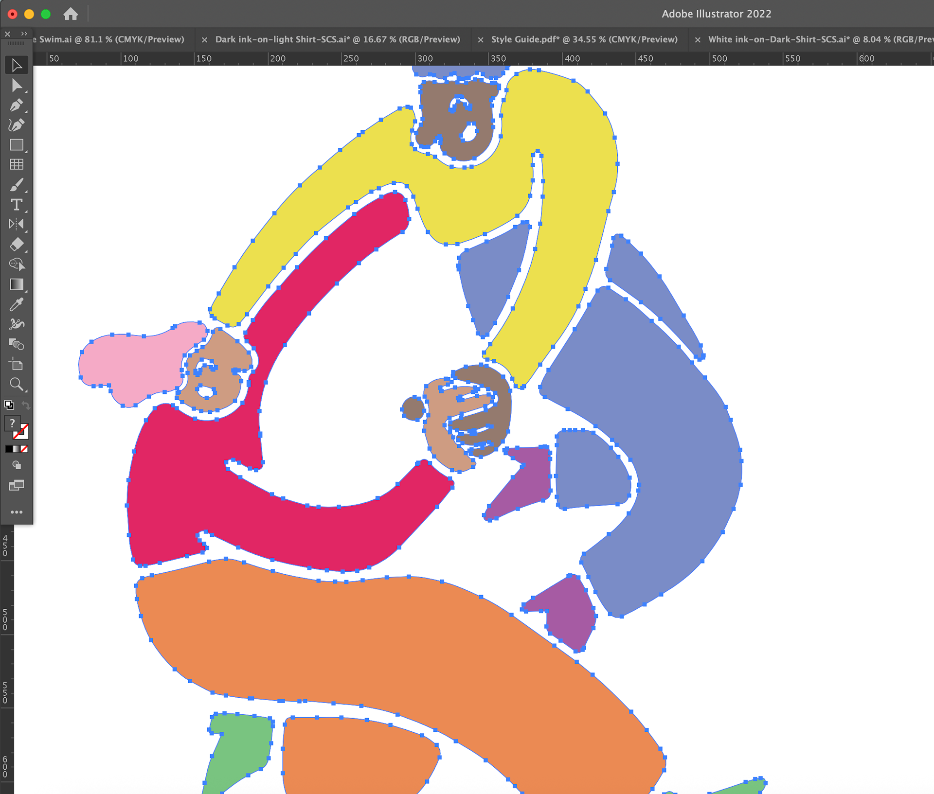
In the illustration, it was equally important that the figures reflect queerness in an authentic, expansive way. This meant being thoughtful about how fashion is represented, while also de-gendering the traditional and heteronormative imagery of partner dancing. Each dancer—whether leading or following—was designed to move beyond conventional gender norms, embodying fluidity, individuality, and joy.
Initial sketches to the client:
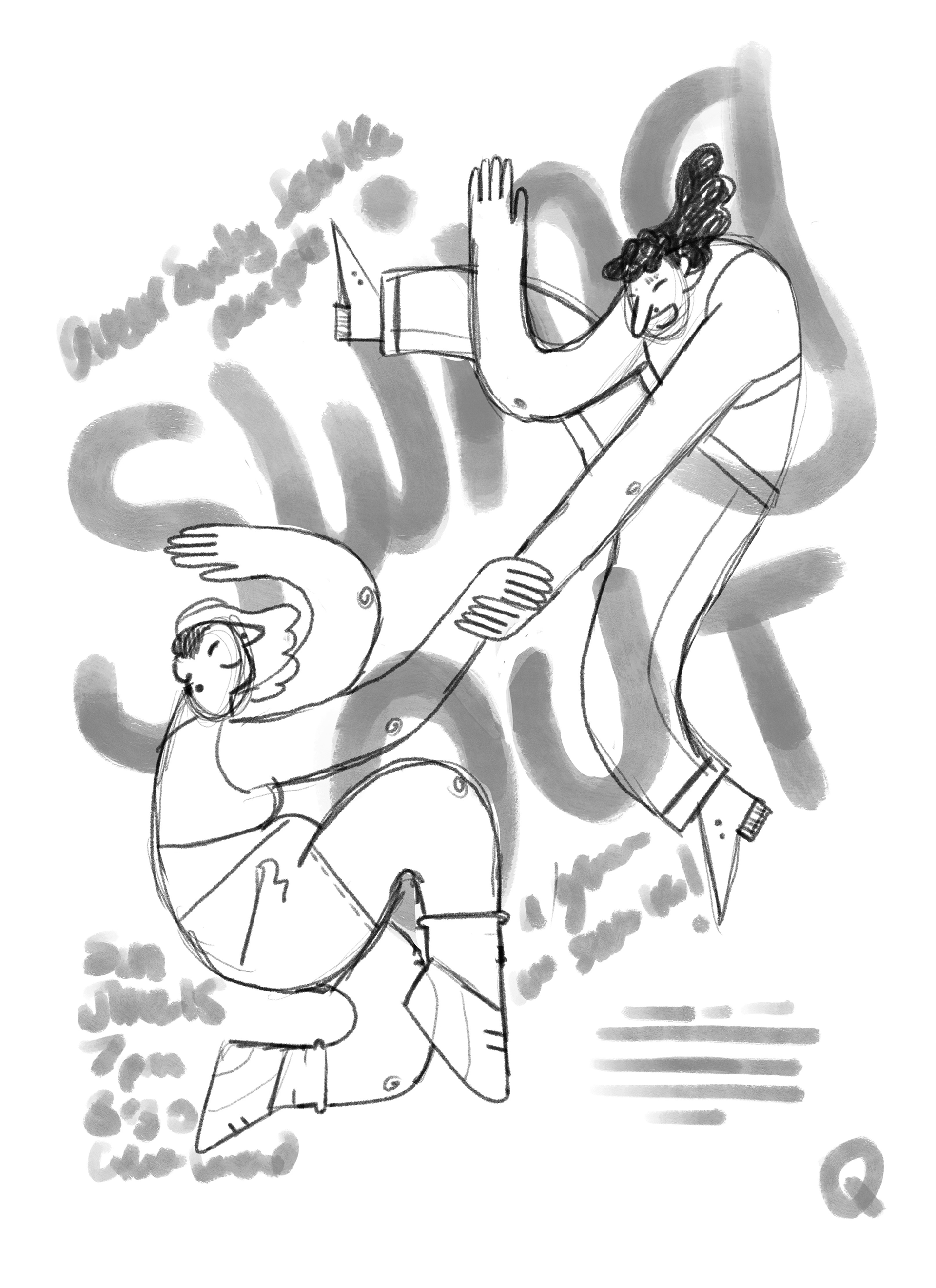
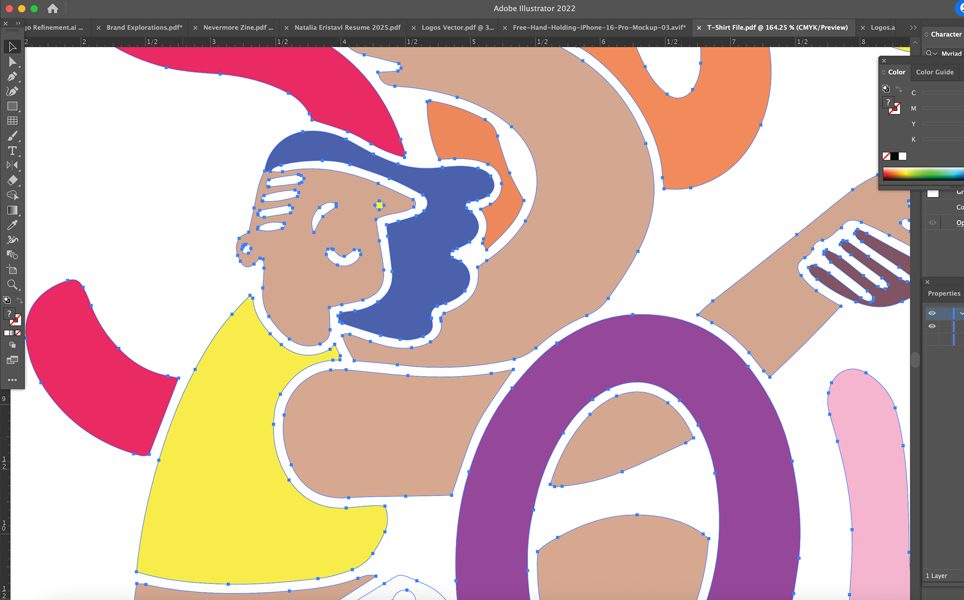
I created a more rendered illustration in Procreate and took it into Adobe Illustrator to vectorize and prepare for printing.

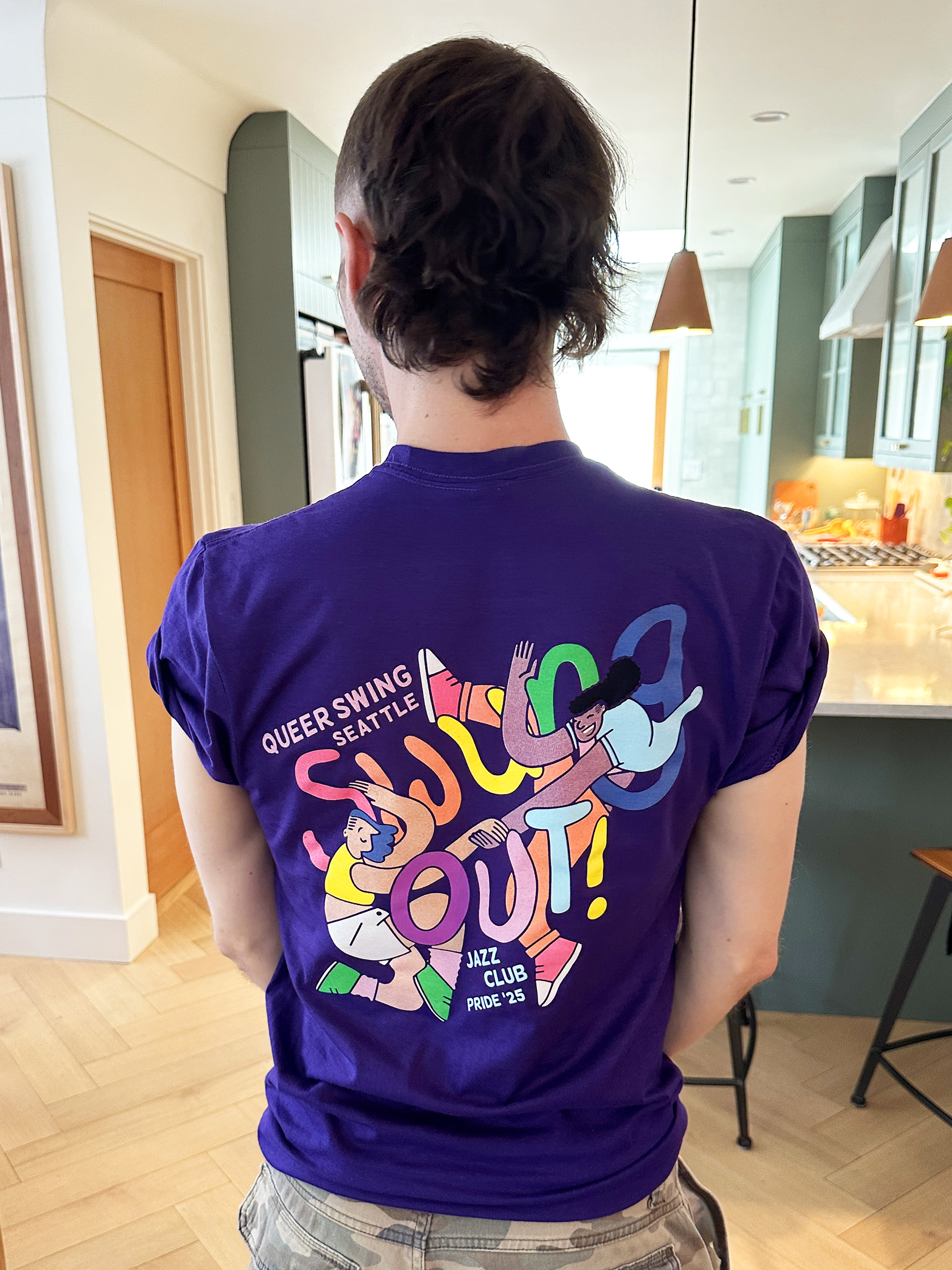
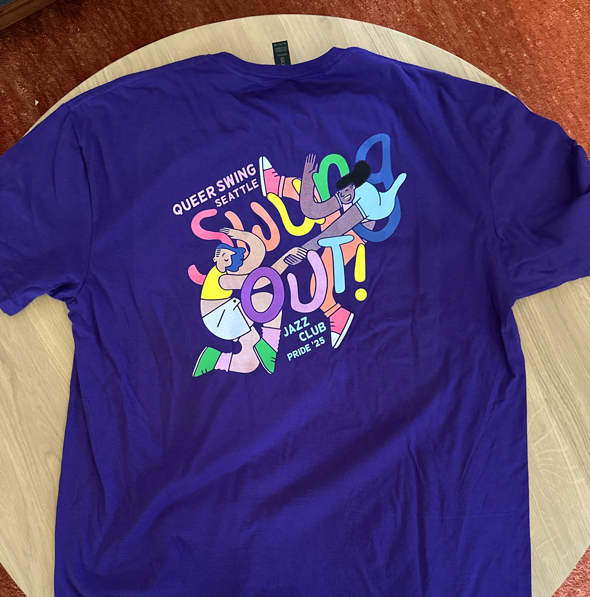
I used the illustration across all promotional assets including flyers and posters.
Logo Redesign
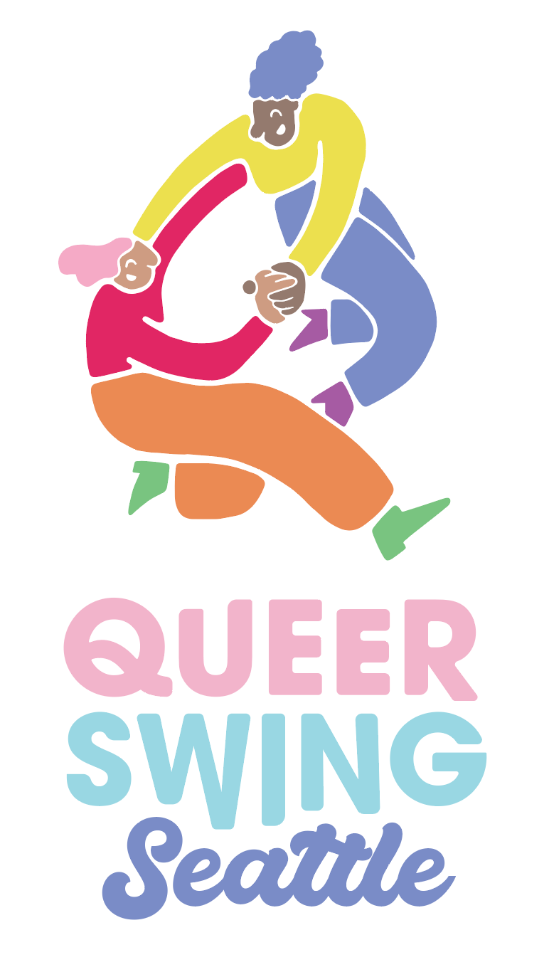
While the process usually starts with branding before illustration, the client loved my Swung Out! illustration so much that they decided to rebrand in the same style. I then adapted the illustration’s visual language to create cohesive branding across their materials—essentially reversing my usual workflow. It was a fun challenge, and I embraced the opportunity to bring a unified, vibrant identity to the brand.
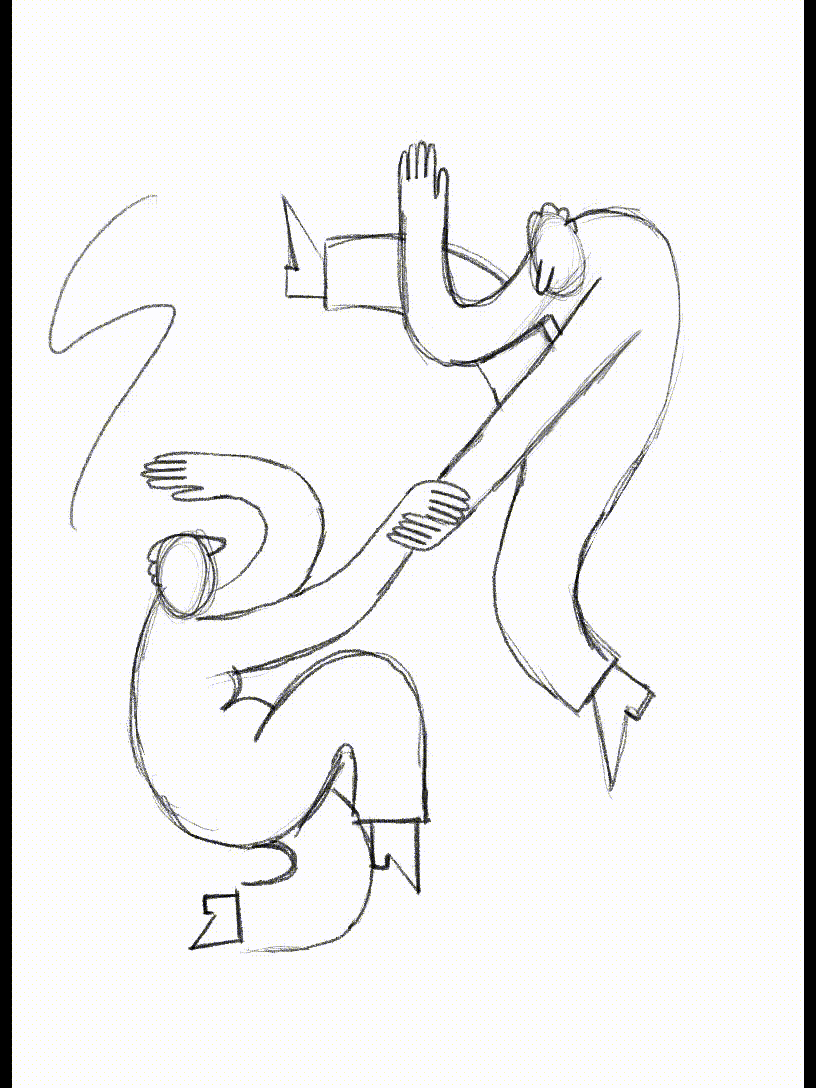
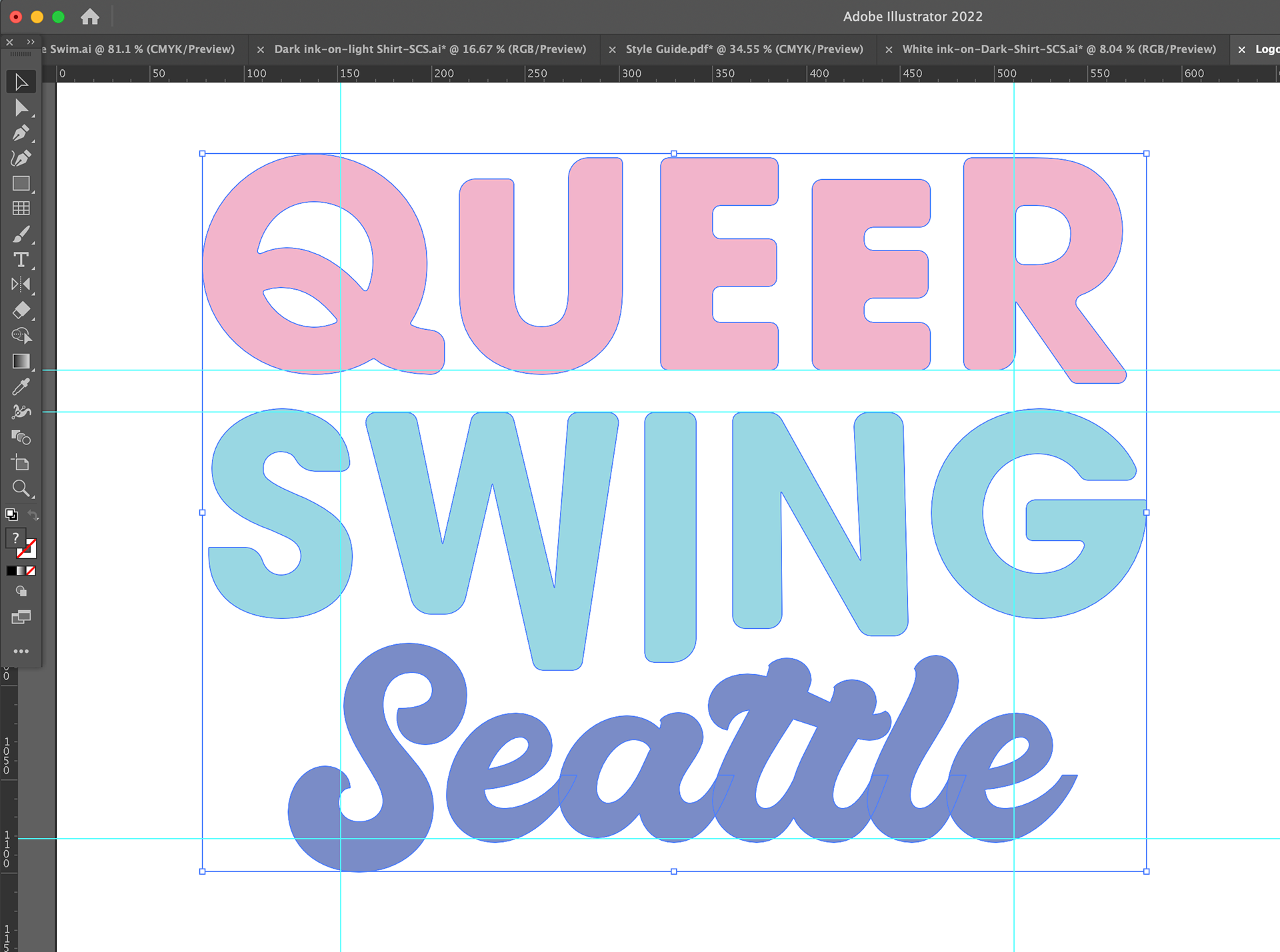
The brief was to redesign the existing logo, retaining the original color palette while making it more cohesive with the T-shirt design—not identical, but visually aligned. The challenge was to create a logo that was simple, scalable, and versatile, while meeting these requirements and maintaining the brand’s playful energy. In order to really connect the icon to the wordmark, I was careful to choose fonts that mirrored some of the qualities of the illustration while also leaning my initial illustrated logo further into the hidden 'Q' the figures created together.

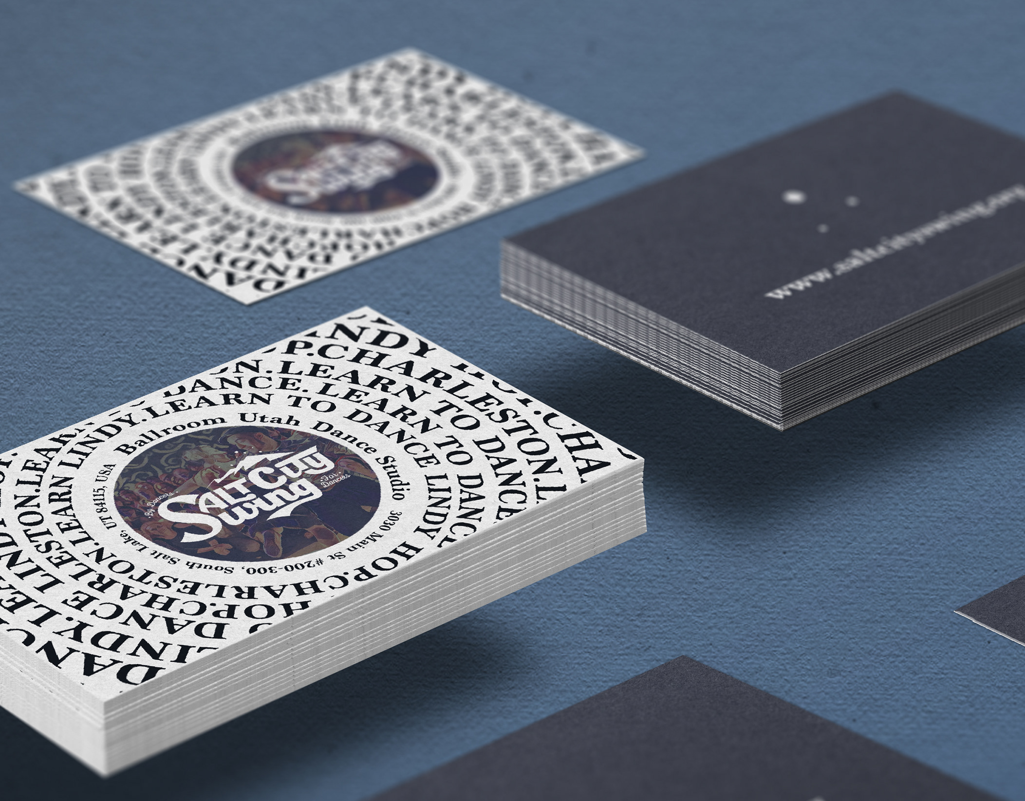
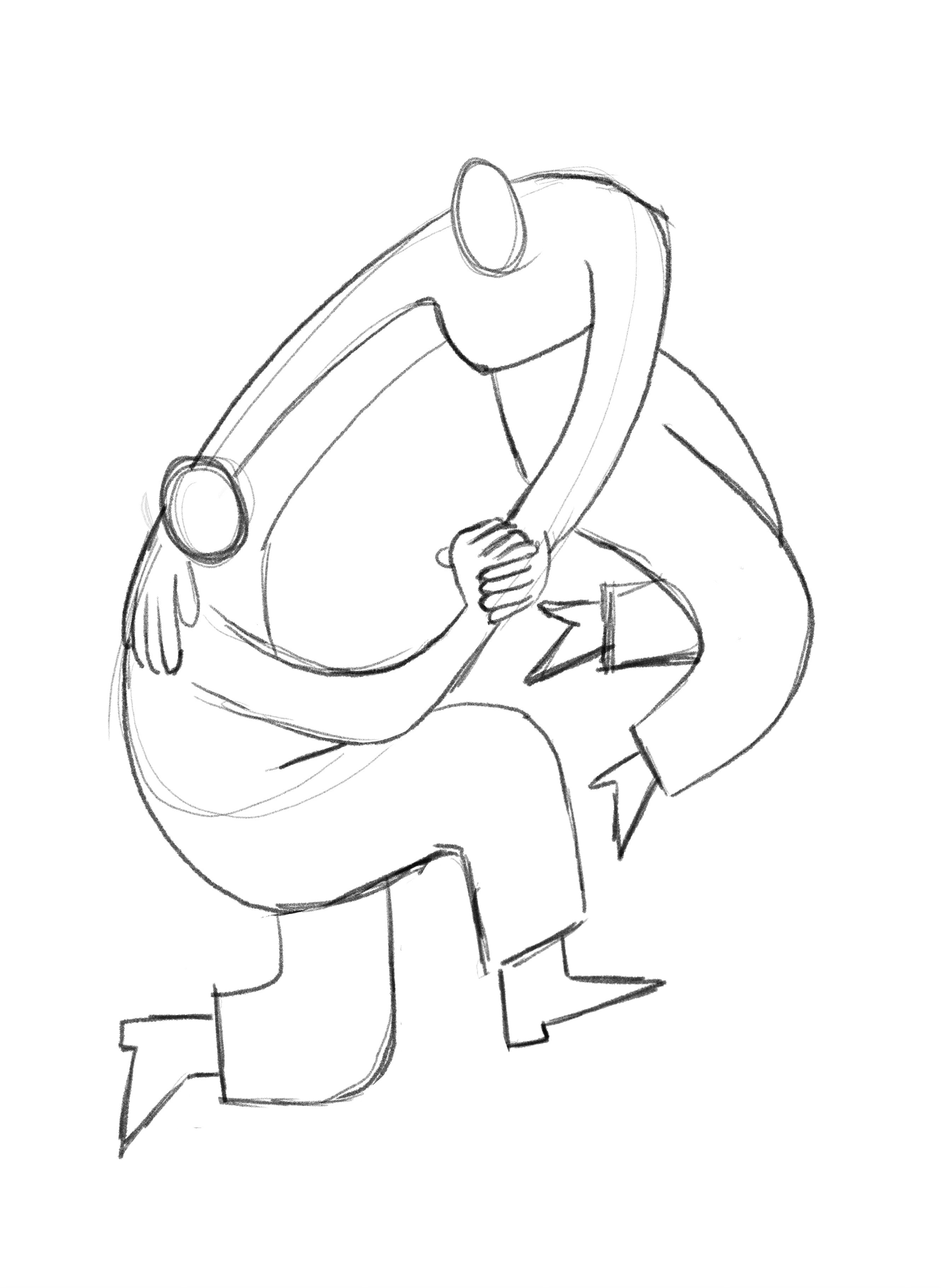
I used one of my sketches for the T Shirt as the basis for the Logo
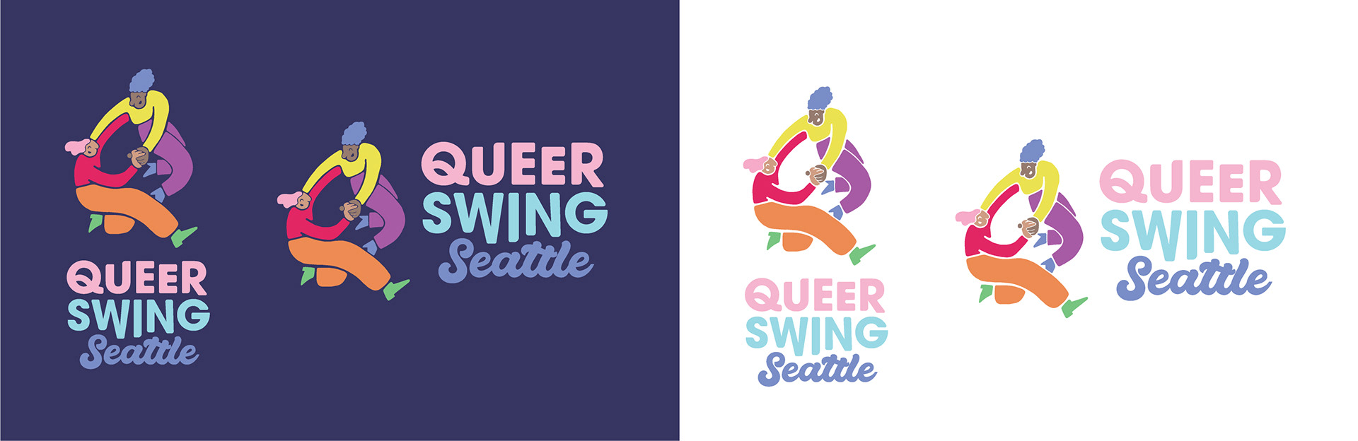
New Logo design
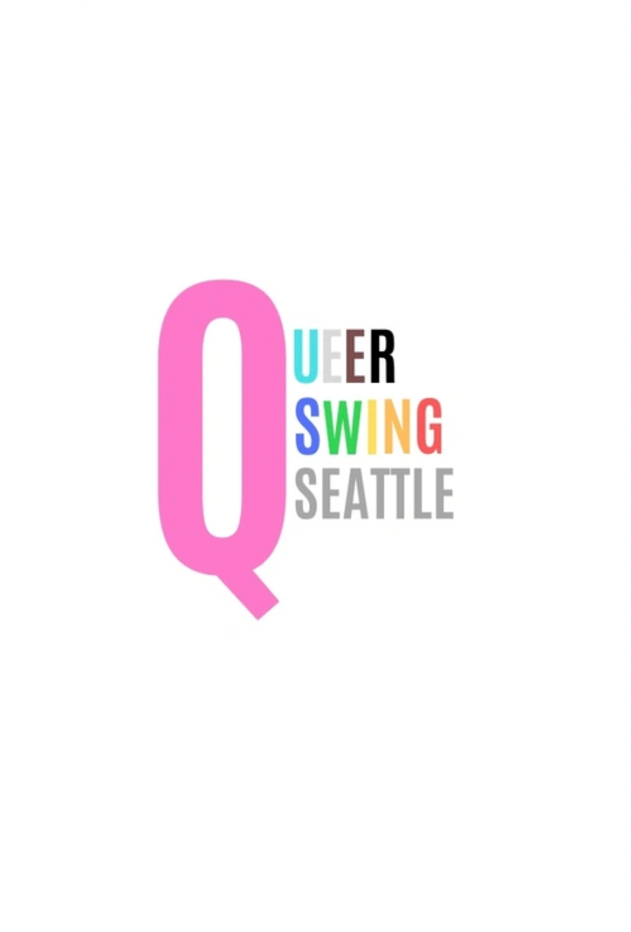
Old Logo
Logo and Wordmark development:
Light and dark backround color solutions:
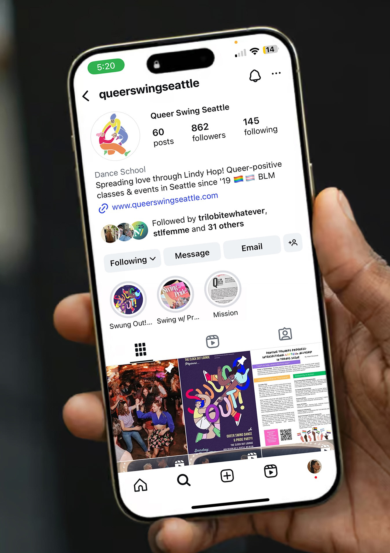
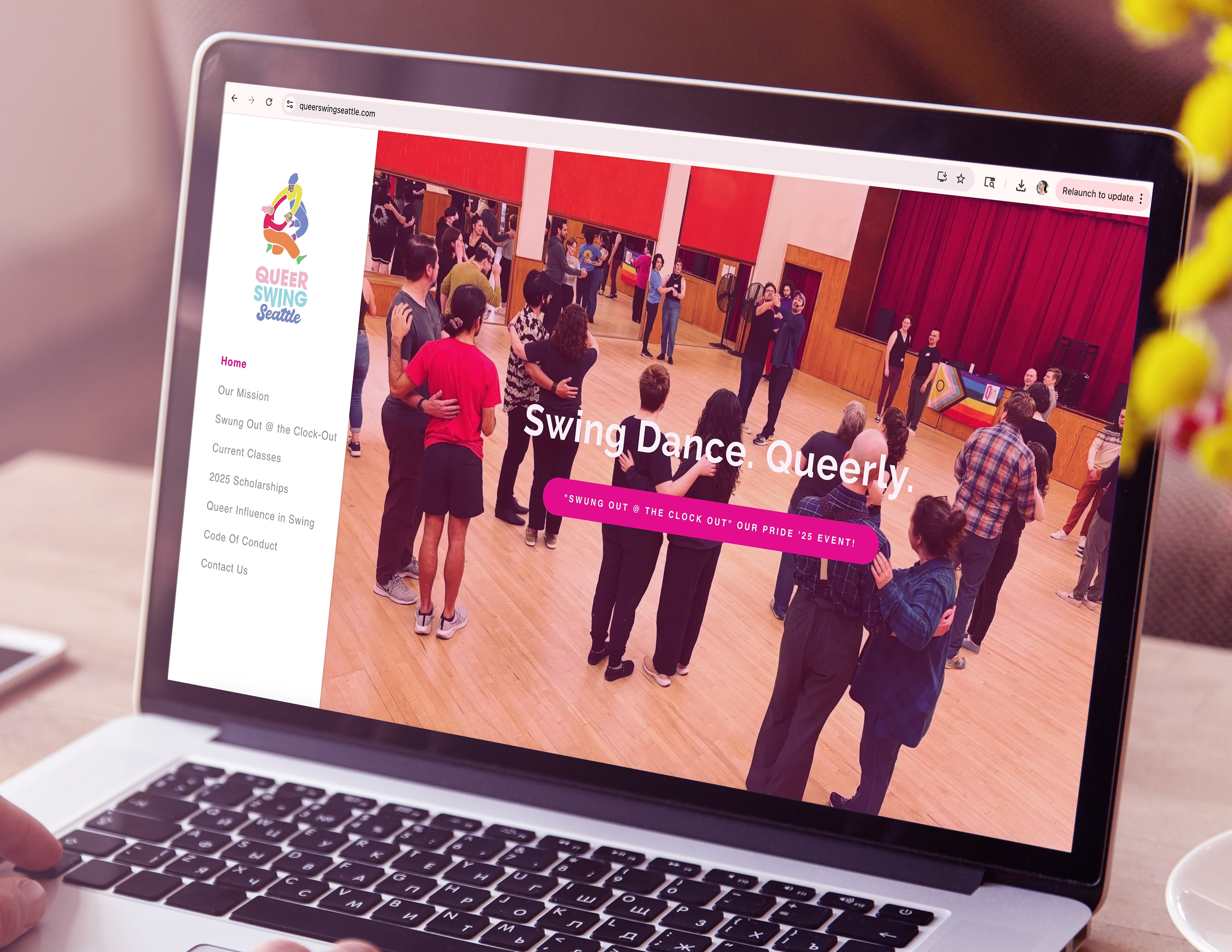
Website before the logo redesign:
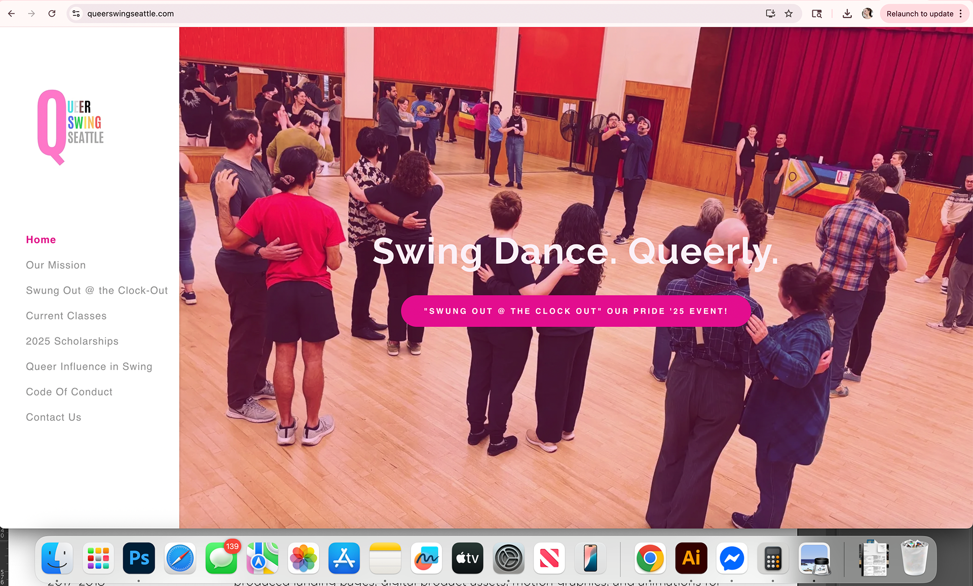
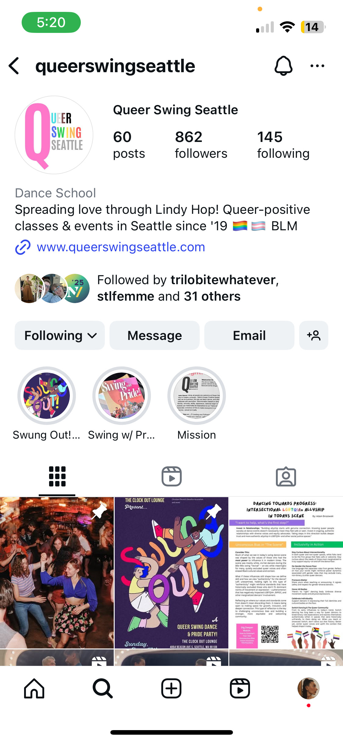
After the logo redesign:
In conclusion, the story we wanted to tell was that you belong here. In our space and at this event you will not only feel safe but valued, celebrated and completely free to be yourself.