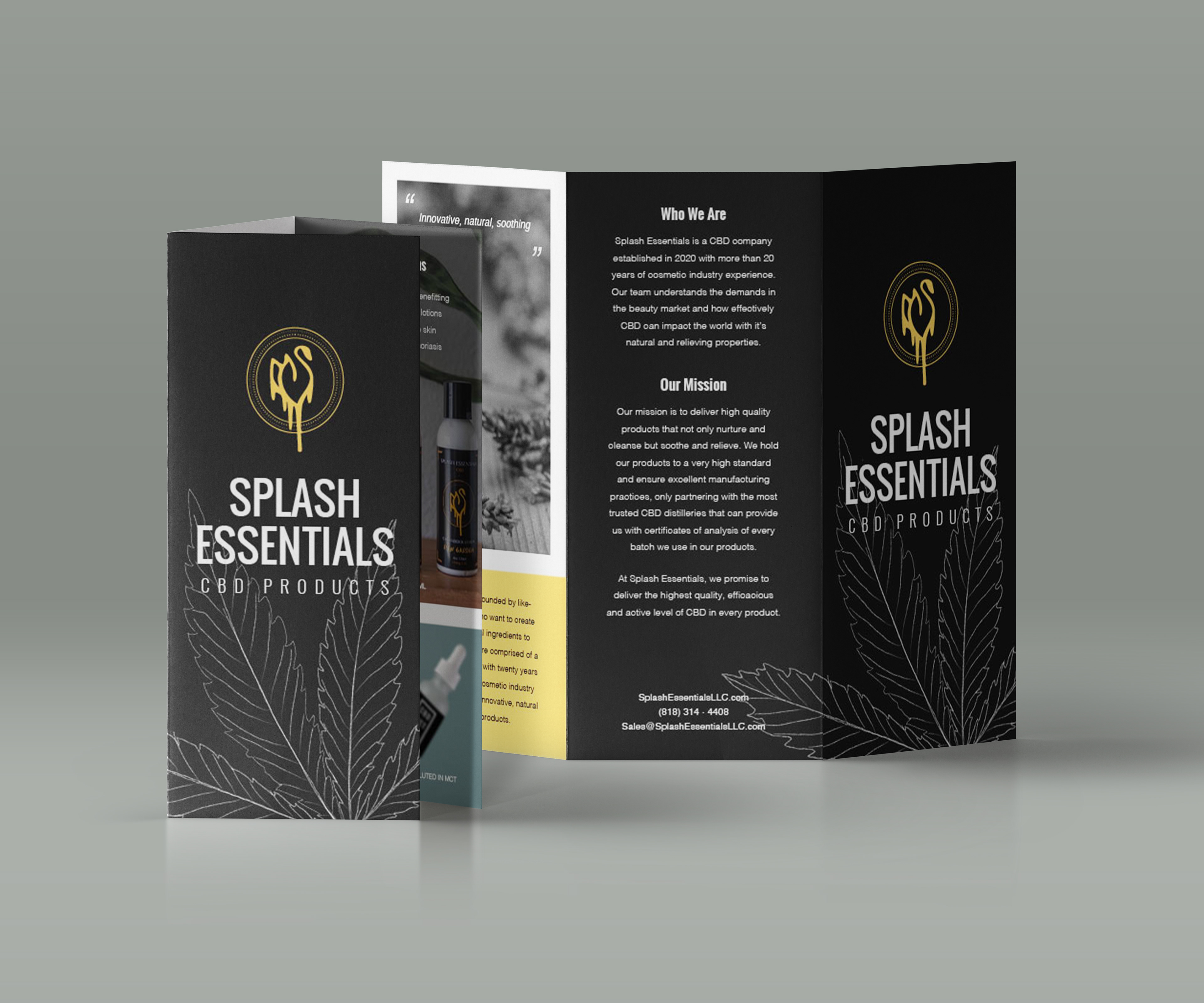
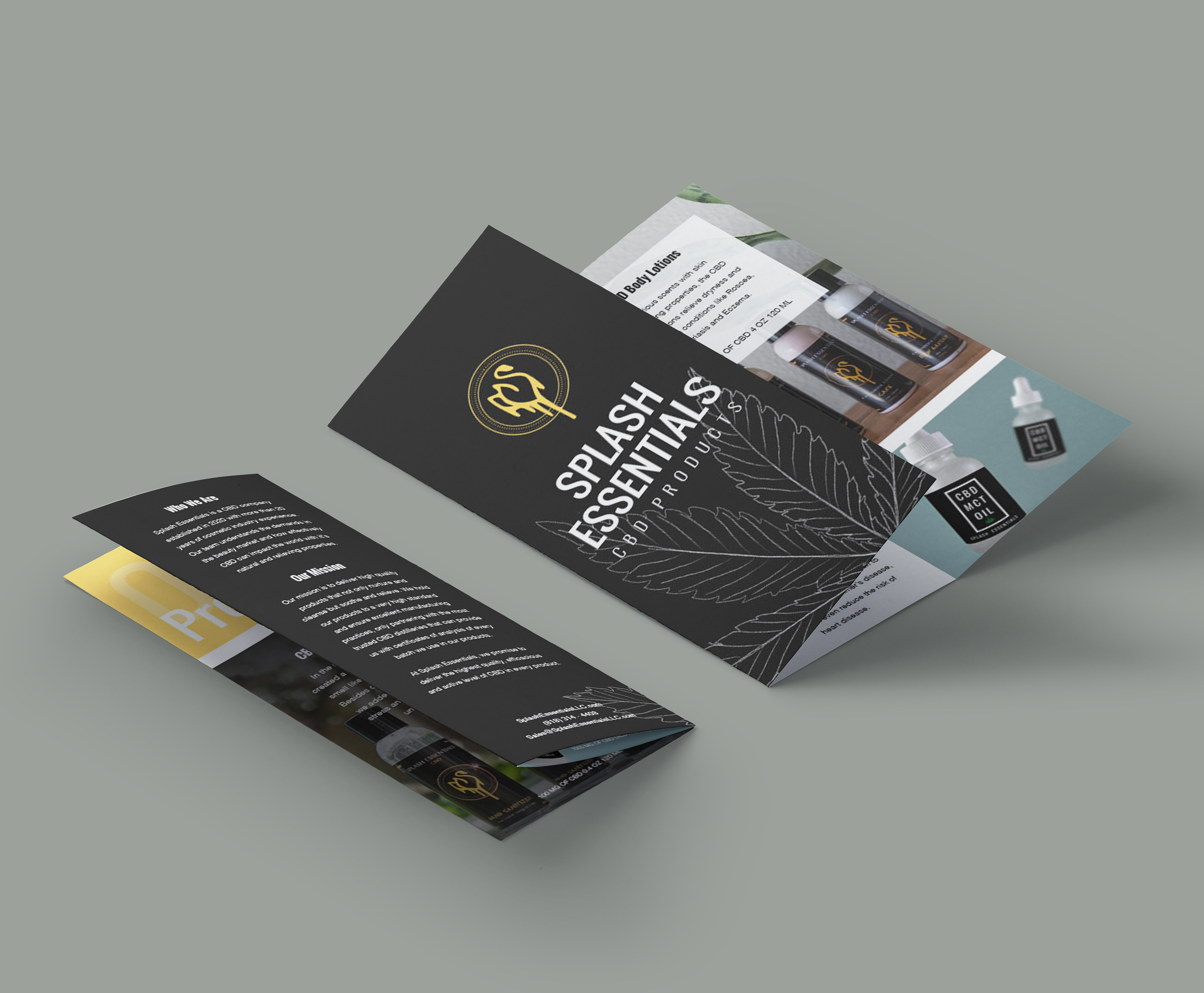
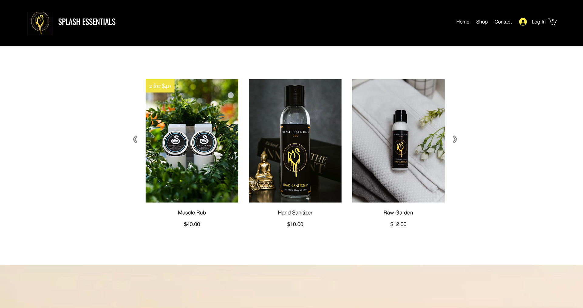
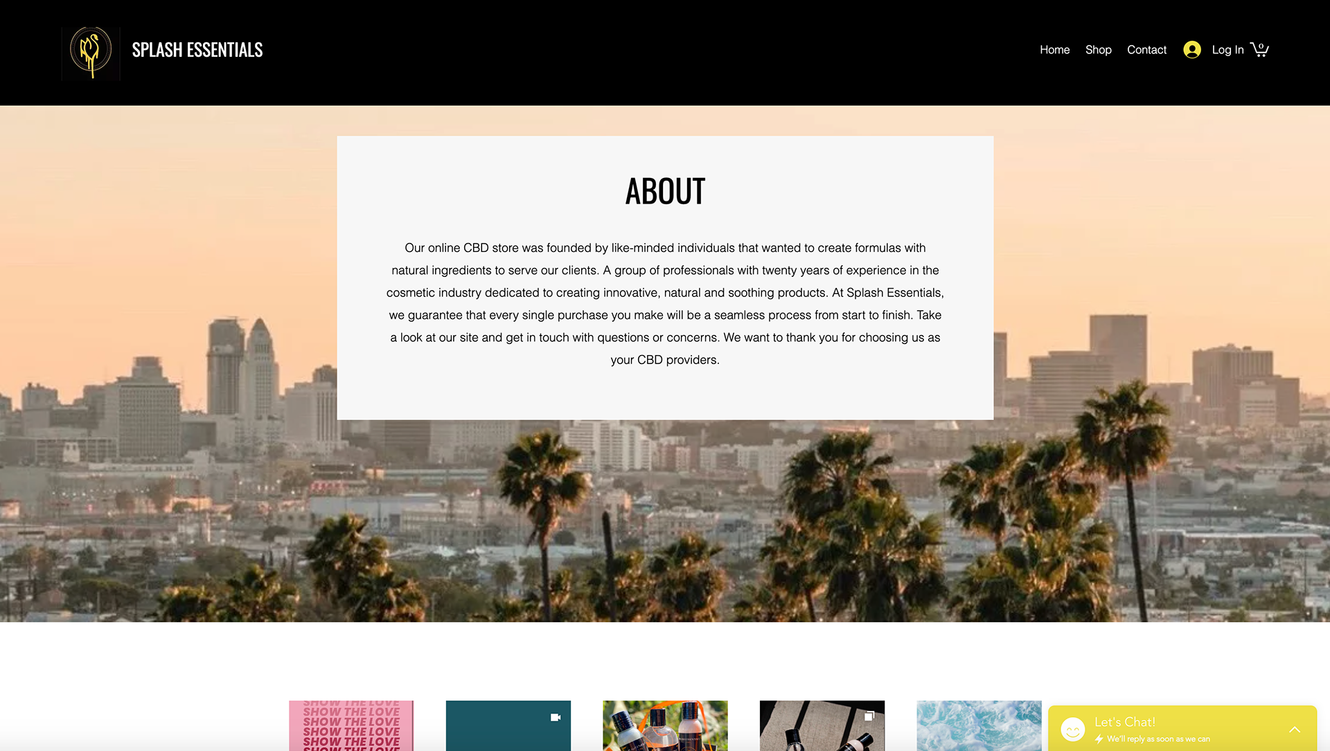
I started my process by familiarizing myself with their already existing brand identity. They have a seal logo and their colors are mainly black and yellow. The designs are relatively simple and they utilize boxes and rectangles as well as the occasional photograph.
Using the information I was handed by the client to include in the brochure, I sketched out some potential layouts according to what information I thought was most prudent to present first. I build the graphic around that initial premise.

Then I took to InDesign and played around with it. After a couple of iterations, I was given the go ahead to refine and perfect the chosen design. I made sure the hierarchy was apparent, the grid was tight and everything lined up perfectly. I had to consider not only how each side of the brochure looks but how the experience of opening it would feel at every stage.
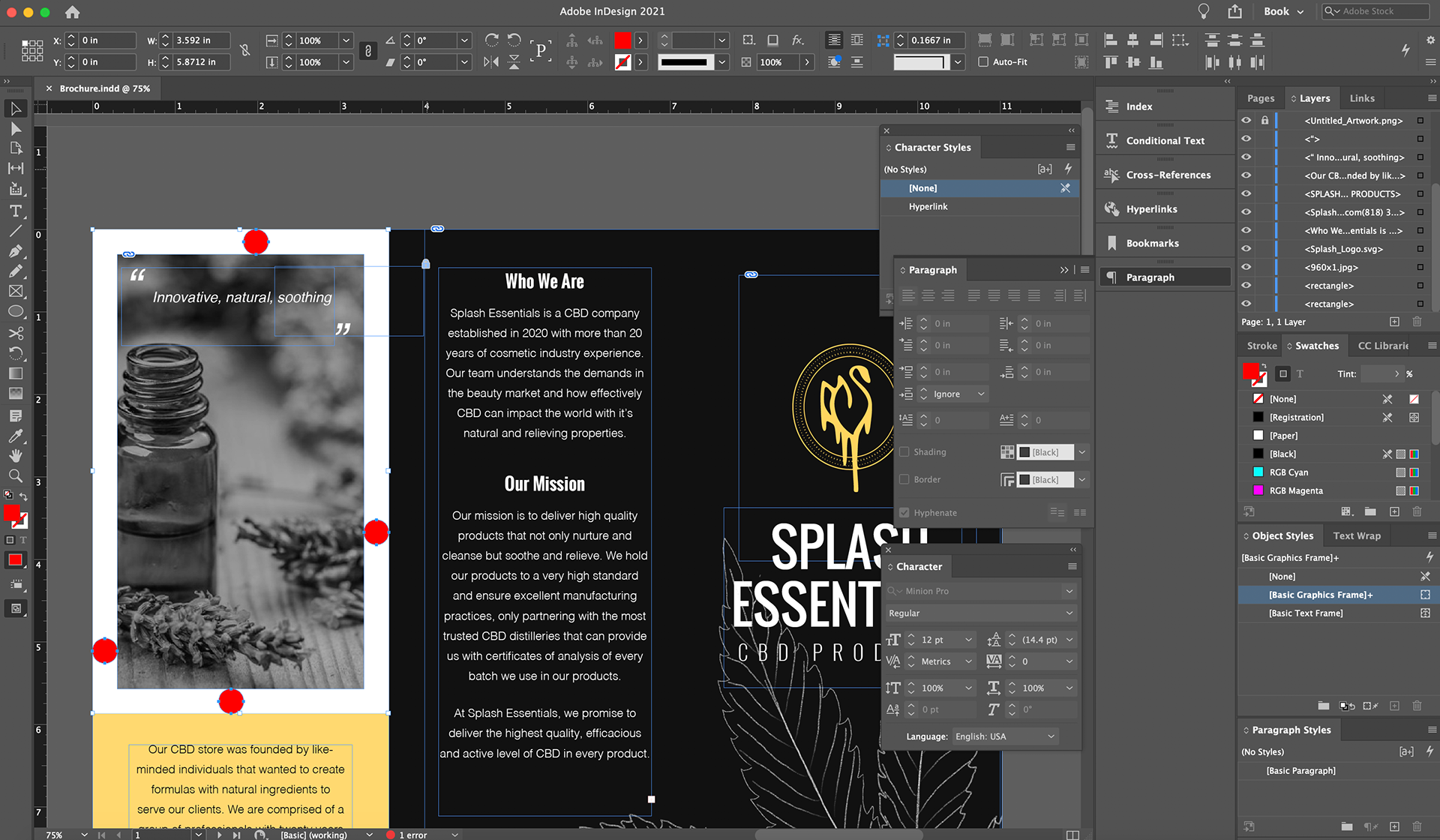
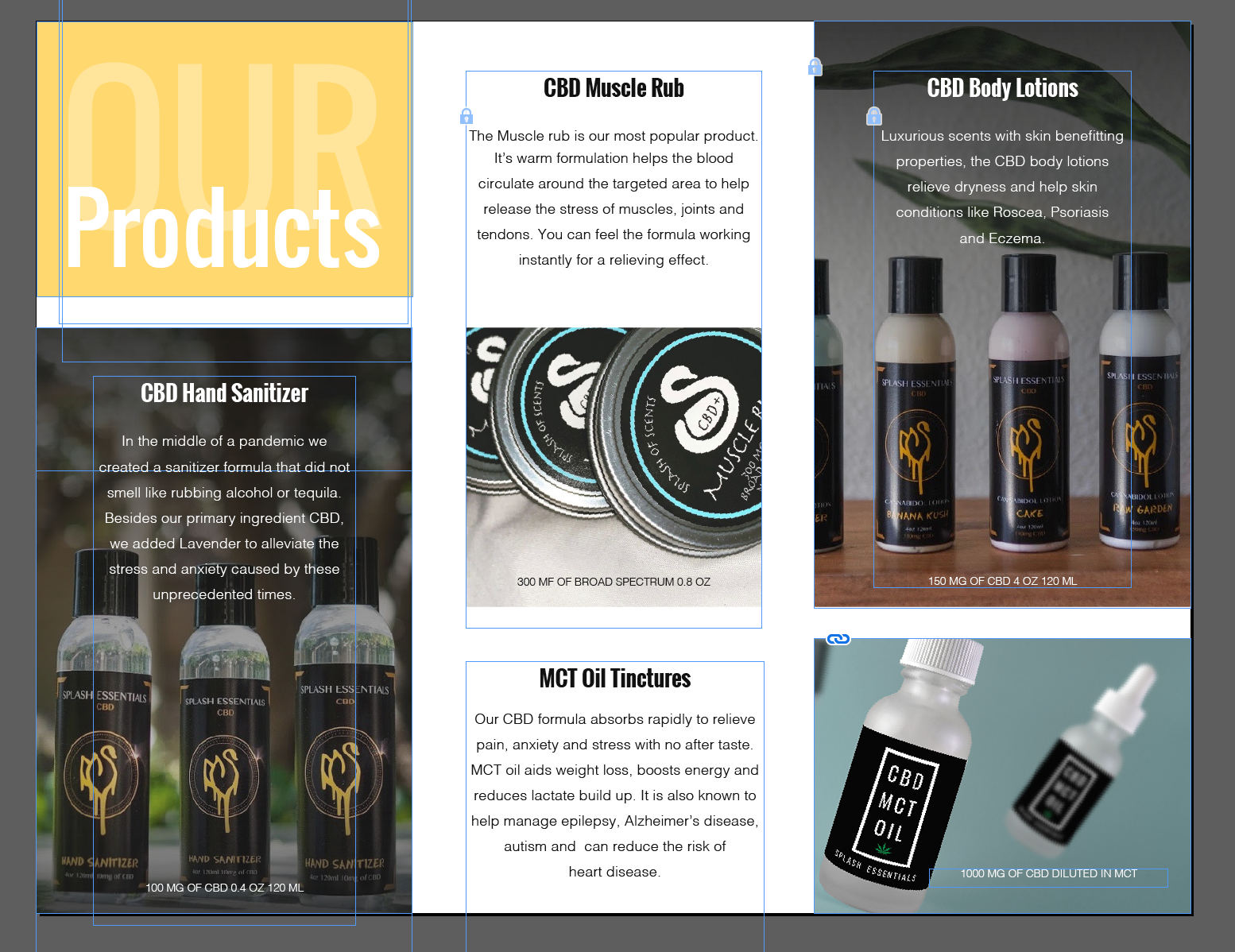
The final design, approved and ready for print. I kept it simple and clean but felt that it was missing something, so I created a line drawing of a cannabis plant (which is their primary ingredient) to place on the front of the brochure. This gives the design an organic and home grown aesthetic which I thought was fitting as Splash Essentials is a small business with a big heart.