Getting to Know the Brand
Tea & Bobbins is a cozy brand rooted in the gentle, timeless rituals of crafting, mending, and teatime. It's a space where needle and thread meet a warm cup of comfort—where every stitch tells a story. The client wanted a visual identity that captured both her passion for slow fashion and the elegance of vintage charm, while feeling approachable and modern.
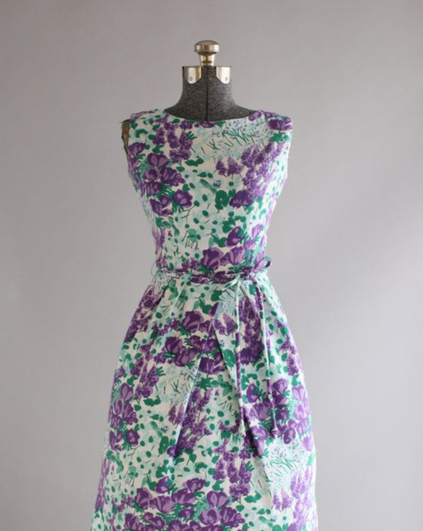
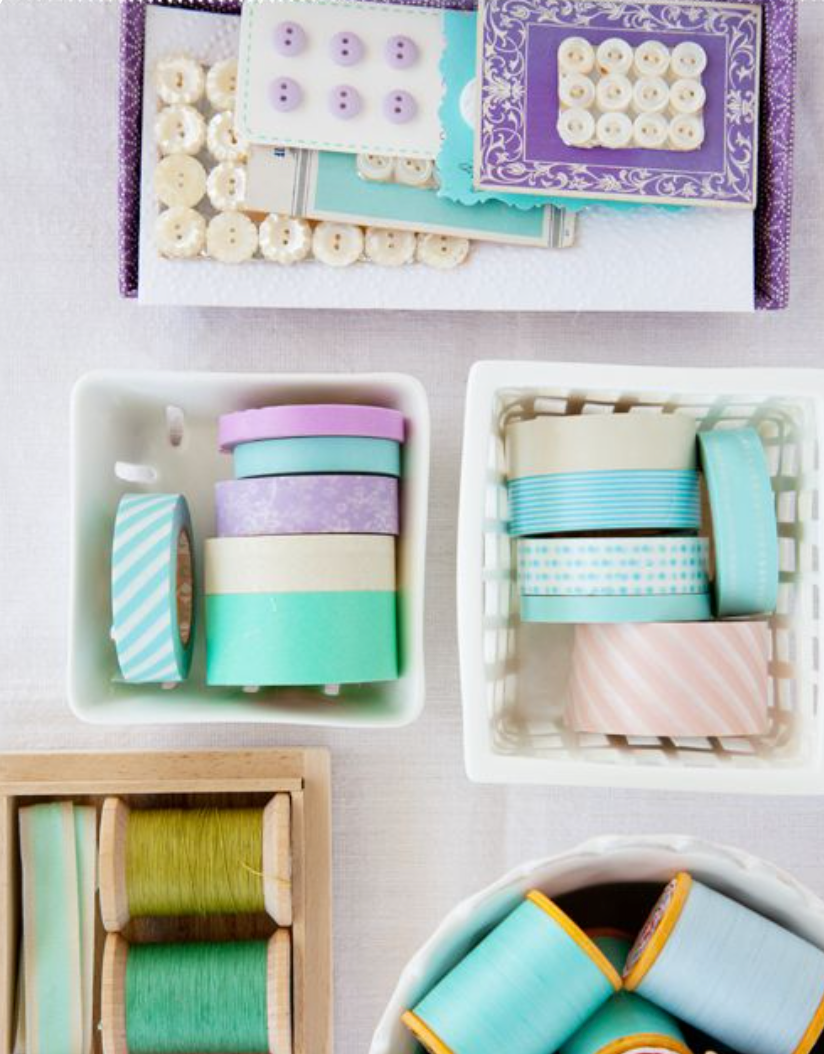
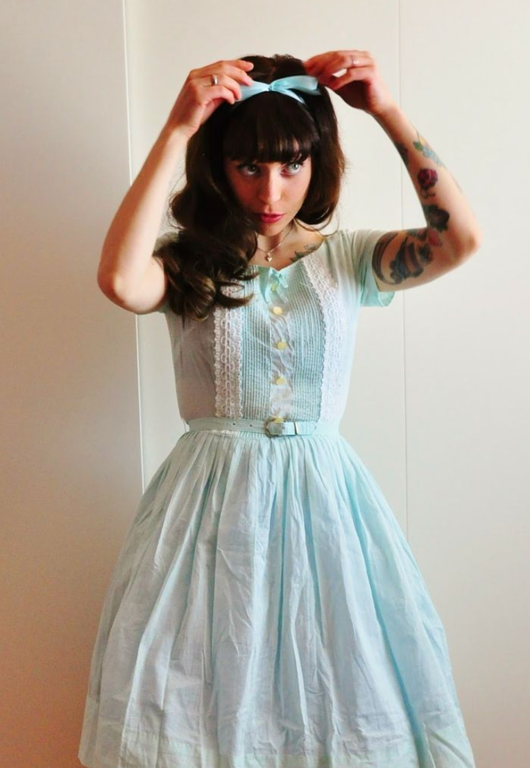
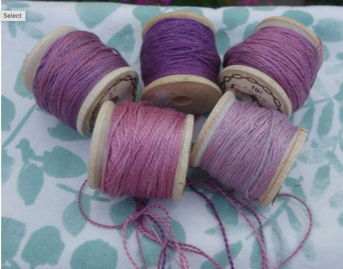
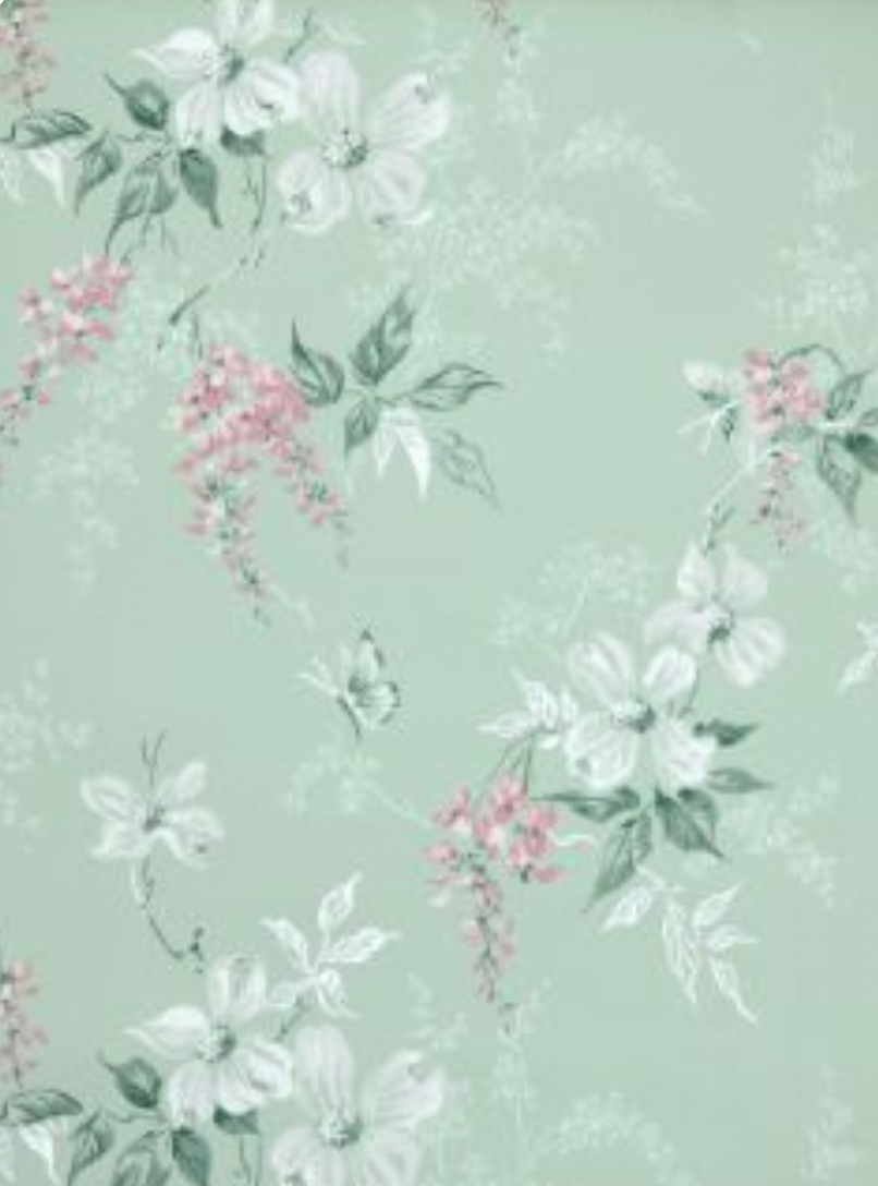
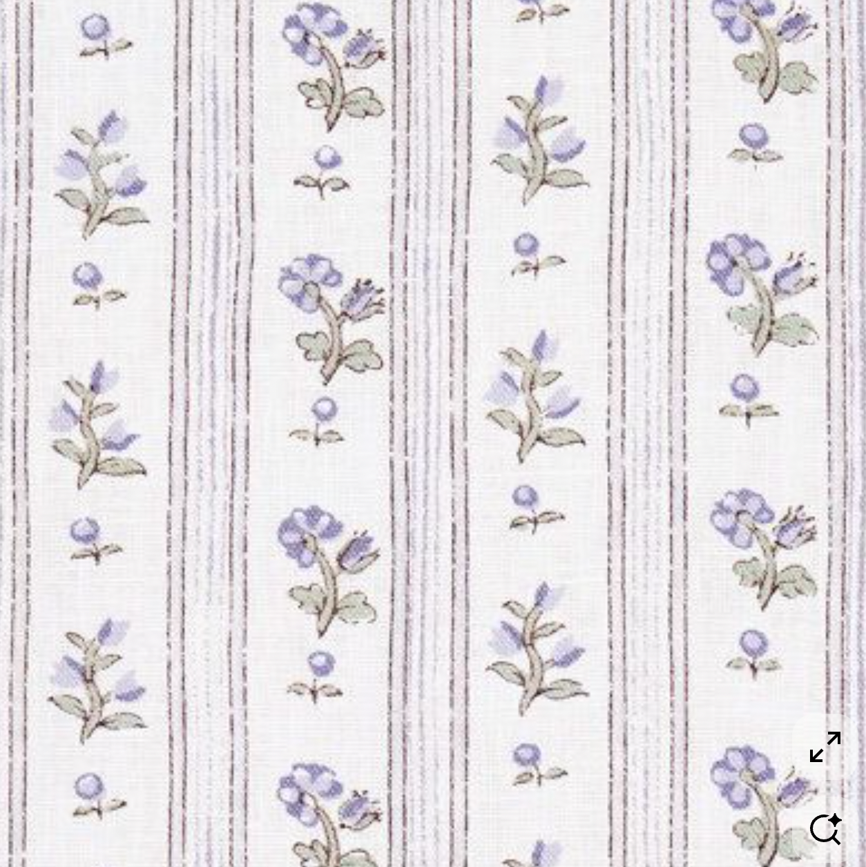
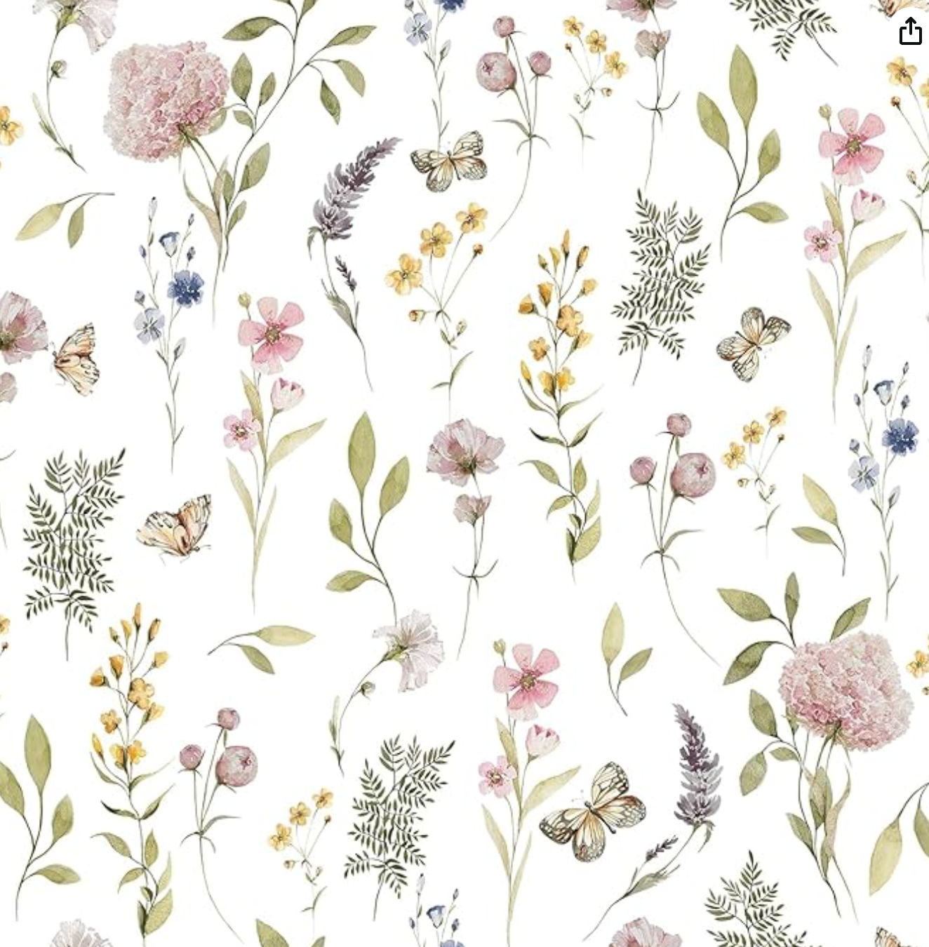
Mood Board
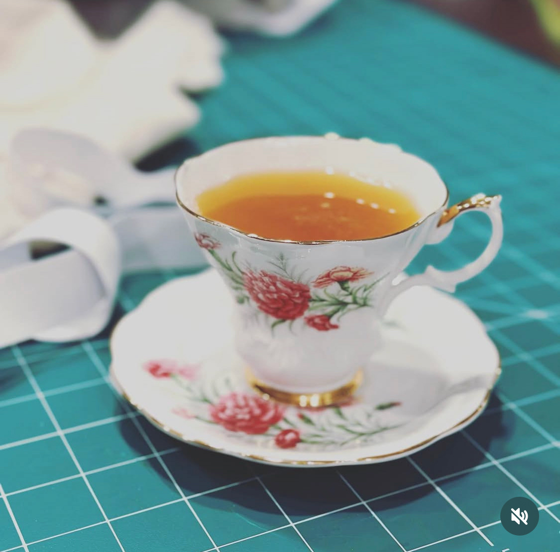
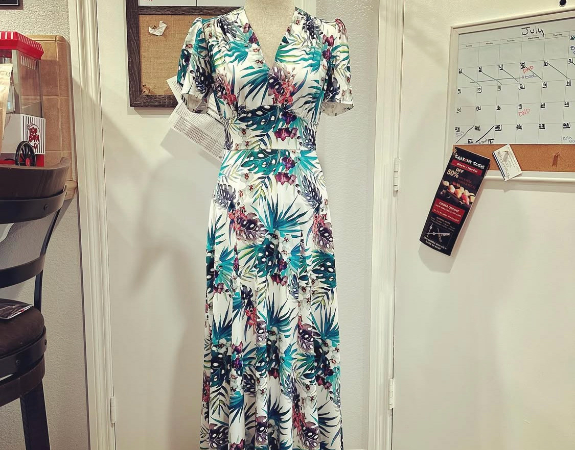
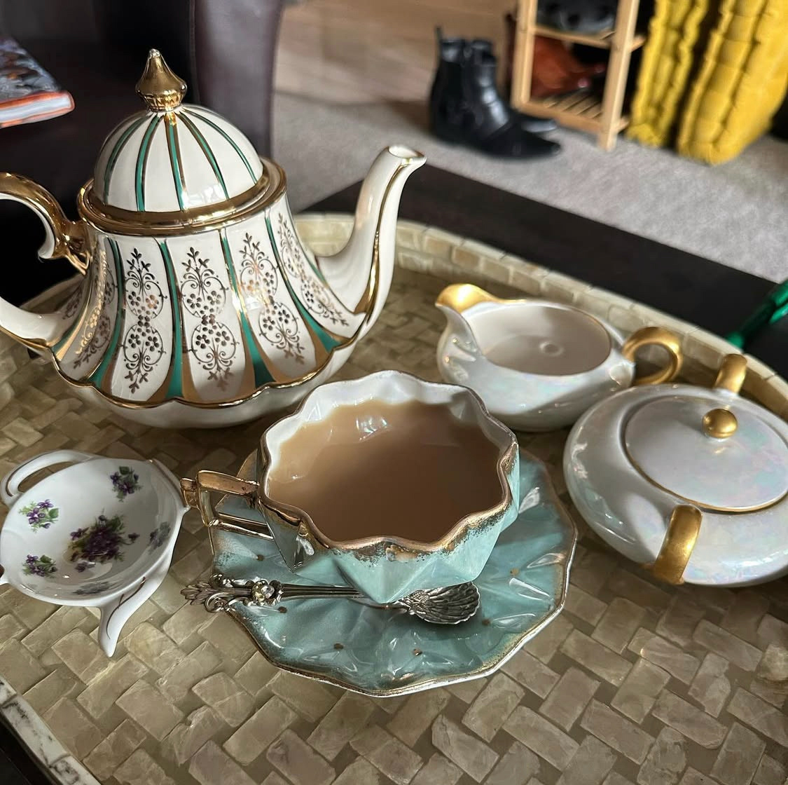
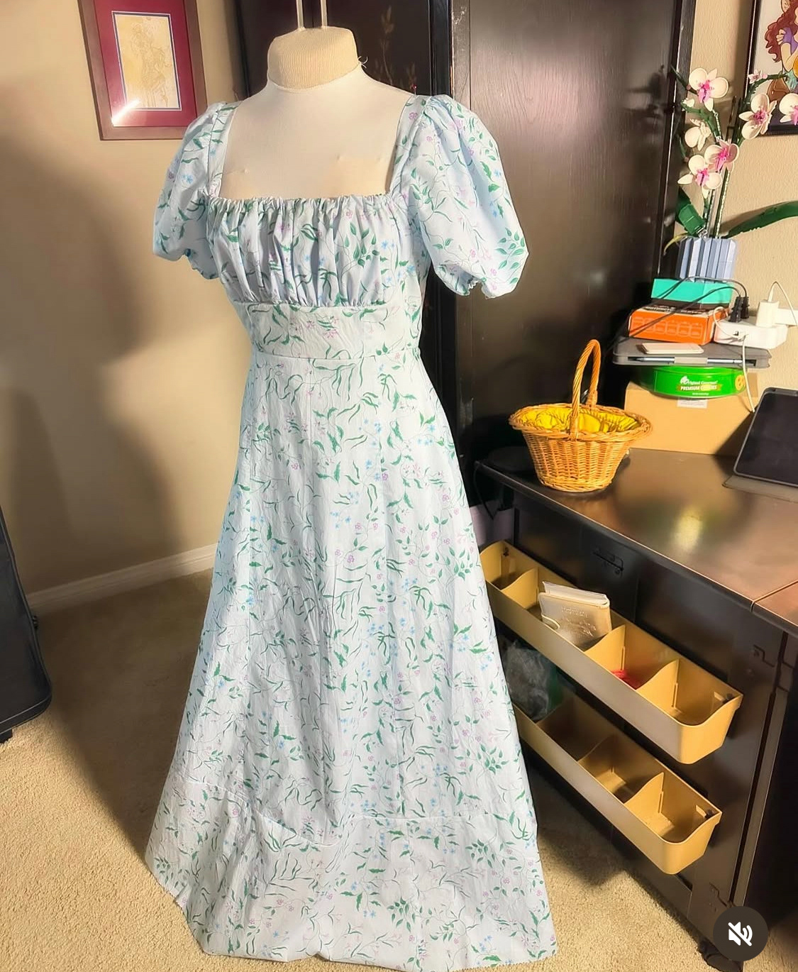
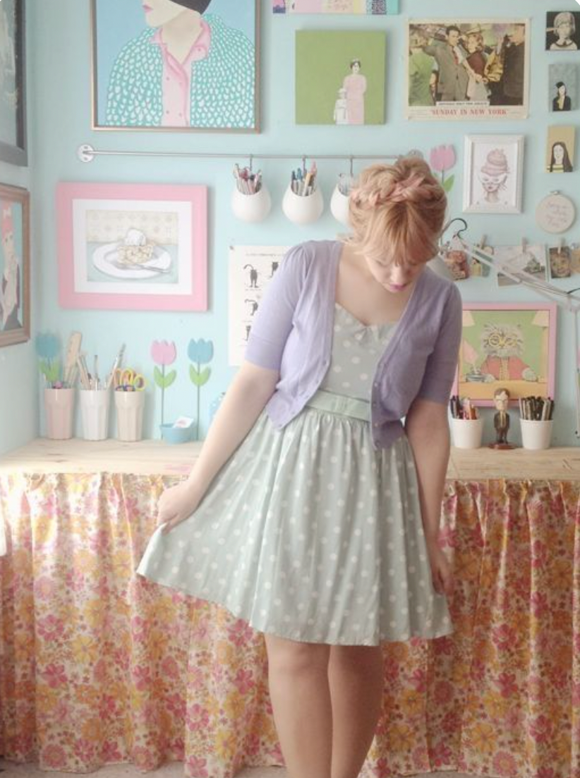
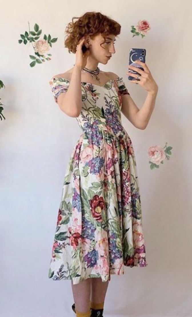
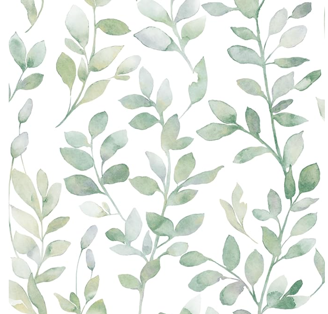
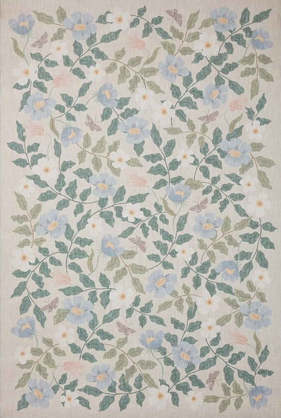
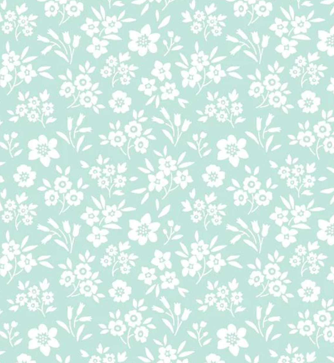
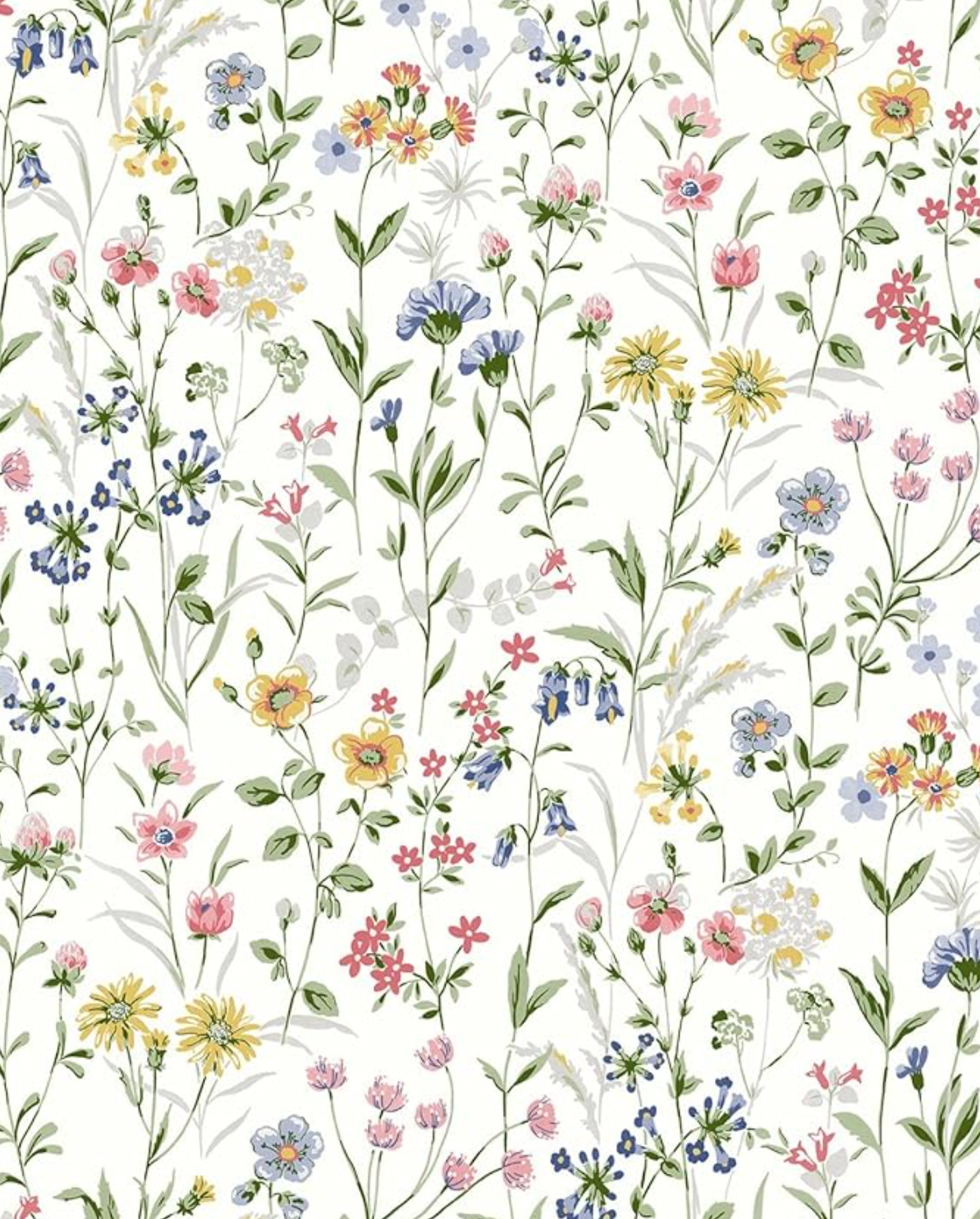
Tea & Bobbins needed a brand identity that felt soft and approachable, while still carrying the elegance and detail of vintage influence. The visual language is grounded in florals, vintage motifs, and tactile textures, yet modernized through simplicity and restraint. This balance of old and new was essential in reflecting both the maker’s passion for handcraft and her contemporary sense of style.
Brand Identity
The heart of the brand is an illustrated logo featuring a whimsical stack of ornate vintage teacups, with a bobbin nestled in the topmost cup with a thread whimsically floating above it. For the typography and logo lockups I presented a couple of directions for the client of which she chose the far right lockup below.
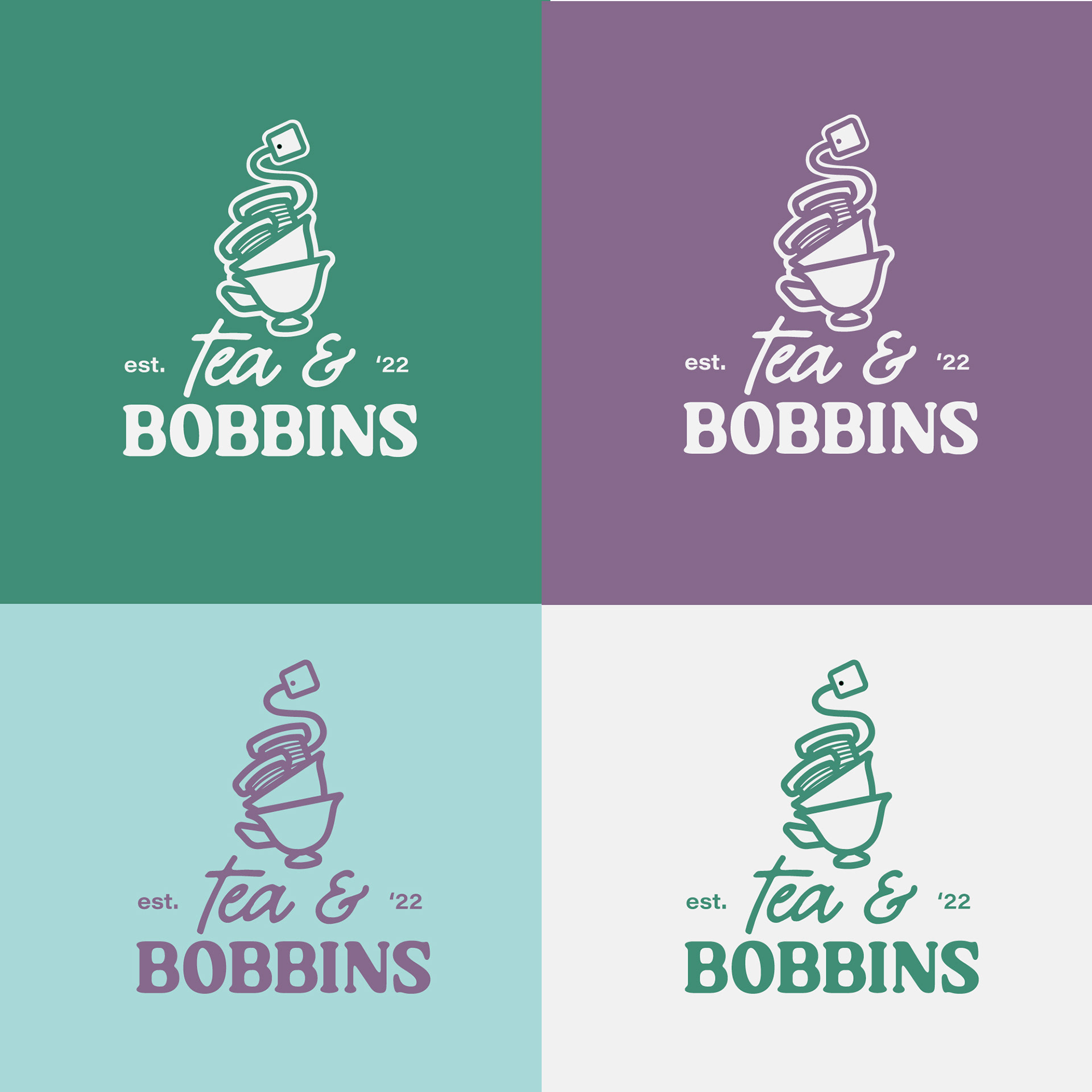
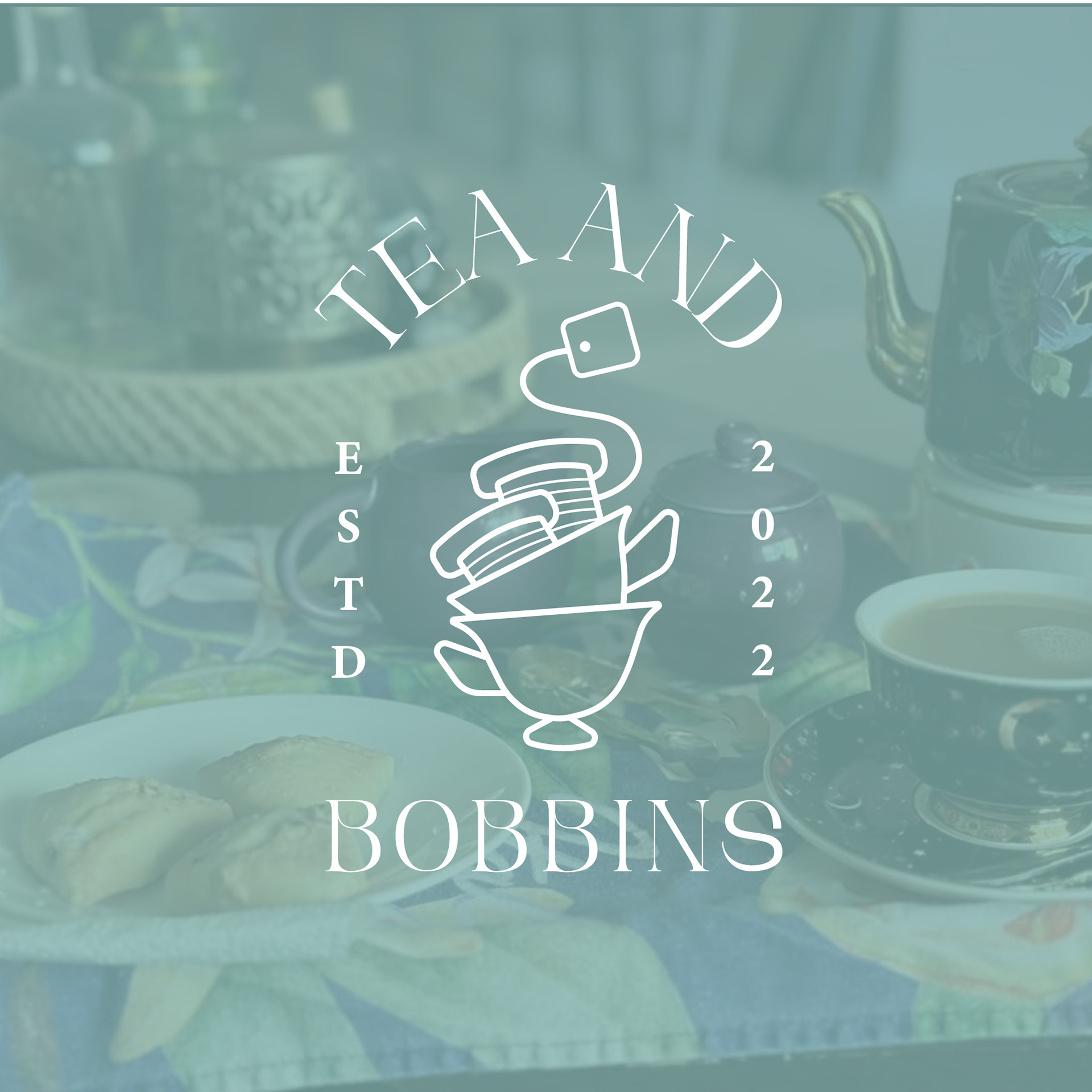
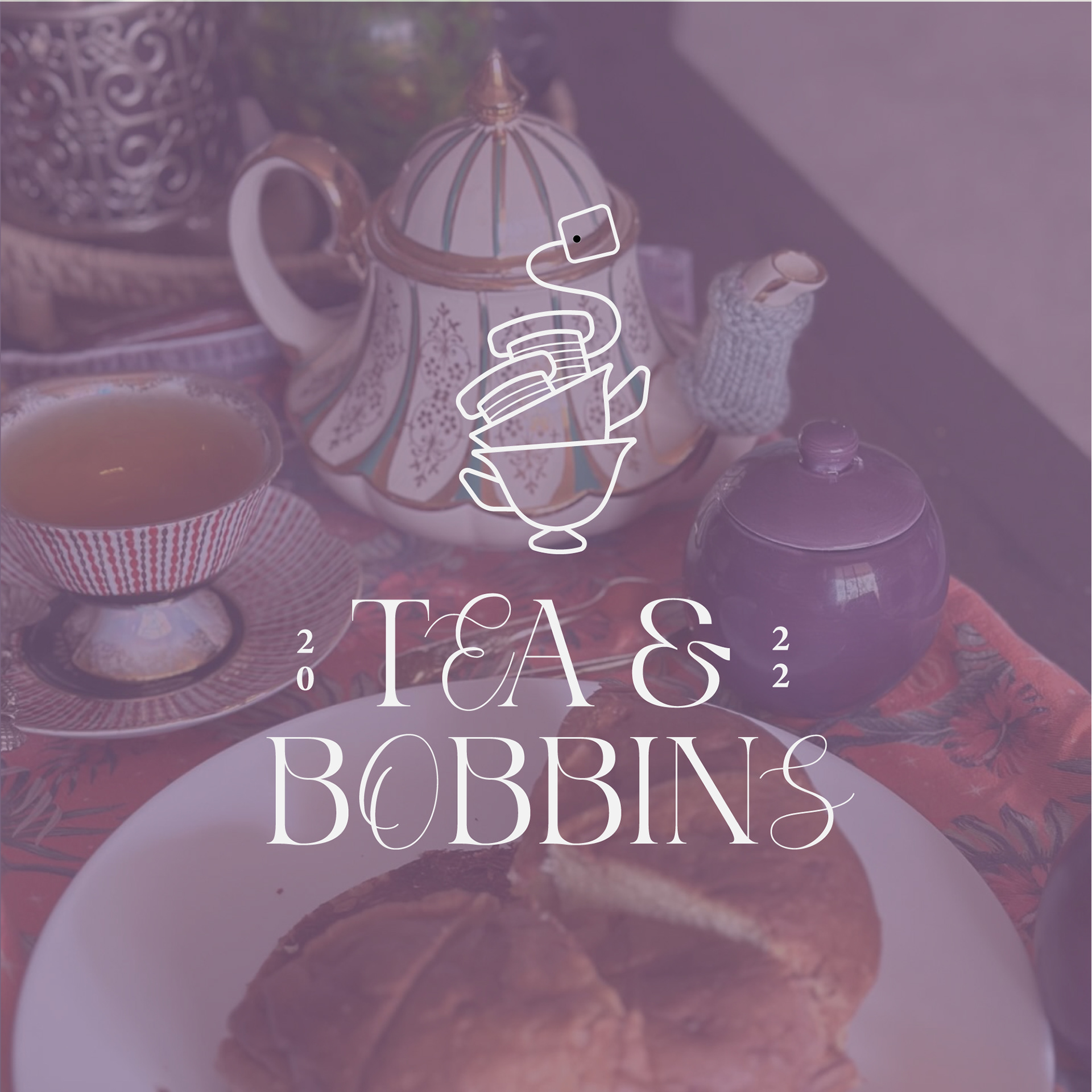
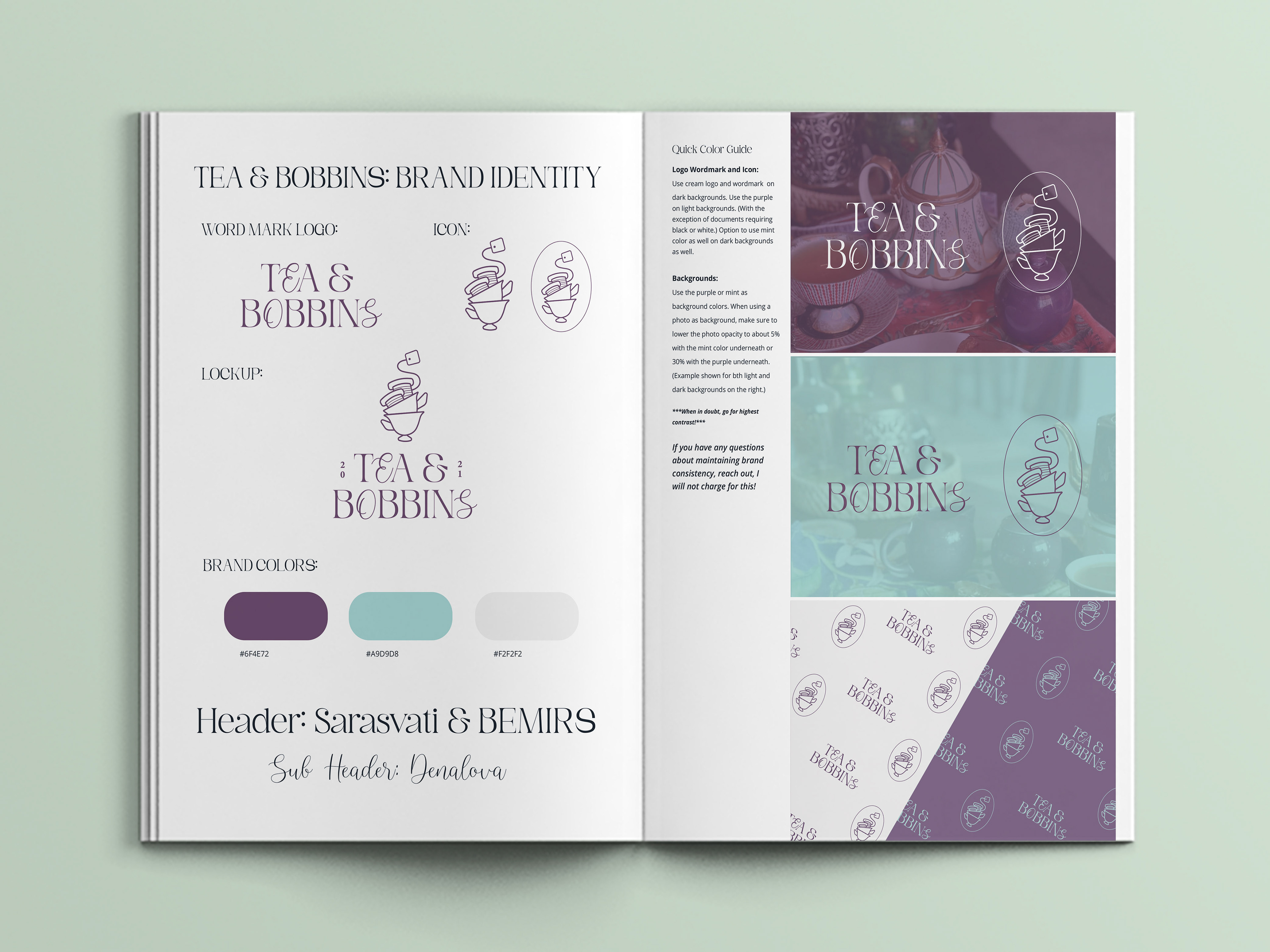
This typographic logo is a thoughtful blend of two typefaces that together embody the brand’s tone. Most of the brand name is set in Sarasvati and select letters—T, O, and S—are set in Denalova. The interplay between these fonts reflects the brand’s identity: feminine and soft, but with timeless character and refinement.
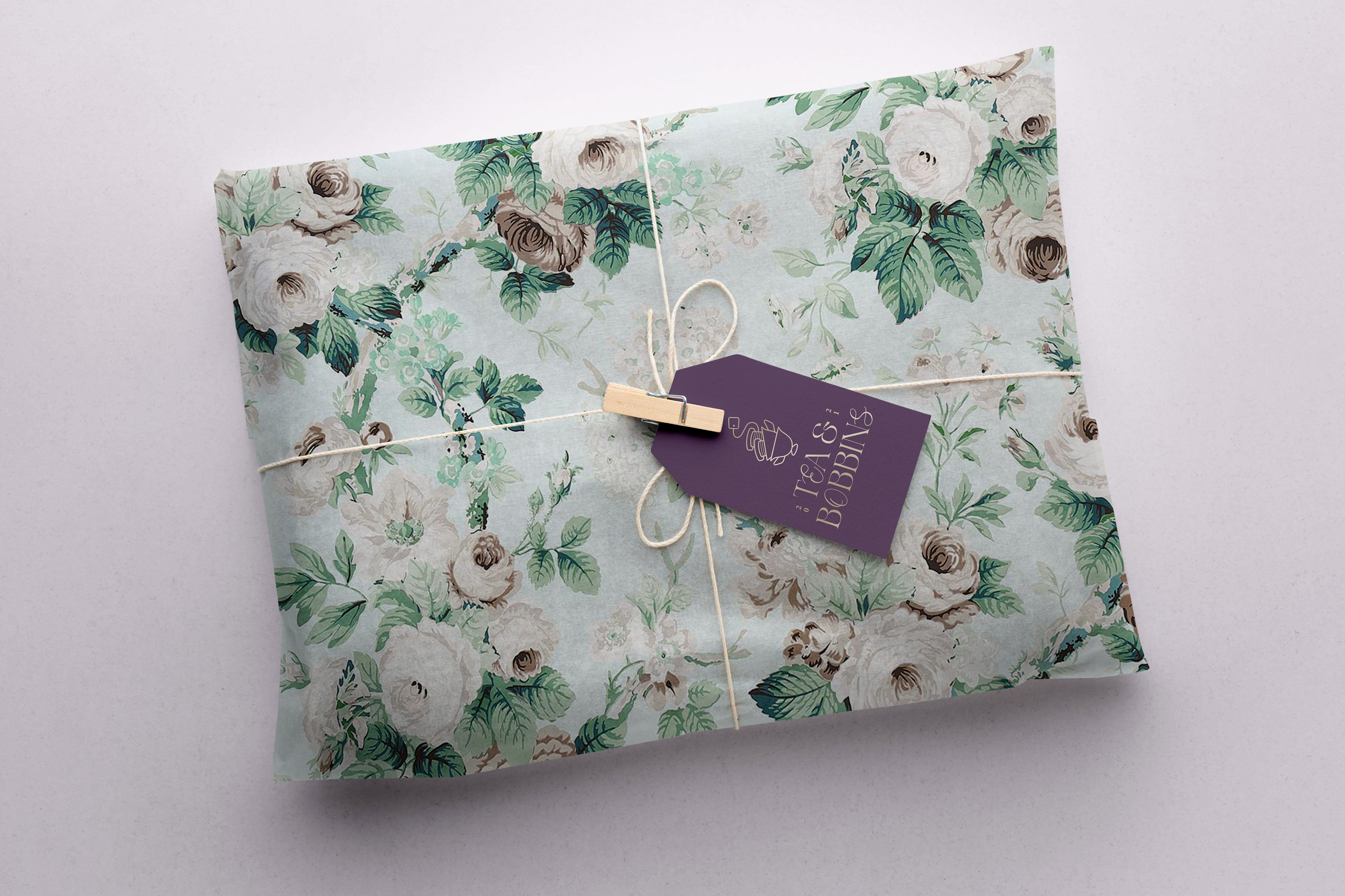
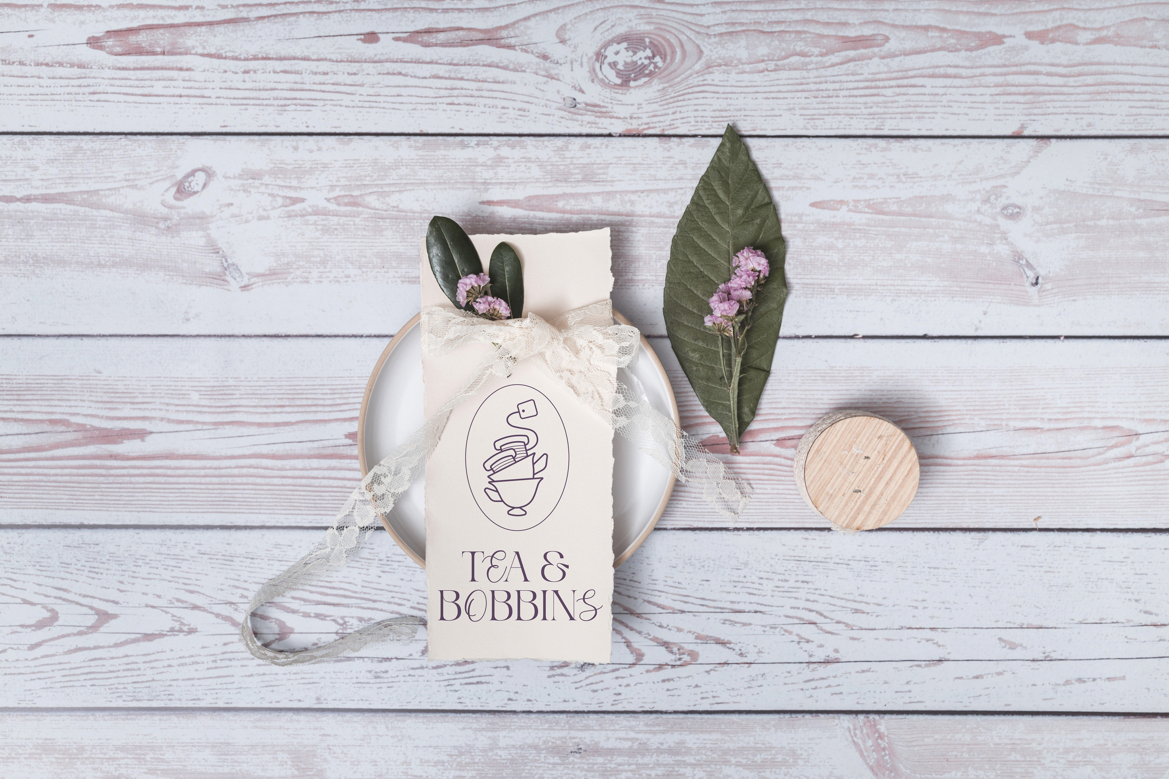
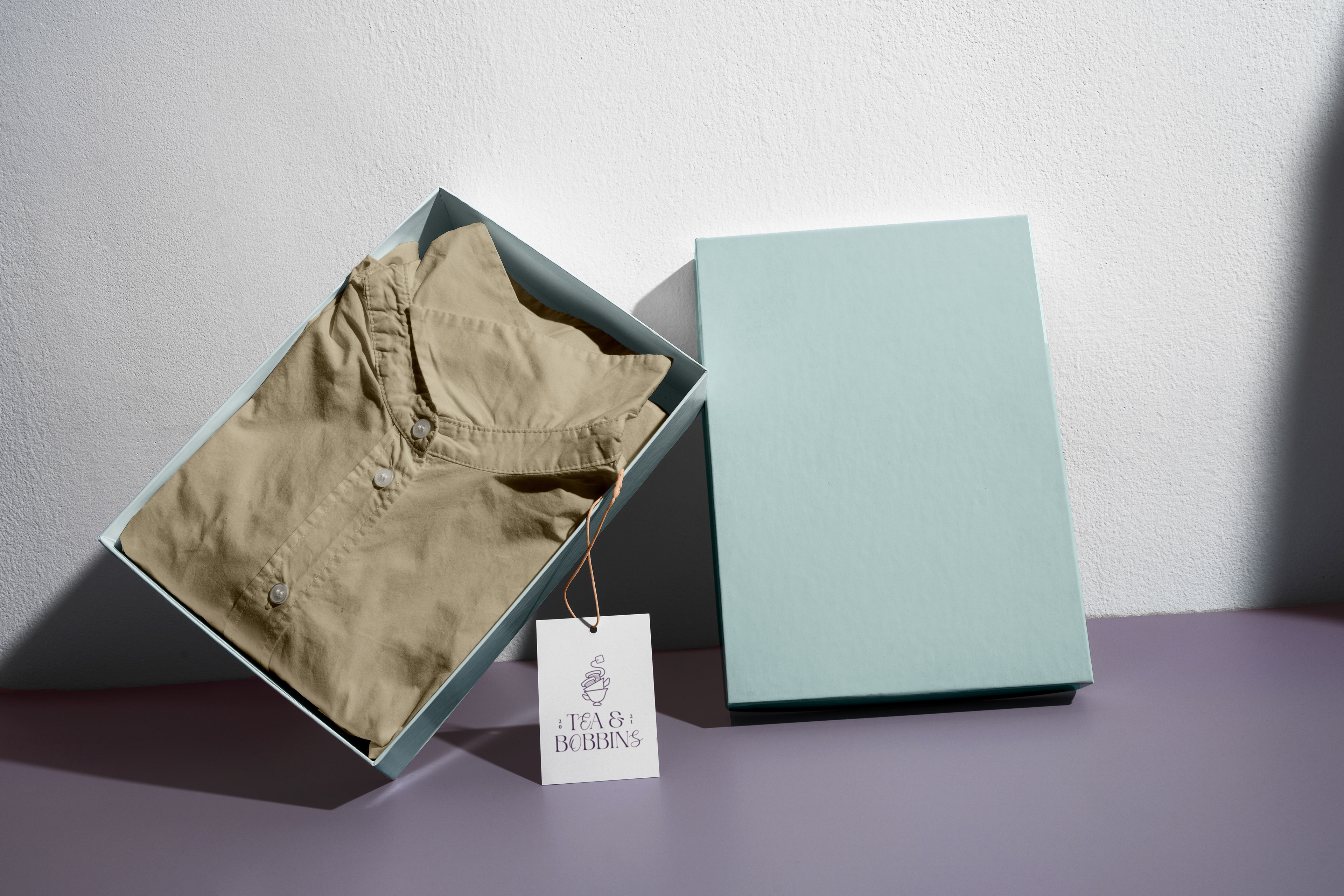
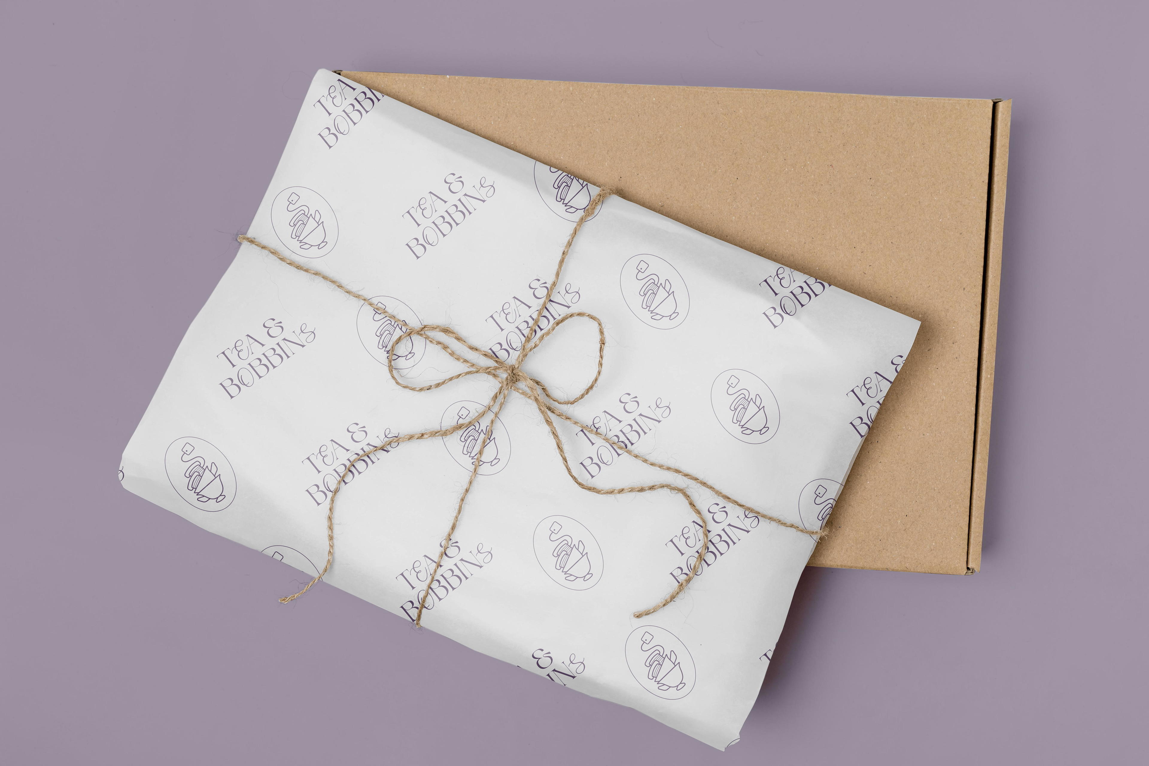
The goal was to create a versatile logo that could be adapted across all brand touchpoints—from small woven labels and packaging stickers to digital headers and social media icons.
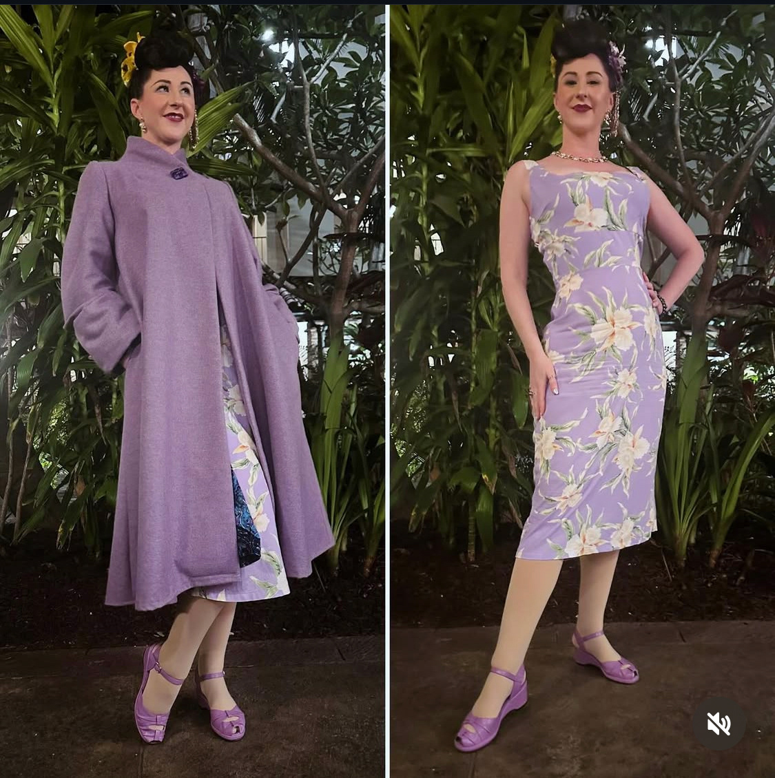
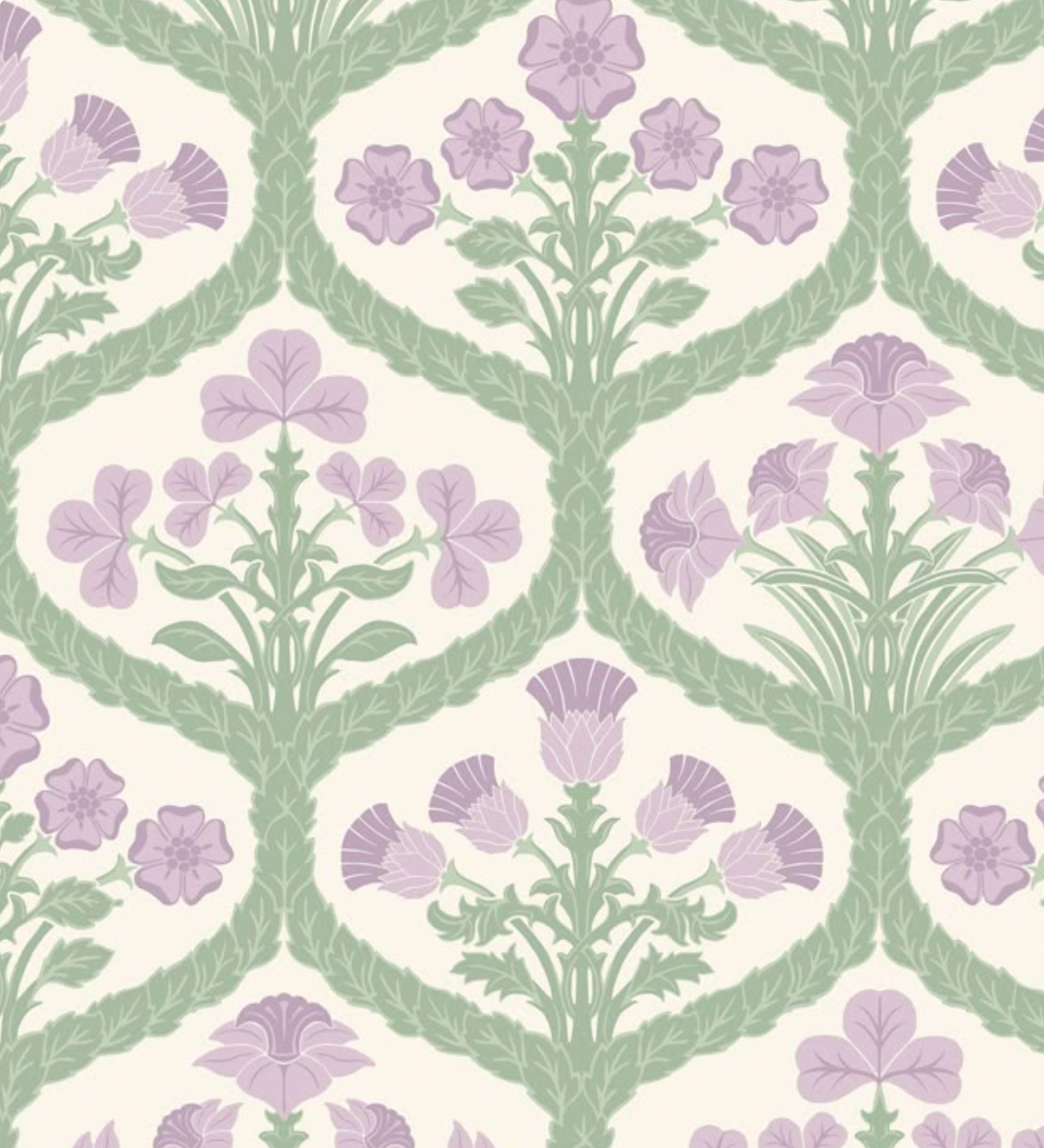
At the client’s request, the color palette was refined to reflect a cooler, more ethereal tone. The final colors center around a dusty purple, offering a romantic, muted sophistication, and a soft light mint, which introduces freshness and calm. These tones are balanced by accents of antique cream and subtle metallic golds, creating an overall atmosphere of softness, warmth, and timeless grace. This palette is consistent across every medium, helping to create a unified and gentle brand presence.
Tags and Packaging